One of the reasons we were told masks were essential for school kids this year was that masks would reduce the likelihood of school closures, by reducing disease incidence. Unfortunately, like so much the CDC has promised, the opposite turns out to be true.
Children in masked districts experienced, on average, 4-times the number of disrupted learning days as those in mask-optional districts (Figure 1). The same districts also had 2.5 times higher case rates during the same period as we demonstrated in analysis published on March 9th, 2022.
Figure 1
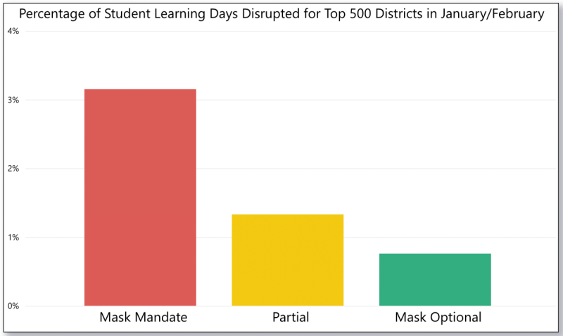
This result is as important as it was expected. The CDC promised that whatever potential (and willfully ignored) harms might come to children from two full years of forced masking, they must be risked, due to the added safety and schooling that masking would ensure. Neither claim ended up being true. As we demonstrated in our analysis of March 9th, during the January peak of the omicron wave, masked districts had 2.5-fold higher case rates than un-masked districts. Yet, during the same period, as we saw in Figure 1 above, those same schools experienced more than 4-fold higher rates of school disruptions—significantly higher rates of disruption even than their increases in case rates.
Figure 2
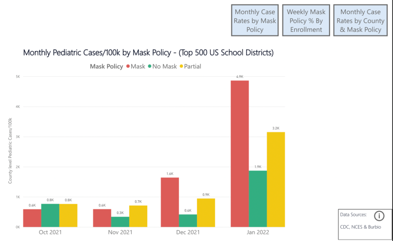
January, when the omicron wave peaked, naturally, saw the highest rates of school closures. Virtually all school closures in February were among masked schools.
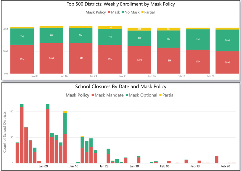
Figures 3 and 4
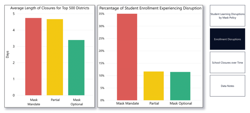
Among the top 500 school districts (which account for 40% of the nation’s school children), 35% of children in mask-required schools experienced school disruptions, where only 11% of children in no-mask/mask optional schools experienced such disruptions. Additionally, those disruptions were longer, with mask-required schools experiencing an average shutdown of 4.74 days vs. 3.39 for mask optional.
Figure 5
Later, I will discuss why these results are not surprising. But before I do that, I must acknowledge that in some ways they are surprising. The reason these results are surprising, is that in August of 2021, in an attempt to “encourage” school masking, the CDC changed the definition of a close contact. After the change, a person was not considered a close contact if both people were masked.
This put incredible pressure on schools to make masking mandatory, because it allowed children who were (by any real definition) closet contacts not to be tested, and hence to be able to stay in school—even if they might in fact be infected. This policy ensured that parents in mask-optional schools would be required to test their children at much higher rates, due to more inclusive exposure rules for these settings.
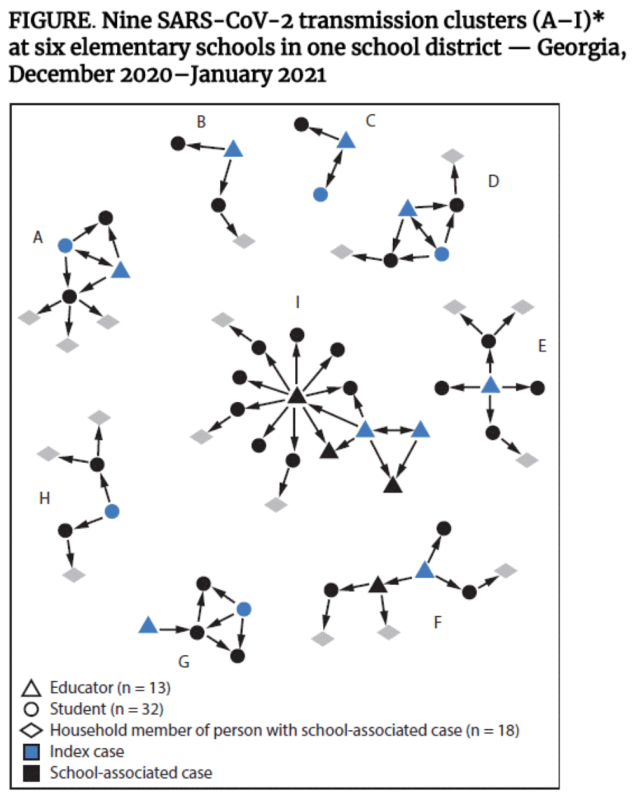
To put this into perspective, based on the CDC’s August revisions to the close contact definition, none of the exposed teachers or students in this Feb 2021 CDC study, would have been asked to test, because masking was required at the school, and they would not have been considered close contacts. (The study notes that “inadequate mask use” was observed in clusters A, C, E, G, and I, but it is unlikely that under the new definition, a school would dare to tell parents that their children who were masked were still going to be sent home to quarantine for 10 days, for “inadequate” mask use.)
Figure 6, excerpt from CDC study
Thus, despite the CDC’s definition of a close contact favoring masked schools in terms of requiring less testing, masked schools still saw higher rates of disruption than mask-optional/no-mask schools. Beyond that, they saw higher rates of disruption evenrelative to their higher case rates.
This tells us that there is something else at work. What is it? The monthly variation of case rates in mask-optional vs. mask-required districts likely reflects differences in seasonality. Southern states, which are more likely to be mask optional, have two smaller COVID seasons, a summer and a winter season, where mask-required states are more likely to be in northern areas, which experience a much smaller summer season, and a larger winter season (and a small spring shoulder season, which we are just entering). Yet even in this case, as was noted above, the difference in observed case rates is lower (2.5 times higher) than the difference in school disruptions rates (4 times higher).
Nor is the answer vaccination rates. The states where schools were more likely to have mask optional districts are also those that have lower vaccination rates. The difference is especially stark amongst school-age children (we’ll do a follow-on analysis that shows the exact relationship).
So what is it?
I believe it is the myth of control—of which masks are the most potent outward manifestation—that is to blame. This is why I say this is not a surprising result.
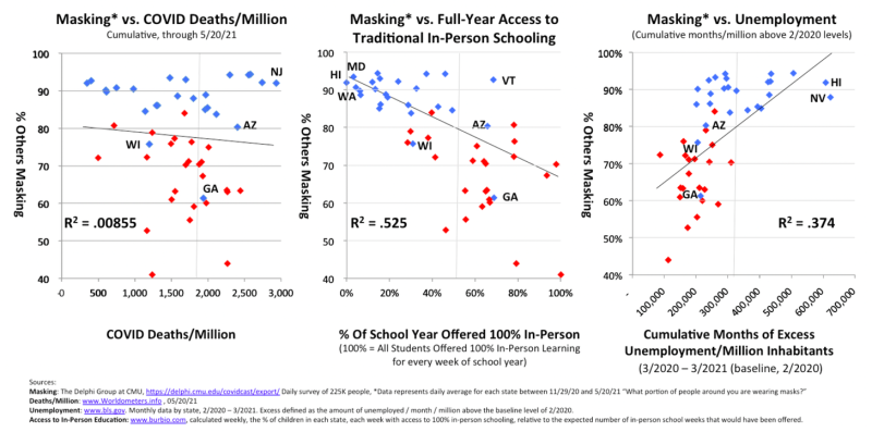
In an analysis I performed last year, by far the strongest correlation to masking rates was low access to in-person schooling (unemployment was the other—COVID deaths were not linked—nor were cases as was demonstrated in this peer-reviewed article).
Figure 7
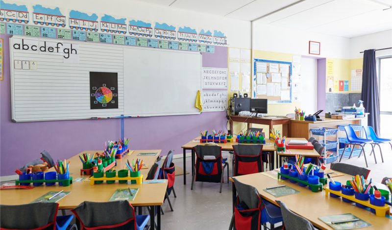
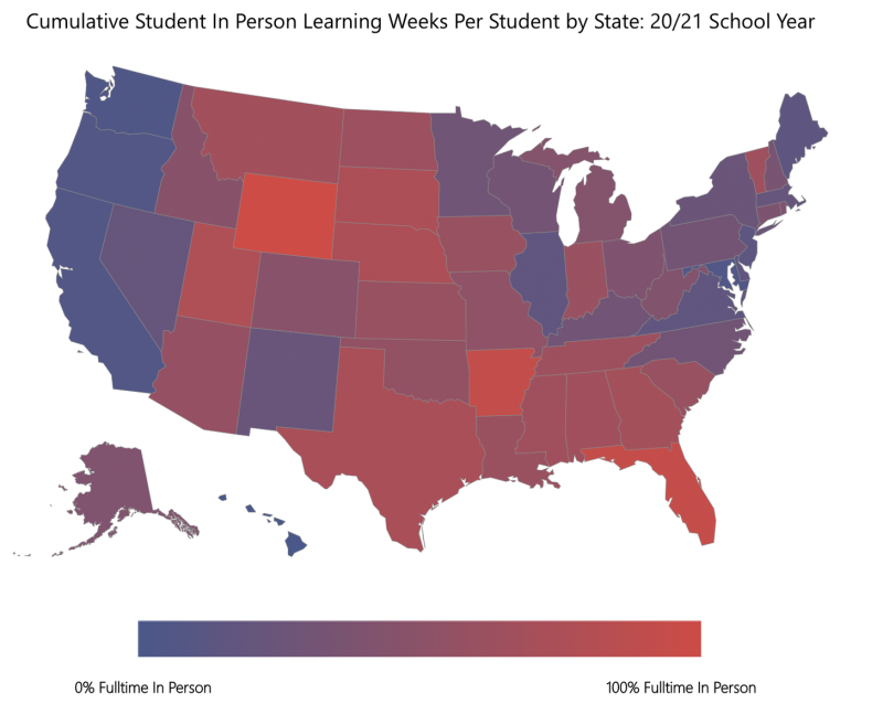
The image in Figure 8 below (which links to an interactive dashboard), shows the average number of full-time, in-person school weeks offered to each state’s children during the 2020/21 school year. Those states where the myth of control was most pervasive saw staggeringly lower rates of in-person learning. Maryland and Washington, both with nearly 100% compliance for masking last year, delivered just 2 full weeks of full-time, in-person instruction per child—compared to Florida, where children were offered the full 40 weeks of full-time, in-person instruction. In Hawaii, the mask, mandate, and general-control-mecca, the average kid received zero weeks of full-time, in-person instruction.
Figure 8 (linked to interactive dashboard)
Thus, we have seen this pattern before, the pattern where the level of mitigation efforts correlates not to decreased disease, but rather, to decreased access to in-person education. Fortunately this year, the differences are smaller, and the magnitude of loss, less. But the lesson remains: More masks, equals less school (and, paradoxically—but probably not causally—more COVID).
Data and Methods
Data on weekly mask policies for the top 500 school districts was purchased from burbio.com. Data from Burbio.com’s school closures tracker was also accessed. Only districts for which mask policy was available were included, i.e. the top 500 districts (accounting for 40% of U.S. public school students). For each school closure, the status of the mask policy in place during the week prior to the closure was used. This ensures that the closures reflect mask policy in place at the time, though in most districts, there was very little movement on mask policy over the course of this period. For each closure, the number of children impacted was multiplied by the number of days of the closure. These were then aggregated according to mask-policy type in place at the time of the closure. The denominator, student learning days by mask policy, was calculated by multiplying the number of children in each district by policy type, and by the number of days.
Further descriptions of the methods are accessible in the fourth tab of the dashboard.
If you would like to further discuss the methods or data used in this analysis, we would be happy to provide further clarification, and answer any questions. We cannot provide access to the mask policy data by week and district, as that data was purchased from www.burbio.com, but you are more than welcome to contact them to purchase access to that data. But we are happy to discuss the nature of that data with you.
Potential Further Analysis…
- Comparison of disrupted school days by district, relative to cumulative in-person learning delivered in 2020/21 school year. (Hypothesis: this will be highly negatively correlated.)
- Demographic characteristics of the districts that experienced the highest rates of disrupted learning days. (Hypothesis: this will show that the districts with the highest closure rates also had the largest minority populations.)
- Comparison of mask policies in place in 2021/22 vs. access to in-person learning offered in 2020/21 school year. (Hypothesis: The place with highest mask compliance in 2020/21 will also be most likely to force masking.)
- Looking forward, changes in achievement levels relative to pre-pandemic performance, based on % of school weeks spent masked. (Hypothesis: the places with the highest rates of mask-required school weeks will show the highest rates of learning loss—this will be the final shoe for masks)
- Average masking rates, relative to vaccination rates (only available by state). (Hypothesis: the states with the highest vaccination rates are highly correlated to low levels of mask-optional instruction.)
- What else would you like to see?
Republished from the authors’ Substack
Published under a Creative Commons Attribution 4.0 International License
For reprints, please set the canonical link back to the original Brownstone Institute Article and Author.