Vaccines have not curbed death rates from Covid in countries around the world. There is no clear evidence that they have saved lives and they have probably done more to precipitate deaths than to avert them.
This is a conclusion reached after completing a straightforward statistical study that compares the death rate from Covid to the level of vaccination within each of the individual countries.
If vaccinations were doing what they were promised to do, then countries in which higher proportions of the population became vaccinated would be countries in which relatively fewer people died from the virus. But there is no evidence that such a thing happened.
A problem with studying this issue is that the pandemic worked its way through the global population in different regions at different times and did so at different rates of speed. We don’t know whether different Covid death rates were a consequence of vaccines or something else.
But here is what we do know. We know that during 2020 — the first year of the Covid pandemic — there was no vaccine available; and we also know that during 2021 — the pandemic’s second year — vaccines were widely available throughout the entire twelve months.
For whatever reason, countries varied greatly in the degree to which they used vaccines to fight the virus. To this day, a handful of countries have only vaccinated 3 or 4 percent of their populations whereas others have vaccinated virtually their entire populations. Between the two extremes lie most countries along a reasonably steady continuum from relatively little vaccination to lots. The biggest confounding factor is the degree to which the virus slew people. In some countries the death rate from Covid was extremely high by the end of the first year while in other countries virtually nobody had died. How can countries be compared to each other when they varied so much in their exposure to the disease during that first year when vaccines did not exist?
Covid deaths in the second year should have been suppressed to some degree depending on how much of the population got vaccinated. Even so, the spread and virulence of the virus might well have been greater in the second year than it was in the first, so there is no guarantee that the Covid death rate would have dropped. The vaccines might have been working but the progress toward herd immunity might have been too slow to offset the rising infection rate.
This may explain, for example, why Covid death rates rose in the second year rather than declining. Of all Covid deaths worldwide, less than 40 percent occurred in the first year when vaccines were unavailable whereas 50 percent occurred in the second year when vaccination was the order of the day.
Covid vaccines were touted as highly effective but did not curtail the pandemic as one might expect. Governments kept claiming that the rising death rates during the second year were because of the unvaccinated but they provided no hard data and their assertion was unconvincing because the pool of unvaccinated people was rapidly shrinking as more and more people got the jab.
If vaccines were immunizing people then countries that went in big for vaccination should have seen a more favorable CHANGE in their Covid death rates from the first to the second year than was true for the countries that did not vaccinate much. This is the fundamental premise on which the following study is built.
There are of course many forces other than vaccination that might have influenced the change in death rate from the first year to the second, but if vaccines had any effect at all there ought to be at least some correlation between a higher level of vaccination and a more favorable change in the Covid death rate from year one to year two. There is, however, a confounding variable: age structure of the population. We know that Covid has killed older people in far greater proportionate numbers than the young. We also know that the proportion of the population that is old varies enormously from one country to the next. An adjustment must be made to account for this.
The chosen approach is to calculate the size of each national population aged 65+ and to then estimate its likely death rate from Covid. National death rates for Covid among the elderly becomes the canary in the coal mine; their higher sensitivity to the prospect of Covid death is used to evaluate whether or not more widespread vaccination programs led to relatively lower Covid death rates.
Because I couldn’t find any country-by-country source of information, I had to assume that the proportion of all deaths from Covid that occur to those aged 65+ was the same in all countries as it was in the United States: 75.6 percent. The above describes the conceptual character of the study. Now it is time to lay out its particulars.
This chart provides total population numbers for each country in the world as well as the total number of deaths from Covid updated to the present day. Such statistics are of course infected with all sorts of inaccuracies and distortions but this would be true no matter what data sources are used.
By clicking on an individual country within the Worldometer table, one gains access to that country’s particulars, including a graph of cumulative deaths from Covid for each day from the beginning of the pandemic to the present. By hovering the cursor over the line in the graph, it is possible to bring up the total deaths from Covid as of any given day. Since I was compiling the data for this study back in February, I arbitrarily chose February 20th of 2020 as the first day of the pandemic and recorded total Covid deaths for that day as well as for the 20th of February on each of the subsequent three years.
Extracting the numbers of deaths for individual countries was a slow and tedious process that also required the occasional use of a number for the day before or after the February 20th marker, but this introduced only minor inaccuracies to the final compilation.
The Worldometer table provides data for 231 countries and territories around the world. Ideally, all these entities would be included in the study, but many of them have populations so small that calculated death rates would not be reliable measures. Rates calculated from very small populations are unreliable so only countries with populations of at least 5 million were included.
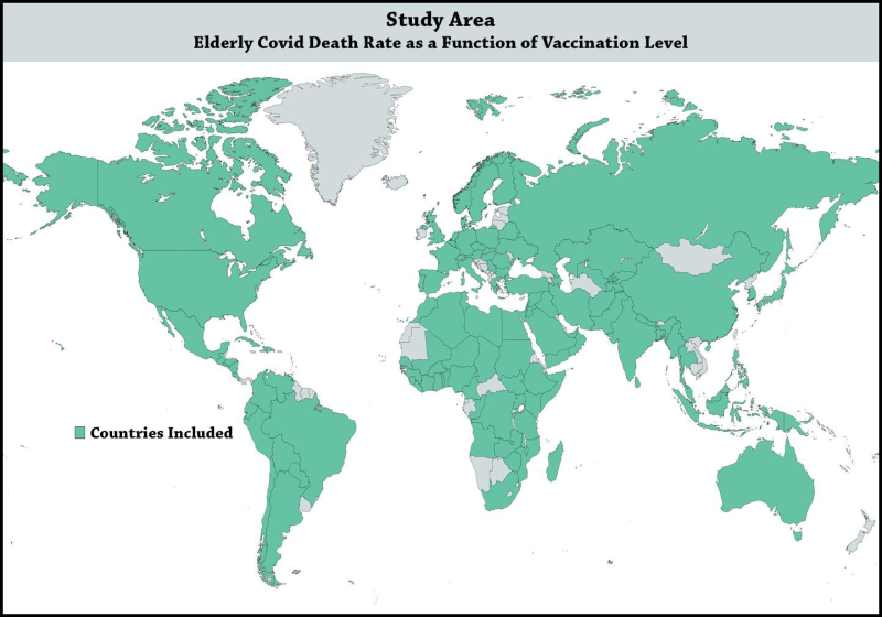
According to the Worldometer table, 123 countries have populations of 5 million or more. Eight of them lacked one or more pieces of data needed to do analysis, so there are only 115 countries in the final list used for this study.
In spite of this weeding process, those 115 countries account for over 90 percent of the world population and over 90 percent of the total land area. It is reasonable to view the inevitable sampling bias as unimportant since the numbers for the 115 countries come close to including all the people and all the Covid deaths in the world.
Here is a world map showing the countries included in the study. The countries not included are few in number and widely scattered.


At this website it is possible to open a table that provides data on vaccinations by country. The table carries an extended URL, but to open it one must first go to the URL listed above.
That table lists countries of the world in alphabetical order and contains a column (column G) that tabulates the cumulative number of persons vaccinated with at least one dose. This column of data was copied and transferred into a new Excel spreadsheet along with the information on the country populations and the Covid deaths obtained from the Worldometer.info URL.
The following URL at Wikipedia brings up a table that lists the percentage of each country’s population that is aged 65 or older. The figures for the 115 countries in our study were transferred into a new column in the Excel spreadsheet.
A bar graph here provides the data needed to compute the percentage of all US Covid deaths that have accrued to those aged 65 or older, and the resultant figure is 75.4 percent. I originally found similar data at a different website that indicated a rate of 75.6 percent and that was the figure I used in this study. Since I can no longer find that original source, this source is used to show that a 0.2% difference in the two numbers is insignificant and tends to confirm the accuracy of that lost source.
Of course, the percentage rate of Covid deaths to those aged 65+ most likely varies somewhat from country to country, but without specific figures for individual countries, the best that can be done is to presume that all countries have the same percentage as the United States. This introduces some error but probably not much since all around the world the elderly were by far the most likely to die from the virus.
With this final data piece added to the Excel spreadsheet, everything needed for an analysis was in place.
The calculation of Covid death rates for each individual year of the 3-year pandemic was done using formulas in Excel, as was the calculation of each country’s elderly population and the raw numbers of Covid deaths estimated for the 65+ age group.
The final steps were to have Excel:
(1) Compute the 65+ death rates for the first year when there was no vaccine and the second year when the vaccine option was readily available;
(2) Calculate the proportionate change in that rate from the first to the second year, and;
(3) Convert both the national vaccination rates and the change in 65+ death rates to rank order.
The conversion to rank data was necessary because the distribution of values for 65+ death rate change was very badly skewed and could not be used for any parametric statistical computations (like Pearson correlation).
Although a lot of information gets lost when measured data is converted to rank form, it does have one saving grace: its Spearman rho correlation calculation captures not just any linear relationship between the two variables but also any curvilinear one. In other words, a Spearman rank correlation ought to detect any possible indication that vaccination was helping to bring down death rates from Covid.
For those unfamiliar with statistical methods, do not despair. The correlation coefficient means the same thing in both cases: a final number that approaches 1 (whether positive or negative) indicates a strong statistical connection between the two variables whereas a final number that approaches 0 indicates a strong likelihood that there is no connection whatsoever between them.
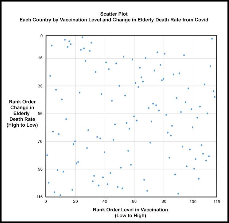
In this study, the Spearman rank correlation computes to .015. This is close enough to zero to conclude that the odds are exceedingly high that the level of vaccination had no influence on the death rate among the elderly.
For those who would like to see a visual presentation of the fact that there is virtually no relationship between the two variables, the following graph shows how randomly the individual countries distribute themselves in a scatter plot.


If the 115 country dots in the above scatter plot tended to cluster along a diagonal line running from the bottom left to the top right of the graph, then there would be clear evidence that low death rates for the elderly are associated with high levels of vaccination. If, on the other hand, there were a similar pattern along a downward line running from the top left to the bottom right, it would indicate a perverse relationship in which high death rates are associated with high levels of vaccination. Instead what we have is a randomly scattered pattern of dots indicating that no connection whatsoever exists between vaccination levels and death rate levels.
In conclusion, there is no evidence to support the widely proclaimed generalization that Covid vaccinations saved lives.
This study says nothing about the efficacy of individual vaccinations. Neither does it say anything about what might cause an elderly death rate to be high or low. It even is silent regarding the forces that might be responsible for shifts in the elderly death rate from year one to year two.
What it does say is that national vaccination campaigns — no matter how vigorously or authoritatively pursued — had no measurable capacity to bring down death rates for the elderly. What is true for the elderly is probably true for all younger age groups as well, but even if not, the elderly Covid deaths are such a large part of all Covid deaths that the overall picture might be shifted only slightly.
In conclusion, a word must be said about the unwillingness of most country governments to present data showing how ineffective their vaccination programs have been. The results of this study suggest that this “oversight” is in fact a form of obfuscation.
With their resources — human, technical, and financial — there is no excuse for national governments having failed to prove to their populations that the vaccinations were bringing down the Covid death rate. Instead, the general public was offered nothing more than a con man’s reassurances.
Furthermore, we can expect that governments will continue to speak in generalities and, if permitted, will avoid ever releasing solid statistical studies that document the relative ineffectiveness of their vaccination programs. They cannot afford to release them because we were reassured from the beginning that vaccines would mitigate the pandemic when in fact they didn’t.
Anybody who publicly doubted the effectiveness of vaccines was treated as selfish and ignorant and undeserving of respect. This skepticism was justified but the governments of the world cannot admit it.
The sorry irony of the situation is that to pursue their vaccination obsession, many Western governments strongly discouraged any sort of certified treatment protocol for Covid because the vaccinations under development would not be eligible for use if even one such protocol were recognized as effective.
In short, governments allowed people to die so that they might employ the vaccine as a silver bullet. It was the wrong gamble. Now we know that vaccine programs have had little effect, their advocates are caught between a rock and a hard place.Anyone who wishes to examine the data and computations contained in the Excel spreadsheet that was compiled for this study can go here.
Join the conversation:


Published under a Creative Commons Attribution 4.0 International License
For reprints, please set the canonical link back to the original Brownstone Institute Article and Author.


