
The housing price data has screamed out, “What inflation cooling?” The Case-Schiller index for June came in at an all-time record high and was up by +6.5% over last year.
So if you happen to be a wage worker you’re not likely to be feeling the chill. That’s because the average wage is up by roughly half that amount at +3.7% on a Y/Y basis.
Still, the LTM period in June was only the latest inning in a race that wage and salary workers have been losing for several decades now. That is, thanks to Fed policies which inflate assets at far faster rates than the price of everyday wages, goods, and services.
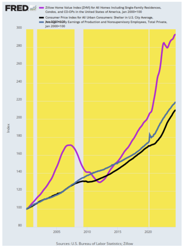
In the first place, the Fed does not even know how fast housing prices are rising because it obstinately refuses to credit the readily available private sector data on residential housing prices. But as shown by the purple line below depicting the Zillow home price index (which covers single-family residences, condos, and coops), the median US price has risen from $124,000 in January 2000 to $362,500 as of July 2024.
That’s a gain of 194% as indexed by the purple line below. During the same 24-year period, however, the CPI for shelter has risen by only 110%, and the PCE deflator version of shelter prices has risen by even less. In short, real-world housing prices are up by 2X the level depicted in the “incoming data” that the knuckleheads in the Eccles Building live or die by.
Of course, the Fed shills on Wall Street will say this mixes apples and oranges—asset prices versus rental service costs. But over a 24-year period—not so much. That’s because in the long run, rents reflect the discounted present value of rental income streams less operating costs.
Accordingly, the fact that the blue line (CPI shelter price) has risen by barely half of the Zillow-indexed asset price (purple line) suggests that BLS is up to its usual games. That is drastically underestimating real-world prices for the actual carry cost of home ownership.
Indeed, the CPI’s OER index (owners’ equivalent rent), which the Fed implicitly swears by, is beyond goofy. It’s based on a survey of a few thousand homeowners who are asked what they would rent their castle for if, presumably, they decided to pitch a tent on the sidewalk and become the landlord of their own property.
Of course, there is a simple test to demonstrate the absurdity of the Fed’s low-flation bias. Simply apply the extant 30-year mortgage rate against the Zillow Home price level and assume a standard 20% down homeowner purchase at any point over the last 24 years. On a beginning and ending basis, the annual mortgage costs are then compared to the annualized value of the average production worker’s wage (blue line).
Since the latter is up only 119%, or just a tad more than the shelter index, over the 24-year period, it’s evident that the Fed’s pro-inflation policy is far from even-handed. As it happened, the average annual wage, Zillow Home price, and 30-year mortgage rate in January 2000 were $124,000, $24,600, and 8.23%, respectively. By contrast, in July 2024 those values were $52,830, $363,000, and 6.78%, respectively.
If you assume an 80% loan-to-value ratio in both cases, you get the following:
- January 2000: $2,990 annual mortgage cost or 12% of the annual average wage.
- July 2024: $19,925 annual mortgage cost or 38% of the average annual wage.
That’s right. The Fed’s vaunted pro-inflation policy of 2.00% or higher annually is not an equal opportunity punisher. The average homeowner, in fact, got his financial head handed to him in a basket, as the interest cost of a standard mortgage on a median-priced home went from one-eighth of his pre-tax wage to nearly two-fifths.
The implication of the above chart actually amounts to a death sentence for the Fed as it is currently operated. Like the hammer-happy carpenter, the Fed’s only real tool is to fiddle with interest rates—notwithstanding the massive slop in the steering gear between overnight rates in the money markets and the opaque interior of the nation’s $28 trillion GDP, enmeshed as it is in the global GDP of $105 trillion.
Yet the skunk on the woodpile could not be more evident. To wit, the stimulus tool of low interest rates inherently drives up the price of leverageable assets far faster than everyday wages, goods, and services. So the 10% of the population that owns most of the financial and real estate assets takes the hindmost, while the 90% of households with modest-to-meager savings never catch up.
It’s a rotten deal. It needs to end.
Republished from David Stockman’s site
Join the conversation:
Published under a Creative Commons Attribution 4.0 International License
For reprints, please set the canonical link back to the original Brownstone Institute Article and Author.