
This article is working document and is open to queries and corrections.
Email [email protected]
Also available on Substack – join the conversation
Coauthored by Thomas Verduyn, BASc, Jonathan Engler, MB ChB LLB DipPharmMed, Todd Kenyon, PhD, Martin Neil, PhD
In a previous article we discussed the large spring 2020 spike in mortality reported for New York City (NYC). This spike comprises an extraordinary 26,000 unexpected deaths over an 11-week period, a much greater figure than would be expected based on experience from the Covid outbreak on the Diamond Princess cruise ship, as explained in that article. Our conclusion was that “something else beyond Covid… was responsible for a significant majority of the excess deaths.”[1] Accordingly, we suggested a few possible alternatives, namely “iatrogenic harms, psychological effects, neglect, panic, ventilators and sedatives, and policies….”
Since publishing that article we have been digging deeper into what might have happened in NYC. After many discussions, and after poring over data, we have come to the point where we are forced to consider the uncomfortable possibility that there is another alternative: something is wrong with the data itself. In other words, there is reason to believe that the actual number and timing of the deaths in NYC in the spring of 2020 is different from the official government mortality records.
We are not currently in a position to prove that the numbers are wrong. Nor do we purport to know if the data is false on account of deliberate fraud. Despite our best efforts, the information required to certainly establish either point has thus far escaped our possession. What we do know is that the data that we have been able to obtain (whether from publicly available sources or by freedom of information requests) is incongruent with itself. Accordingly, we here present eight reasons why we think the NYC mortality data for spring 2020 might be false.
1. Compressed Timeframe of the Excess Mortality
First, if human factors (such as panic) and non-pharmaceutical interventions (NPIs, such as lockdowns) caused any excess deaths, we would expect to observe excess mortality for as long as either lasted. At the very least we would expect to see the excess slowly return to zero over time as the effects reach their limit of destructive influence.
This did not happen in NYC. Rather, the official data would have us believe that over 26,000 more deaths than seen in the previous year in NYC happened in one very brief 11-week period in the spring of 2020. The following graph demonstrates this vividly.
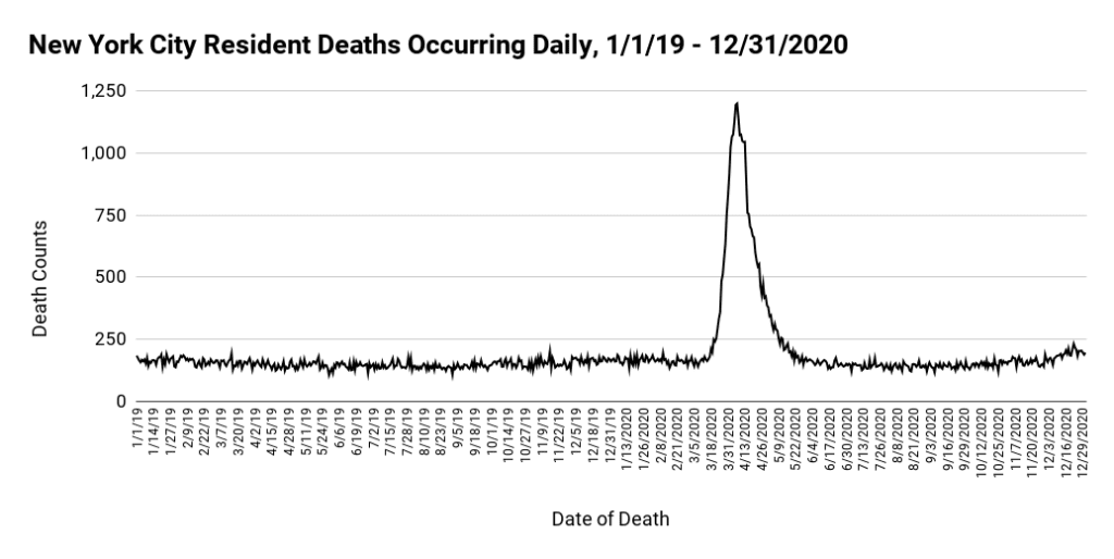
As can be seen from Figure 1 above, after multiple months of a relatively flat baseline (163 deaths/day), a massive spike in mortality abruptly started on March 17, 2020, took only 21 days to reach its peak (1200 deaths on April 7), and then returned to baseline (153 deaths/day) in only 44 days. The entire wave lasted just shy of 10 weeks.
There are three aspects about the above graph that makes the data seem implausible: the increase in all-cause deaths was too rapid, the peak was too high, and the return to normal too fast. It seems unlikely that all of the factors that we mentioned in our previous article could have combined to produce a wave of this nature.
Although we demonstrated in our previous article on NYC that the number of deaths attributed to Covid was unduly high, yet it is instructive to remove from Figure 1 all the deaths that were attributed to Covid. As can be seen below in Figure 2, we find an identical pattern: months of an almost flat baseline followed by a steep increase and then an abrupt return to normal. The only difference is that the peak is lower.
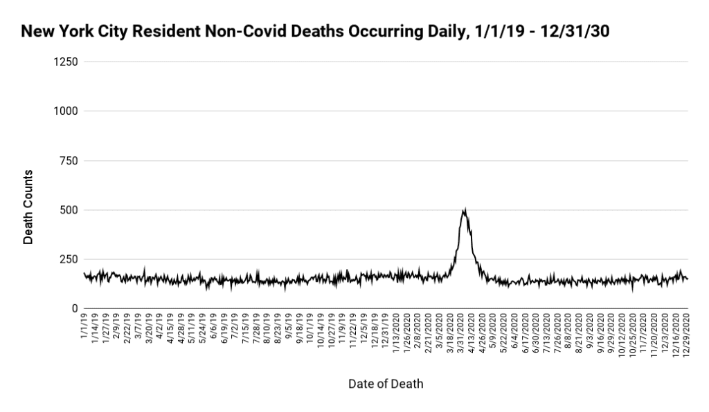
It is difficult to comprehend why there should be only six weeks of excess deaths in a year that saw ongoing restrictions & closures, civil unrest, healthcare avoidance, and myriad mental health challenges.
2. Simultaneous Rise in Deaths Across all Adult Age Groups
A second reason why we suspect the veracity of the NYC mortality data is that both the sharpness of the 2020 spring wave and its phenomenal height were simultaneous across every age bracket. This may be seen in the following 2 graphs:
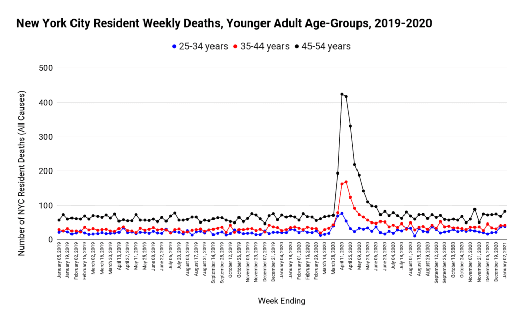
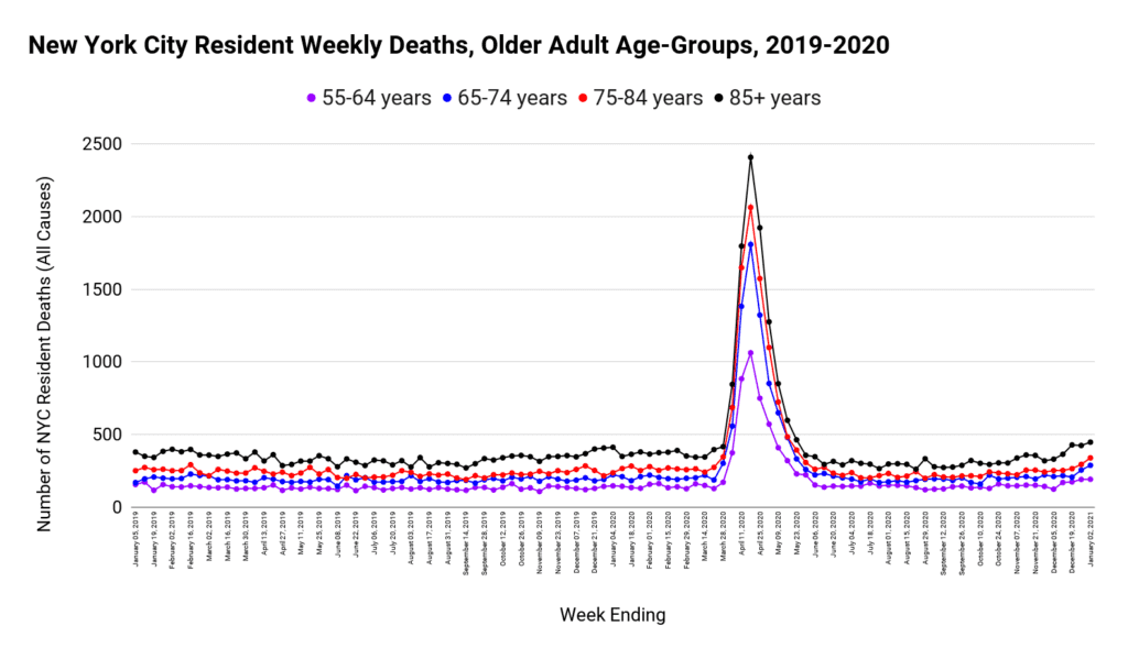
As one would expect, the peak increases with each successive older age group. What is unexpected and notable, however, is that the spike in deaths happened simultaneously across all age groups. Unless these deaths were caused by an external agent (such as buildings collapsing), we would expect the weak and frail elderly to succumb sooner than those still in the prime of their lives.
3. Simultaneous Rise in Mortality in all Settings
Third, the same odd trend was found even if the data is broken down by place of death.
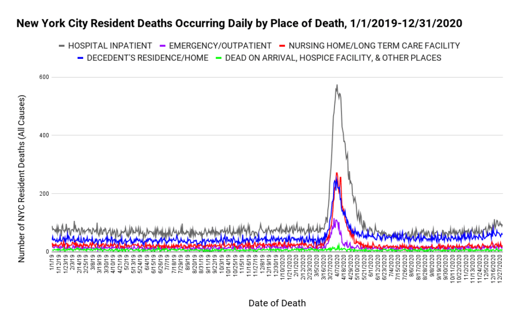
Is it possible that hospitals, nursing homes, and private residences all experienced such an unprecedented spike in all-cause mortality at exactly the same time? What mechanism is there to accomplish such a phenomenal event? Existing models of viral transmission cannot be tweaked sufficiently to create a matching mortality profile. Neither do changes to hospital protocols typically cause massive increases in deaths at home, unless it involves utter negligence on the part of paramedics and ambulances responding to home emergencies.
4. Mass-Casualty Event Without Explanation
Fourth, according to the official data, New York City experienced 34,451 deaths in a period of time when only 10,732 people would normally have died, resulting in an unimaginable 24,719 extra deaths (See figure 1). It seems unlikely that all the hospitals and funeral homes in New York City could have handled three times their normal capacity for 10 weeks straight, let alone a peak that reached more than seven times normal.
Furthermore, if these deaths did happen as recorded and an observer with no knowledge of the pandemic narrative was asked to comment on likely causes, it is almost certain he or she would suggest a mass casualty event such as an earthquake, an asteroid strike, a terrorist attack, a large-scale release of a toxin, or even a failure in the water treatment system. It may be helpful to examine this claim a little closer.
NYC experienced a non-natural mass casualty event in September of 2001. Therefore it is appropriate to compare the 2020 event with the devastating destruction of the two towers in the World Trade Center. We begin with a graph of all-cause deaths for those aged 20 to 44 that spans from 2001 to 2020, and which therefore covers both events.
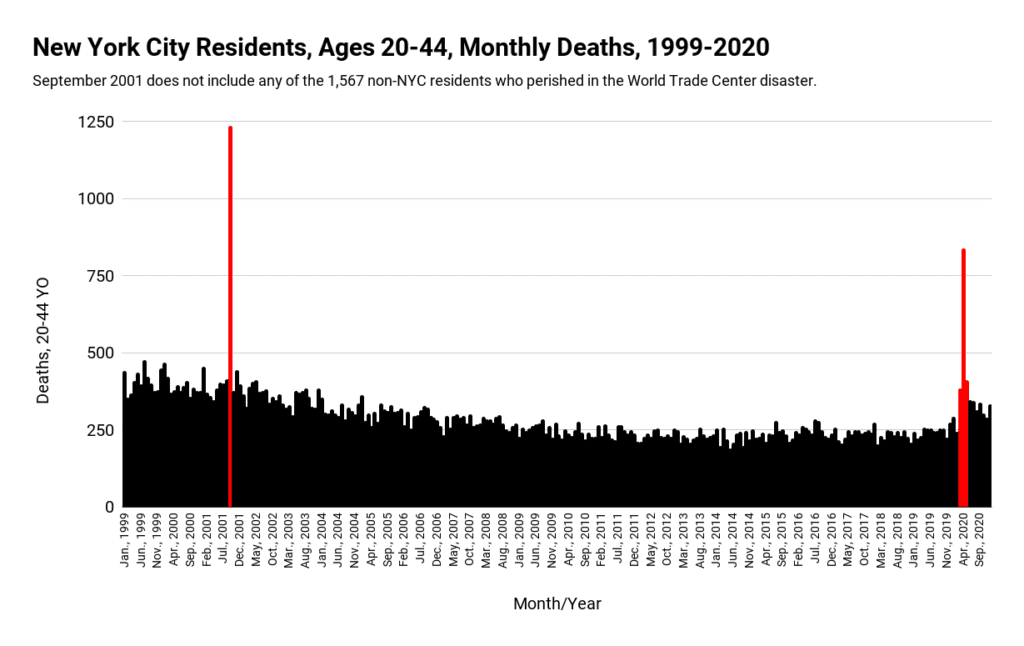
As can be seen from Figure 6, the comparison between what happened on “9/11″ and in the spring of 2020 is eerily identical, albeit the event in 2001 had a more vertical spike. Nevertheless, both events saw a massive and sudden increase in death that peaked far above normal, followed by a rapid decline back to normal. In the case of “9/11” the explanation is that two large sky-scrapers crumbled while occupied. The problem is that no similar mass-casualty event was recorded in 2020. If such an event did happen, it has thus far escaped detection.
Incidentally, figure 6 has the potential to make the “9/11” event appear more cataclysmic than the 2020 spring wave. Although it was worse for the 20 to 44 age group, it was definitely not worse overall, as may be seen by the following graph which includes all age groups:
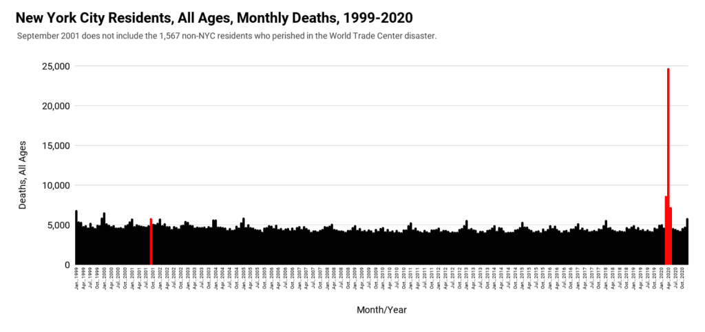
Are we to believe that what happened in NYC in the spring of 2020 was so much worse than what happened on “9/11” that it caused 21 times more excess deaths among NYC residents (1,176 to 24,719) – all without any event capable of causing such unprecedented carnage?
5. Discrepancy Between Mortality and Hospital Activity
Fifth, if in fact the daily all-cause mortality suddenly shot up to 738% above normal, and then fell precipitously back to baseline, we should expect to find evidence of this in hospital records and ambulance dispatches. Sadly and unexpectedly, the data seems to imply the exact opposite.
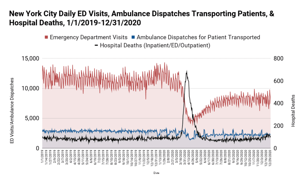
In figure 8, the number of emergency department visits (red) plummeted at the exact same time that the phenomenal and unprecedented wave of deaths (black) was supposed to be happening. The total number of patients being transported by an ambulance also dropped, albeit not to the same extent.
Furthermore, not only did emergency department visits drop, but outpatient visits also plunged substantially and at the same time. Even inpatient admissions witnessed a moderate decline. We demonstrate this by looking at data for 2 particular hospitals: Maimonides Medical Center (one of the city’s largest private hospitals), and Elmhurst Hospital, (which received wide media coverage about being overrun with patients in late March 2020).
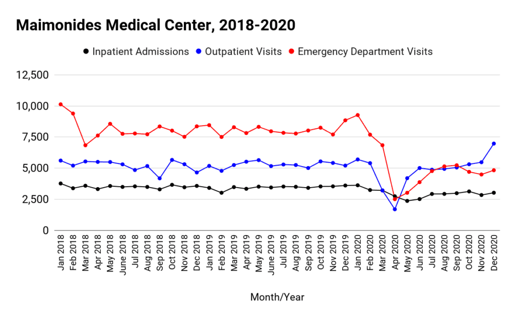
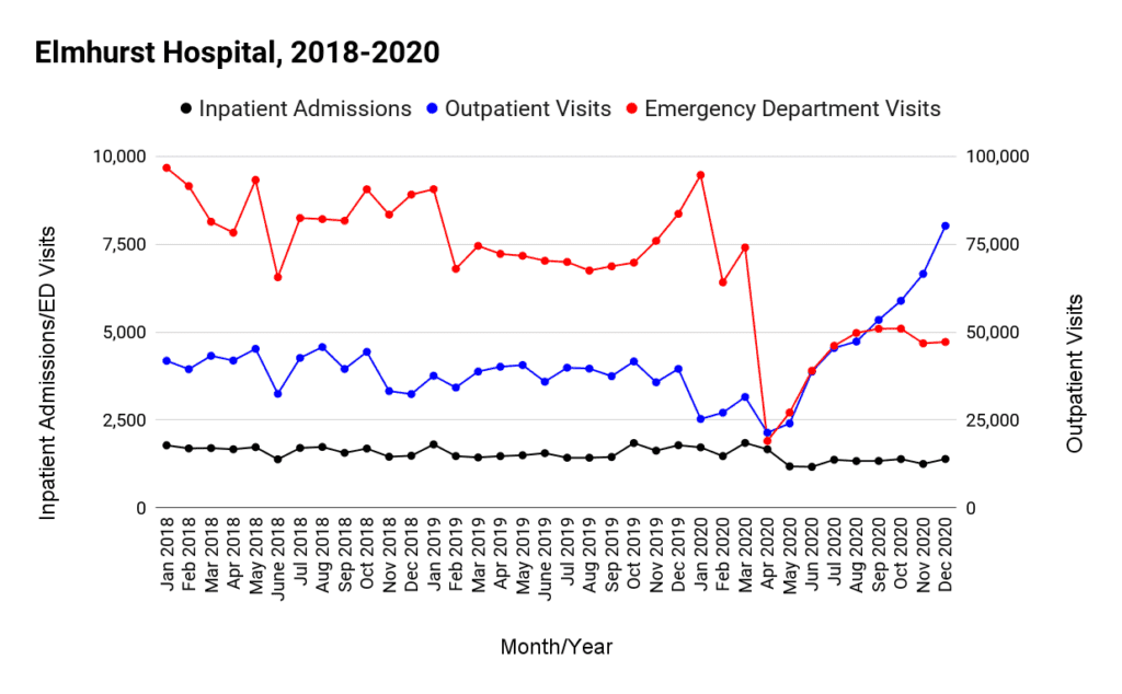
During the 10 week spike in mortality, 21,003 deaths occurred in hospitals (Figure 5: hospital inpatient + Emergency/outpatient). This is 15,065 more deaths than expected based on the baseline average. Are we to believe that at a time when Emergency visits plunged (from 12,000 per day to less than 5,000), ambulance transports dropped (from about 3,000 to 1,500 per day), and outpatient and inpatient visits also tanked, that 15,065 extra people suddenly died in a hospital?
Although the numbers are mathematically possible, it would require that at the peak of the wave the great majority of people either already in hospital or coming to a hospital died. That scenario sounds implausible to us. If it did happen, it most certainly was not caused by a respiratory virus like Covid, which has an infection fatality rate less than 0.2%. At the least, such an appalling hospital record should require an honest inquiry.
6. Discrepancy Between Mortality and Hospital Occupancy
Sixth, despite the fact that hospital inpatients accounted for the bulk of the deaths (figure 5), bed occupancy levels in NYC hospitals showed only a minor increase, and never reached capacity, as may be seen from the following graph:
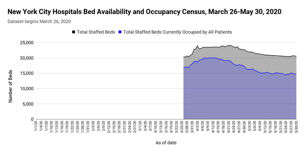
The reason behind why the above graph starts abruptly on March 26, 2020 is that the data is suspiciously unavailable for any dates before this. Despite the glaring omission, it is still possible to observe that there is no evidence of hospitals being overrun with patients during the phenomenal spike in the number of deaths.
Furthermore, data obtained directly from the agency that operates the city’s public hospital system show a marked decline in Elmhurst Hospital’s ICU occupancy rates during the spring wave, a pattern that distinctly diverged from that of previous years:
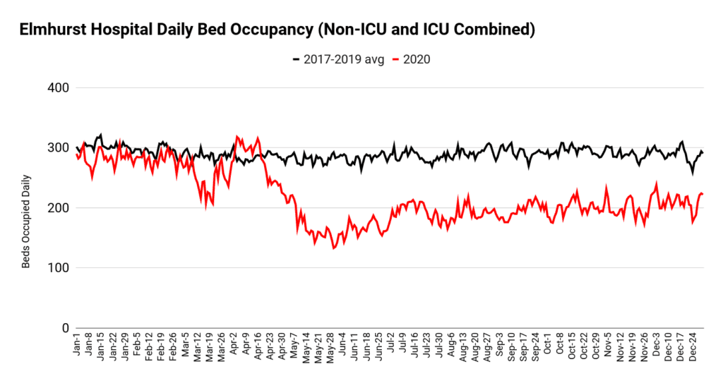
At the risk of being repetitive, are we to believe that 15 thousand extra deaths occurred in NYC hospitals while total bed occupancy levels dropped? Of course, it is possible that beds were empty because so many dead people were being discharged. The problem with this explanation is that since Covid is given as the leading cause of death during the spike, and since Covid hospitalizations began about the same time as the spike in mortality, the only way for discharges to remain ahead of bed occupancy is if those that died remained in a hospital bed for less than one day.
However, official data for NYC informs us that the median duration of hospitalization was 6 days for Covid patients, or 8 days for those that died. Furthermore, Covid patients regularly survived 3 weeks before dying. Why then is the massive spike in mortality not reflected in bed occupancy levels?
An alternative explanation for how discharges prevented bed occupancy from being overrun is that the bulk of people dying were those that had been in hospital already for some time before the spike occurred. That, however, would implicate hospitals for either fraudulent coding of Covid deaths or utter mismanagement of existing inpatients.
7. Unparalleled Scale Compared to Other Major U.S. Cities
Seventh, the magnitude and shape of the spring mortality curve in NYC is significantly worse than what happened in any other major U.S. metropolitan area, as can be seen by the following graph.
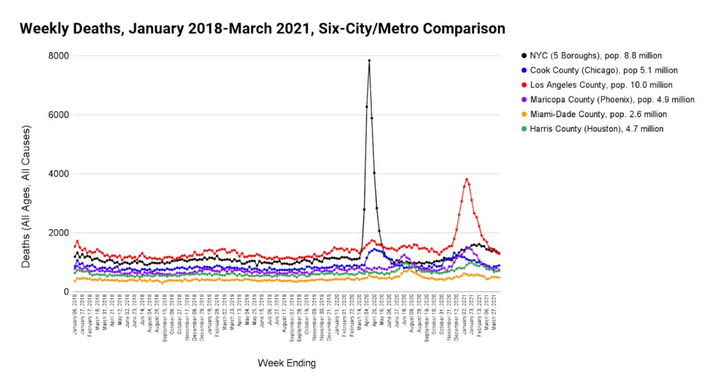
Despite the fact that the 5 other counties included in figure 13 experienced somewhat similar circumstances (news of Covid, lockdowns, changes to hospital protocols, panic, etc.), the excess mortality of the spring wave in NYC stands 14 times worse than all the others. This seems questionable.
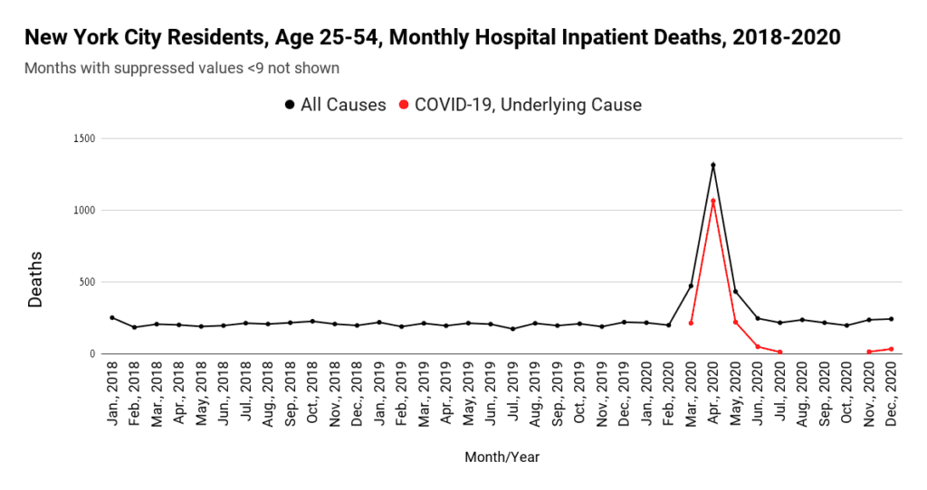
8. Unexpectedly High Mortality in Younger Adults
Eighth and last, as can be seen from Figures 2 and 5 above, the number of younger people that perished in the NYC spring wave of 2020 is unexpectedly high. Covid did not typically kill younger people. Nor should iatrogenic factors have caused unprecedented numbers of deaths in these age brackets. Nevertheless, the official data blames almost all the hospital inpatient deaths of residents in the age group of 25 to 54 on Covid.
The implausibility of this can be further demonstrated by comparing what happened in the rest of the USA with NYC for this age group.
| Location | Pop aged 25-54 | Percent | Covid Deaths aged 25-54 | Percent of total U.S. Covid deaths aged 25-54 |
| NYC | 3,838,849 | 3% | 1,937 | 25.4% |
| Rest of U.S. | 122,421,151 | 97% | 5,704 | 74.6% |
| Total | 126,260,000 | 100% | 7,641 | 100.0% |
Table 1: NYC vs USA, deaths attributed to Covid in NYC and the rest of the U.S. for those aged 25 to 54: March to May 2020. Source: US Census Bureau, CDC Wonder, NYC Health
As can be seen from Table 1, more than one quarter of all the deaths attributed to Covid in 25 to 54 year old Americans happened in New York City, despite the fact that only 3% of Americans in this age group lived in the City in 2020.
Conclusion
In summary, we have outlined eight different reasons why we suspect that the data surrounding the 2020 spring mortality wave in NYC might be incorrect. They are:
- It is unlikely that Covid combined with iatrogenic and other factors could have caused a wave of mortality as recorded.
- It is implausible that every age category should experience a spike in deaths simultaneously.
- It is improbable that deaths occurred simultaneously independent of place of death.
- The magnitude and steepness of the spike in deaths is indicative of an unparalleled non-natural mass casualty event. But no such event has been detected.
- Records of hospital visits and ambulance transports do not correlate with what would be expected had the massive wave of mortality happened as stated.
- Occupancy levels of hospital and ICU beds are not what one would expect if such a wave of death happened.
- What happened in NYC is significantly worse than similar cities in the U.S..
- Far too many younger people are reported to have died in a very short time frame, and to have died from Covid.
Therefore, we call upon the authorities to release basic daily hospital data so that admissions can be matched with bed occupancy, deaths and discharges. Death certificates should also be released in order to prove the number of deaths occurring each day and at each place of death. Officials must substantiate the timing and magnitude of the event with complete datasets, supported by records.
Finally, if the data are correct, it does not bode well for how hospitals, congregate settings, and ambulance services were managed. We believe the people of New York City deserve a full explanation for how so many people died in such a short time.
Republished from PANDA
Join the conversation:
Published under a Creative Commons Attribution 4.0 International License
For reprints, please set the canonical link back to the original Brownstone Institute Article and Author.