

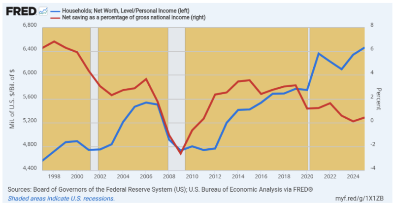
Here’s a graph the Keynesians, statists, and Wall Street gamblers—yes, we repeat ourselves—would prefer not to explain. At the same time, it also explains why socialism at this late date in history—and after all its abysmal failures the world over—is having some kind of dubious second coming in America.
During the last three decades the national savings rate (red line) has essentially collapsed, having fallen from 6.3% of GDP in 1997 to 0.5% of GDP in 2025. Between the same two dates, however, the net worth of US households (blue line) has soared from 4.6X personal income to 6.5X personal income.
In economist jargon, the question would recur as follows: How in the world over a three-decade period did the stock of wealth soar when the flows of savings virtually evaporated?
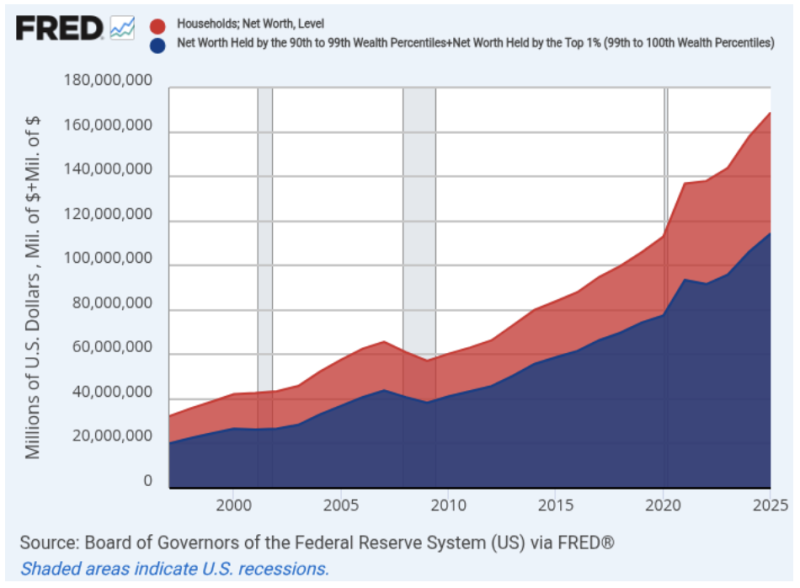
Or in plain English, how did so many Americans get so damn rich while living high on the hog? And we do mean wealthy: According to the Fed’s Flow of Funds data, household net worth erupted from $32 trillion in 1997 to $169 trillion at present. These figures amount to an average of $320,000 per household in 1997, which grew to an average of $1.250 million per household 28 years later.
Needless to say, some substantial part of that gain is reflective of inflation. But even in constant 2025 dollars, average net worth per household has virtually doubled from about $630,000 to the aforementioned $1.250 million.
In short, the average savings per household diminished to nearly zero over that three-decade period—even as $85 trillion in added wealth accumulated in household balance sheets.
As it happened, of course, the massive $136.4 trillion increase in net worth over this period went to the holders of financial and housing assets, less associated debts. Accordingly, with a lot of debt at the bottom income rungs relative to modest asset levels, the resulting wealth distribution skewed sharply to the tippy-top of the economic ladder.
To wit, $44.1 trillion of the gain was accounted for by the top 1% of households and fully $94.2 trillion by the top 10%. And while Keynesians, statists, and stockbrokers would have you believe this was nothing more than Mr. Market at work, we beg to differ.
Under a regime of sound money and honest markets there would have been no soaring gains in net worth relative to the very modest gains in national income and savings. To the contrary, the former is the work of the money-printers at the central bank and the Cantillon Effect of monetary inflation.
That is to say, when the Fed prints money it effectively first deposits the receipts among the primary bond dealers, which sell government bonds to its open market desk and then send the proceeds ricocheting through the canyons of Wall Street. At length, the inflation gets to Main Street in the form of higher energy, food, and other everyday prices, but not before much of the inflation is absorbed by the leveraged gamblers on Wall Street.
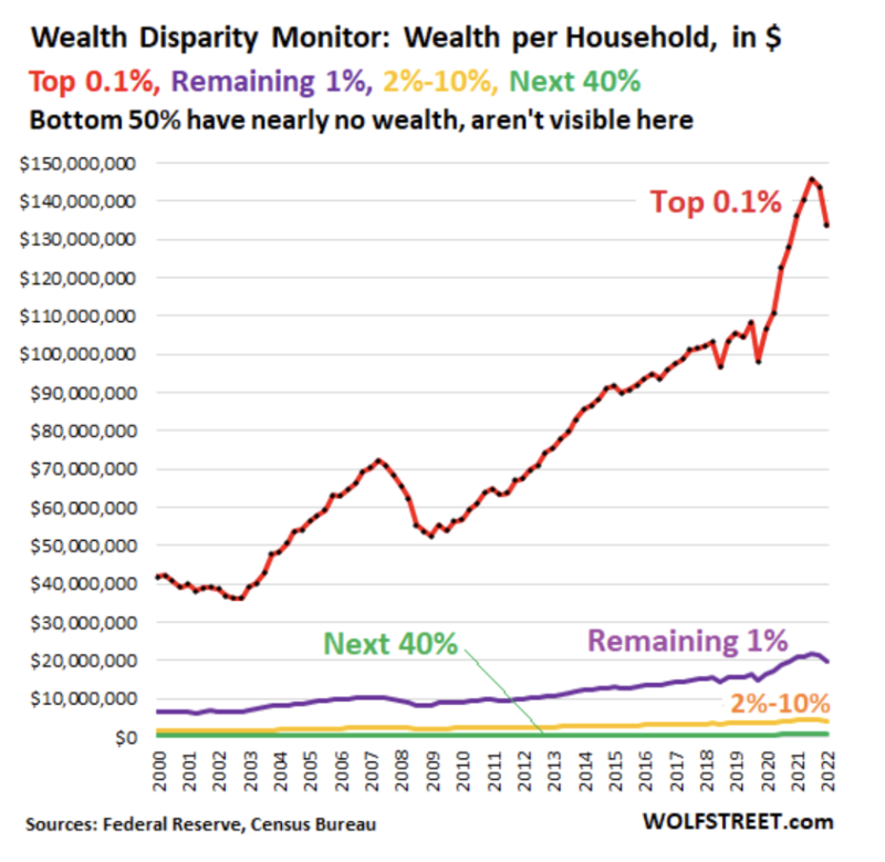
So there is no mystery as to why the wealth distribution in America has been skewed sharply to the top of the ladder during recent years. The culprit was not the Reagan tax cuts back in the 1980s or the inherent inequality of capitalism.
To the contrary, the normal skew of wealth to the most productive, capable, persistent, and enterprising households has been badly thrown out of kilter by the capture of the Federal Reserve by Wall Street speculators.
In the interim, however, the chart below speaks for itself. By embracing Greenspan-style monetary central planning in lieu of gold standard sound money, the modern day GOP has paved the way for the emerging Mamdani socialist coup in the Democrat Party.
That is to say, the wealth disparities shown below did not exist with nearly this much skew as recently as 1987, when Alan Greenspan’s pro-inflation, pro-wealth effects regime became official policy at the Fed. Then again, the Fed’s balance sheet stood at $250 billion in Q2 1987 after 73 years of a moderately tame printing press, which footings then ballooned to nearly $9 trillion by the peak in Q1 2022.
Yes, flood the free market with $8.75 trillion of fiat credits in barely 25 years, and you will indeed get a rip-roaring financial asset inflation. And you will also get a rekindling of socialist economics, which should have been finally left for dead by 1984.
Let’s start with the axiomatic. Redistribution of wealth from rich to poor is none of the state’s business. Full stop. At the same time, however, it’s an equally grave sin for agencies of the state to artificially tilt the scales on behalf of the already rich. Yet that is unmistakably the consequence of Keynesian monetary policy as it has been practiced and amplified since the arrival of Alan Greenspan at the Fed in August 1987.
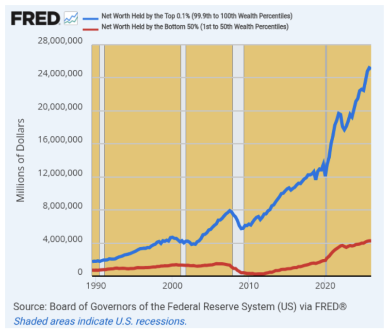
In this context, there is no reason to believe that the wealthy were getting shortchanged on the net worth front after the Morning in America boom of the mid-1980s. Yet as is evident in the graph below, the gap between the very rich and the bottom 50% of households has been relentlessly expanding since Greenspan bailed out Wall Street gamblers the first time after Black Monday in October 1987.
The net worth of the top 0.1% of households back then stood at $1.757 trillion, which was 2.4X the $718 billion net worth of the bottom 50% of US households. In unit terms, that amounted to an average net worth of $15,460 among the bottom 50% of households, which compared to $18.892 million for the top 0.1% of households.
Call this the status quo ante and there was no reason to find it objectionable. Mr. Market at work, as it were.
Fast forward to 2025, however, and the wealth distribution is far, far more skewed. The net worth of the top 0.1% or 135,000 ultra-wealthy US households now stood at $25.072 trillion, which compared to aggregated net worth of $4.266 trillion among the 67.4 million households in the bottom 50%.
That is to say, the gap had widened from 2.4X in 1989 to 5.9X by 2025. And this widening was even more dramatic when expressed in per household terms, where net worth now stood at $185.7 million each among the top 0.1% of households compared to $63,300 for the bottom 50%.
The truth is, there is absolutely no reason to believe that under a regime of sound money and honest financial markets that the gap between the tippy-top and bottom half of American households would have doubled during that interval. Not even remotely for the reasons we amplify below.
To the contrary, what we have is the Cantillon Effect: The inflationary emissions from the Eccles Building stick to the walls earlier and more completely on Wall Street and among financial asset holders before they eventually wend their way into the incomes and spending levels of the Main Street population.
There is no mystery, however, as to how the central banking branch of the state managed to double the wealth gap between the ultra-rich and the bottom 50% of US households in barely 37 years. Keynesian central banking has just a single policy instrument and it inherently makes the asset rich richer.
It can be succinctly described as systematic falsification of the price of debt or what economists are pleased to call “financial repression.” It is axiomatic, in fact, that when bond yields are artificially pushed lower, asset prices get jacked higher—even as leveraged speculation becomes even more rewarding as a matter of sheer arithmetic.
So what you have is a central bank-enabled double-whammy for the age-old carry trade: Through massive bond-buying, pegging of overnight money market rates, and open-mouth steering of price action on Wall Street, the Fed artificially boosts the asset side of the ledger—even as the carry cost of highly leveraged ownership of these appreciating assets falls increasingly below risk-based free market rates.
That is to say, the reason the net worth of the top 0.1% rose by 14.3X—from $1.757 trillion to $25.072 trillion—over a 36-year period in which the national income (GDP) rose by only 5.6X is this: Owing to a lot of help from their friends in the Eccles Building wealthy asset holders have been shooting fish in a barrel for the better part of three decades.
This has manifested itself, of course, in the relentless rise of PE multiples since the 1970s. Indeed, the S&P 500 traded at about 11X trailing GAAP earnings in the late 1970s, which multiple has climbed steadily on a rolling three-year trend basis to nearly 30X at present (dotted red least squares trend).
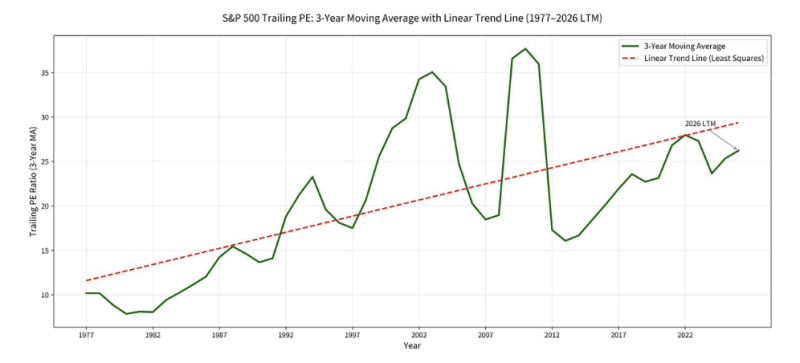
Then again, the logical direction of the trend line above would be the opposite—from the upper left to the lower right. That’s because the underlying performance trend of the US economy has sharply deteriorated over the past four decades.
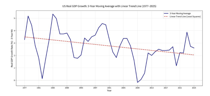
Thus, the trend of the three-year rolling average of real GDP has been moving decisively counter to the upward trend of valuation multiples. From a trend rate of 3.5% per annum in the late 1970s the real GDP growth trend has marched downhill for 40 years, currently posting at barely 2.0% per annum.
To be sure, in shorter intervals the profits share of GDP can fluctuate and potentially trend higher. But over time the real economy has to expand in order for business activity and the profit offtake from it to rise, as well.
Alas, the valuation multiple trend above is just plain not compatible in economic terms with the steadily falling rate of US economic performance depicted below. Somebody had their big fat thumbs on the scale, and that was the debt-enabling money-printers at the nation’s central bank.
Yes, it is that simple. Like the case of the Wizard of Oz, the only thing behind the screens at the Eccles Building is the stimulation of debt, more debt, and still even more debt. And the reason remains the tattered Great Depression-era fallacy that times were hard because consumers and businesses suddenly lost their nerve and their minds, apparently, and refused to spend enough on consumer goods and capital goods to keep the macr0 economy on an expansionary path.
So economic policy-makers ever since, and one way or another through a variety of fiscal and monetary “stimulus” expedients, have sought to goose spending by fostering cheaper and more abundant debt than the free market would generate on its own steam.
This cardinal (Keynesian) error of modern economic policy has had a Brobdingnagian impact on financial markets and the Main Street economy alike.
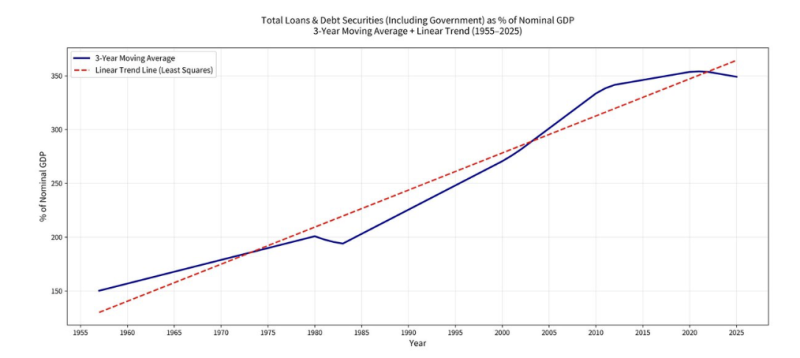
That’s because the other key line on the graph also has been chugging relentlessly uphill—most especially after Nixon shit-canned sound gold-backed money at Camp David in August 1971. We are referring to the trend of the national leverage ratio, which is depicted by the least squares line (dotted red line) in the graph below. It could not be more dispositive.
From a historic ratio of below 1.5X national income in 1955, total public and private debt outstanding now sits at an aberrant and unprecedented 3.5X national income.
Those two turns of extra debt tell you everything you need to know about today’s massive central bank-fostered financial bubbles. At the historically stable and prosperity-compatible 1.5X ratio to national income, combined public and private debt outstanding today would total just $48 trillion.
As it happens, of course, that figure was actually $116 trillion at the end of Q1 2026. What we have, therefore, is an extra $70 trillion of debt freighting down the US economy at a level never before even imagined. In turn, this comprises the flood of mispriced debt that sent Wall Street into a relentless frenzy of leveraged speculation.
From endless basis trades to triple-leveraged ETFs and every manner of inherently leveraged options trading schemes, Wall Street has driven financial asset prices ever higher. But these pyramids of speculation and debt are not based on sustainable value-added and real economic output—they are the fetid fruit of the central bank printing presses.
Here’s the skunk on the woodpile, however. None of the massive buildup of leverage and $70 trillion of extra debt depicted above was necessary for prosperity. It made the wealthy unspeakably rich—perhaps symbolized by trillionaire Elon Musk—but it was built on the so-called “Greenspan wealth effect” doctrine, surely the greatest economic policy error of modern times.
And now it threatens the very basis of American democracy, as well. That’s because it is generating such egregious wealth disparities as to actually revive what had been the dead-as-a-doornail carcass of socialism at the turn of the century.
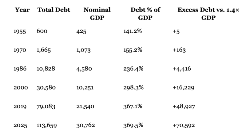
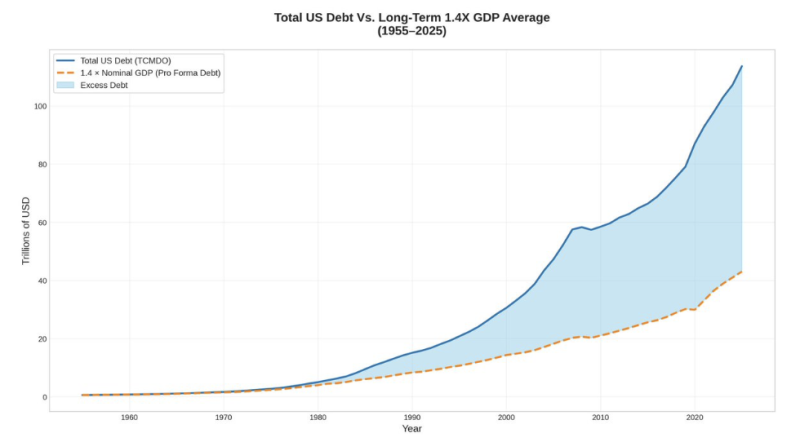
Using the 1955 Golden Era’s ratio of total public and private debt to national income (GDP) at 1.4X, here is the buildup of the current $70 trillion of excess debt now hanging like a financial sword of Damocles over the financial markets and US economy.
Indeed, this data makes clear that the main thing being cooked up behind the screen by the monetary wizards at the Eccles Building—especially since Greenspan’s arrival—was the false elixir of debt, more debt, and still even more debt. After all, during the 70 years after 1955 total US public and private debt outstanding rose by a staggering 190X, from $600 billion to $113.6 trillion.
And, yes, there was a fair amount of economic growth and an even more fulsome inflation of the price level during that seven-decade interval. But, still, the debt growth far outpaced both of these macr0 drivers, thereby causing the national leverage ratio—or ratio of total public and private debt to nominal GDP—to rise from 141% in 1955 to 370% at present.
In a word, the legacy of activist central banking since the mid-1960s has been the saddling of American free enterprise with what amounts to a rolling and perpetual national LBO. And like in all leveraged buyouts, it is the existing shareholders who get the loot, not the workers, businessmen, and consumers who subsequently labor under its crushing burden of debt.
Moreover, unlike standard LBOs where sponsors claim—and sometimes do—enhance returns by steady debt paydowns, the Fed’s national LBO has worked in only one direction: Namely, toward ever higher national leverage ratios and a progressively greater burden of excess debt, which we are here defining as leverage above the 140% of GDP historic standard.
The blue area of the graph below depicts the growing margin of debt in excess of the 140% of GDP standard as it stood in 1955. It makes clear as a bell that we are not talking about an oscillating cyclical trend, but a long-term path driven by the central bank printing presses that have generated a growing, debilitating wedge of debt on the US economy.
In fact, when your editor first arrived in Washington, DC as a youthful Capitol Hill staffer on the eve of Nixon’s folly at Camp David in August 1971, the excess debt wedge stood at a modest $163 billion and 15% of GDP. But by the time Greenspan took the helm at the Fed in 1987, the newly liberated proprietors of its printing presses had already expanded the excess debt wedge to $4.416 trillion and 95% of GDP.
Thereafter, of course, it was off to the races. Even before Greenspan went full retard after the dotcom crash, excess debt already stood at $16.2 trillion and 158% of GDP, but in successive turns at bat his successors and assigns—Bernanke, Yellen, and Powell—operated the printing presses on turbocharge for the next two decades, causing the excess debt wedge to balloon to nearly $49 trillion and 227% of GDP by 2019.
Despite Powell’s belated efforts to shrink the Fed’s elephantine balance sheet via a short spell of QT (quantitative tightening), there has been no respite from the excess debt tsunami. At the end of 2025, in fact, it stood at $113.7 trillion and has continued to grow by leaps and bounds and is likely to hit $120 trillion by year-end 2026.
Yet and yet. The proof that none of the chronic and systemic interest rate repression that fostered this debt explosion was necessary lies in the pudding of the historical economic performance statistics. Indeed, if we scroll back to the very low starting debt figures and national leverage numbers of 1955, what we find is that was one barnburner of a year economically. On a Y/Y basis, real GDP had boomed by 7.1%, while the CPI actually fell by 0.4% and real median family income surged by 6.6%.
In a word, 1955 was the epicenter of the Golden Era that Donald Trump only brags about today. The aforementioned $600 billion of total public and private debt, which represented 141% of GDP, stood right square upon the prior long-term average of about 150% after 1870.
Obviously, it took nothing like today’s mountainous debt levels and the associated inflationary bloating of both financial asset prices and goods and services to generate the prosperity of 1955—a time when the great President Dwight Eisenhower was also slashing real defense spending by 35%, seeking a rapprochement with the Soviet Union, and moving the Federal budget into balance for the first time since the 1920s.
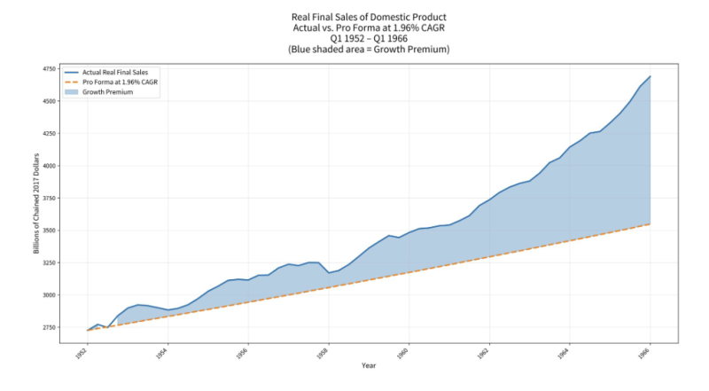
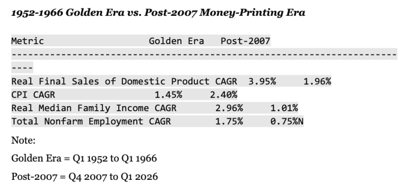
None of these conditions were remotely akin to the spend/borrow/speculate and print modus operandi of present times. In fact, during the period between Q1 1952 and Q1 1966, constant dollar US output (as measured by real final sales of domestic product) rose by 4.0% per annum.
By contrast, during the years since Q4 2007, when the Fed went all-in on stimmies and money-printing, real final sales grew at just 1.96% per annum or by barely half the growth rate during the Golden Era of the 1950s and 1960s. Over a continuous 14-year period these growth rate differences make a huge cumulative difference.
As shown in the graph below, the US economy was actually 72% larger by Q1 1966 than it had been in Q1 1952. By contrast, under the growth rate which has prevailed since the Great Finance Crisis—and notwithstanding massive fiscal and monetary stimulus from Washington policy makers—it would have been only 30% larger.
We’d call that a smoking gun. The Fed and its shills on Wall Street and Washington alike always claim that a modest amount of inflation on Main Street and a goodly helping of asset inflation on Wall Street are the necessary price to obtain higher growth, job creation, and overall prosperity on Main Street.
It is not. Not in the slightest as we detail below.
In fact, there is no contest. The table below compares real growth, inflation, real median family income, and job growth for the two periods, and the sharp contrasts speak for themselves.
Finally, it needs be recalled that this 14-year Golden Era occurred immediately after the 1951 Treasury Accord, which ended WWII-style monetization of the public debt and the pegging of Treasury bond interest rates at artificially low levels. As a consequence, under the sound money leadership of William McChesney Martin, the Fed’s printing press was virtually idle until 1966, when LBJ forced the Fed Chairman to monetize his ill-conceived “guns and butter” policies for war in Southeast Asia and the so-called Great Society at home.
Over the course of 1951 thru Q2 1966, however, the Fed’s balance sheet had expanded by a micr0scopic 0.7% per year, and that’s in nominal terms.
In inflation-adjusted dollars it actually shrank by nearly 11% and dropped from 15% of GDP to just 7%.
By the lights of today’s Fed fanboys, of course, the American economy—left unattended and undernourished by the central bank printing presses as it was during this 14-year period—should have tumbled into severe economic disrepair and crisis.
It didn’t. American businesses, workers, consumers, savers, investors, inventors, and speculators pursuing their own best interest on the free market—coupled with relatively sound money—caused the American economy to actually boom and glow with noninflationary prosperity.
In a word, it showed its true stuff. No government “stimulus” and lickety-split debt growth was needed then, and it’s not needed now.
So the first step toward restoration of a True Golden Era is the opposite of the recipe of easy money, big deficits, high tariffs, and ceaseless Washington meddling in the process of investment, resource allocation, and growth on the free market.
Simply pass a law forbidding the Fed to own government debt or buy and sell any securities at all. In lieu of this mode of monetary central planning, instead, just restore passive Discount Window lending at a penalty spread above the free market rate of interest based on the presentation of sound commercial collateral by Member banks.
That’s all it would take to promote sustainable prosperity. And the proof is in the Golden Era pudding.
Undertake these reforms else we will see the rage grow and the long knives of wealth slayers drawn and used in ways no one wants. An economy this top-heavy with paper wealth – as the poor and middle class get destroyed with persistent inflation, slow growth, and unstable labor markets pervasive with dropouts – is not sustainable. It’s not capitalism but rather corruption by the printing press. History shows precisely where this leads, namely to some upheaval that is even worse for everyone.
This essay is drawn from a 3-part essay on Stockman’s Corner
Join the Conversation
Published under a Creative Commons Attribution 4.0 International License
For reprints, please set the canonical link back to the original Brownstone Institute Article and Author.