
Because there are no possible ways to analyze, categorize, parse, or dissect population data other than by “Share of Trump votes,” there must not be any other possible explanation for anything other than that red counties = bad (high Covid deaths!), blue counties = good (not as high Covid deaths!).
Of course I am being facetious. The entire proposition is just silly. The concept of innate differences in populations is a well established consideration for those who study population health. One might think that our nations most prestigious newspaper might require their top writer to consult with population health experts or even an actuarial scientist in order to obtain a more informed perspective and give the data more rigorous analysis.
Let’s take a look at the highlights of David Leonhardt’s “Red Covid” series.
September 27, 2021
“Red Covid: Covid’s partisan pattern is growing more extreme.”
(Please note the Y-axis on this chart)
“What distinguishes the U.S. is a conservative party — the Republican Party — that has grown hostile to science and empirical evidence in recent decades. A conservative media complex, including Fox News, Sinclair Broadcast Group and various online outlets, echoes and amplifies this hostility. Trump took the conspiratorial thinking to a new level, but he did not create it.”
“Democratic politicians have been imploring all Americans to get vaccinated and many Republican politicians have not.”
November 8, 2021
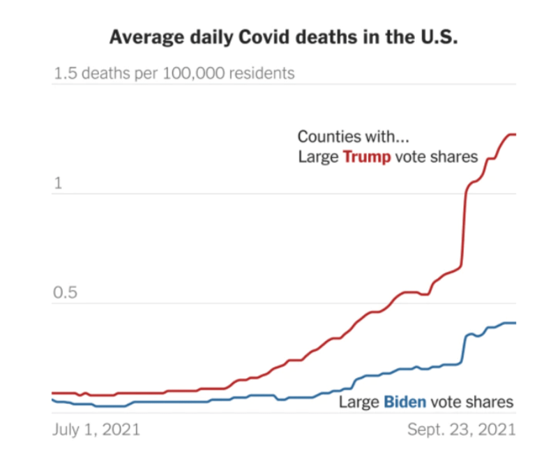
U.S. Covid Deaths Get Even Redder: U.S. Covid Deaths Get Even Redder
“The brief version: The gap in Covid’s death toll between red and blue America has grown faster over the past month than at any previous point.
In October, 25 out of every 100,000 residents of heavily Trump counties died from Covid, more than three times higher than the rate in heavily Biden counties (7.8 per 100,000).”
February 18, 2022
“Red Covid, an Update: The partisan gap in Covid deaths is still growing, but more slowly.”
“As the chart makes clear, the toll has been even worse in counties where Trump won by a landslide than in counties that he won narrowly.
“This phenomenon is an example of how the country’s political polarization has warped people’s thinking, even when their personal safety is at stake. It is a tragedy — and a preventable one, too.”
Before getting into the specifics about these over-simplifications, I would like to make clear that I believe that Leonhardt’s statements above reflect a genuine belief. He truly believes that political preference is the causal explanation for Covid mortality. Not health status, age, weight, comorbidities. Just one thing: personal political preference.
To be clear, he believes that the underlying explanation for higher Covid-19 mortality in red counties is actually the lower vaccination rates in red counties. So by extension, this is explained by political preference.
What I hope to lay out below is a more complete picture of what is going on when we subdivide the county level data into the categorizations that Leonhardt chose: ‘Share of Trump Vote within county’ (0-30%, 31-45%, 46-55%, 56-70%, and 70%+). Using historical county level mortality data, I will attempt to answer the following questions:
How do Covid mortality trends compare with historical trends when categorizing by political preference?
Does Covid-19 mortality correlate with all cause mortality?
Did 2021 see a major, unprecedented divergence in overall mortality between ‘red’ and ‘blue’ counties?
There could be additional analysis done to see whether or not vaccination rates are correlated with overall mortality (as opposed to just Covid-19) over the long term, However with the definition of “fully vaccinated” or “up to date” being a moving target, I have chosen not to compare deaths by vaccination rate by county for now (many others have already undertaken that task!). To be clear, I believe that for those who are at risk, the vaccines have been shown to reduce the risk of the disease to those individuals. The goal of this analysis is to look deeper into these political subdivisions that the New York Times’ insists is an unquestionable explanation for Covid-19 mortality otherwise known as “Red Covid.”
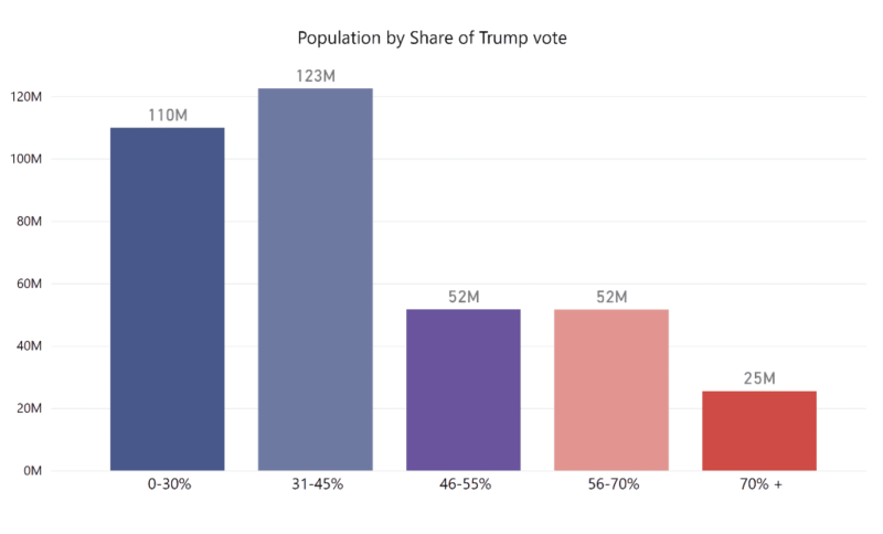
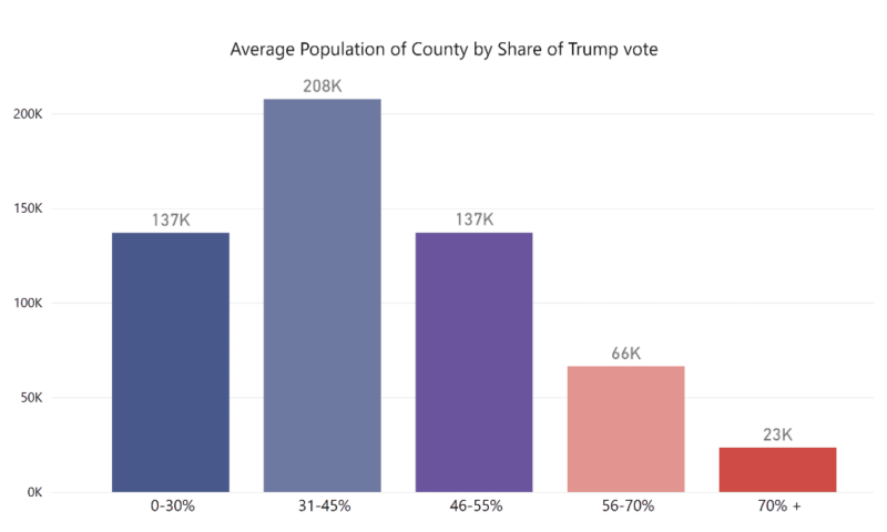
To start out- let’s take a look at the difference in the counties that we are comparing here. Looking at the “70% + Trump Vote” group- it represents 25 million Americans, and the average population of the counties in that group is 23 thousand. These are primarily rural counties. Compare to the Biden Counties where Trump had less than 30% of the vote that represents a 110 million Americans (primarily in Urban areas), and average population in those counties is 137 thousand.
To caveat the remaining analysis with that population data, we are comparing very very different demographics, and are not controlling for those underlying differences. The correct way to make these comparisons would be to control for those differences- primarily by age adjusting, in order to tease out the effect that different vaccination rates or different policies might have. The NYT articles did not do this, and in one case attempted to dismiss the importance of age differences between these groups. I will simply use the same categories they did, but take a higher-level view of these categorizations to see whether or not the primary proposition by Leonhardt is plausible or not.
How do Covid mortality trends compare with historical trends when categorizing by political preference?
To answer this question, we should look to see whether or not this trend of higher mortality in more conservative areas is a new or unique finding. Is this something new or unique that was caused by the pandemic? A paper in the Journal of Epidemiology and Community Health, written in 2015 (Pre-Trump era), answers this question for us.
“In this analysis of 32 830 participants and a total follow-up time of 498 845 person-years, we find that political party affiliation and political ideology are associated with mortality. However, with the exception of independents (adjusted HR (AHR)=0.93, 95% CI 0.90 to 0.97), political party differences are explained by the participants’ underlying sociodemographic characteristics. With respect to ideology, conservatives (AHR=1.06, 95% CI 1.01 to 1.12) and moderates (AHR=1.06, 95% CI 1.01 to 1.11) are at greater risk for mortality during follow-up than liberals.”
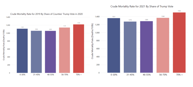
So according to this paper, conservatives mortality rate was observed to be slightly higher than other political groups. To see if this shows up in All-Cause Mortality data, I took county level mortality data from pre-Covid years (2018 & 2019) from CDC Wonder, and grouped them with the same groupings that NYT uses – ‘% Share of Trump Vote’ to see whether or not the higher mortality rate during the pandemic is unprecedented.
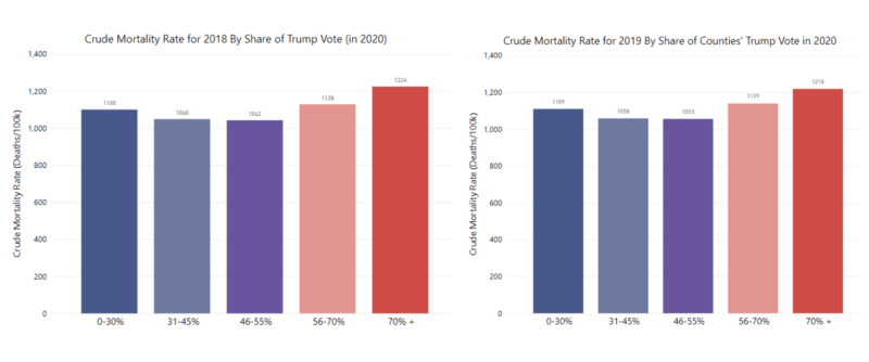
It turns out that Trump counties had higher mortality than the other groupings at ~1200 deaths/100k population in both of the preceding years, 2018 & 2019. So the data shows that Red counties having higher mortality rates overall is not a new phenomena at all, and fits with historical trends. Interestingly though, blue counties had only slightly lower mortality than ‘Light Red’ counties, with ‘Purple’ and ‘Light Blue’ counties having the lowest. There are many plausible explanations for this, with the simplest one being that these counties are just simply older populations. Let’s see how the data changes when we age-adjust the mortality rates. (Side note: for an detailed post on the importance and the how/why behind age adjustment see Mary Pat Campbell’s post here🙂
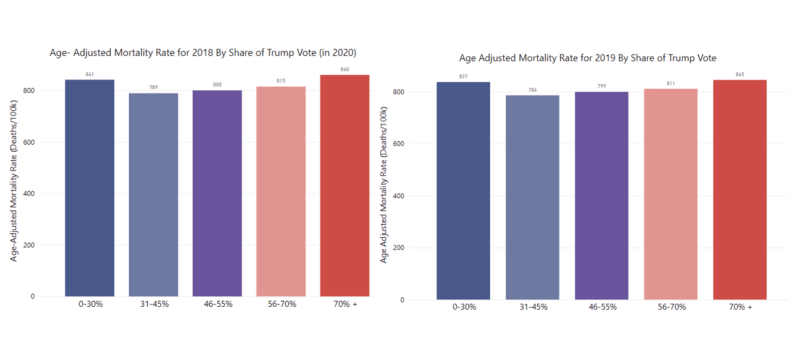
You can see that when adjusting for age, the difference in rates between county groupings almost disappear.
Does Covid-19 mortality correlate with all cause mortality?
An underlying assumption in the NYT pieces is that these groupings are representative of some sort of massive difference in overall death and mortality burden. The pieces focus exclusively on deaths from or with Covid-19, and there’s really no mention of the overall impact of mortality. Without question, Covid-19 caused excess death and increased the overall mortality burden in the population.
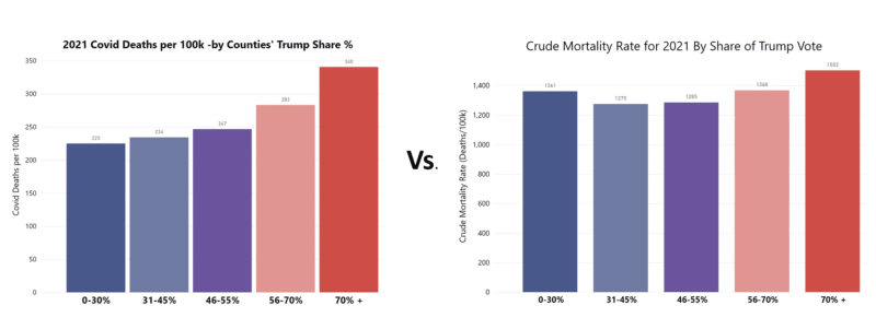
But the question remains – to what extent was that burden higher or lower in ‘Red’ vs. ‘Blue’ areas of the country? We can answer this question by comparing Covid-19 deaths within these groups with the overall mortality for these same groups. Let’s see what happens when we do that. Since the NYT focused on 2021, the year when vaccines became widely available, we’ll start there.
Take a look at Covid-19 mortality rate on the left, vs All Cause mortality rate on the right.
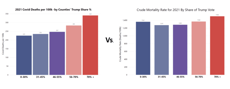
As you can see, the chart on the left is what the NYT series of articles focuses on – this sizable gap between red and blue. Looking at the chart on the right (Mortality from all causes), you can see that the differences disappear. I wonder if anyone reading these articles would walk away realizing that despite lower Covid-19 mortality rates in blue counties, those same deep blue counties actually had higher overall mortality than purple or light blue counties?
Did 2021 see a major, unprecedented divergence in overall mortality between ‘red’ and ‘blue’ counties?
When you compare mortality rates in 2021 by these groupings with the same in 2019, you would see that they are overall higher, but comparatively, each grouping retains their same ranking as their non-pandemic year. So while it may be true that Covid-19 death rates were lower in dark blue counties, this did not translate to overall death rates in those counties. (I would age-adjust these rates if I had the data available, but currently CDC Wonder does not have 2021 data yet as of this writing).
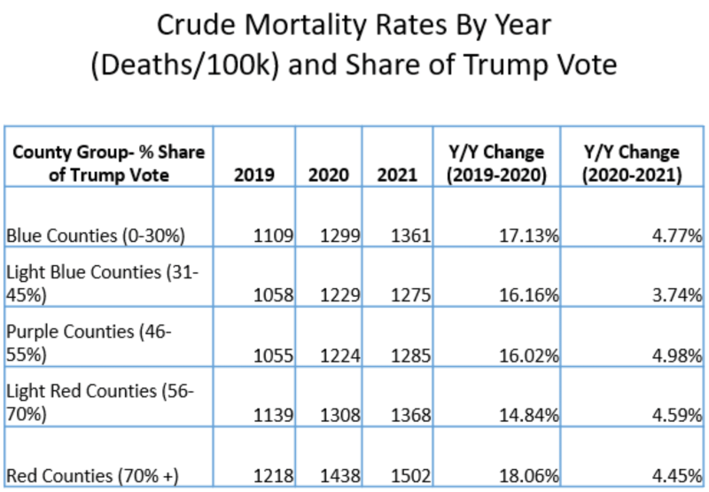
Another way of looking at this is to look at the Year over Year change of rates within each group. As you can see from the chart below, the percentage change remains pretty consistent among each individual grouping, with 2020 seeing the largest change rate, and 2021 seeing a small but significant change rate from 2020 (meaning overall mortality was still quite elevated relative to 2019).
In summary, when we take a historical view and higher level view while maintaining these same groupings, these stark differences in Covid-19 mortality rates do not seem to translate into overall morality rates. Why?
At the risk of this analysis turning into another pile-on pointing out the New York Time’s errors, I’d like to offer a more benign explanation. It’s one that has plagued journalists and reports throughout the pandemic. Why is it that everything is framed in Red and Blue? One simple reason: the availability of the data. Leonhardt is using data that is easily accessible and is already formatted for easy analysis.
This is what is called an availability bias. It’s essentially creating a hypothesis or completing a study based on a specific set of data, purely for no other reason than that the data is there. Just because the data is available does not mean it’s the best data to use to try to answer a question.
Republicans are People Too
Why does all of this matter? After all, we’ve seem to come to accept that mainstream reporting and cable news have a left wing bias. What’s the big deal?
When it comes to population health, the goal is to promote the health and wellbeing of everyone, and when public health messaging and reporting become unabashedly partisan, employing the tactics of accusation and shame, it very likely will have the opposite of the intended effect of promoting better health.
Conservatives and “Red Counties” need good health advice too. They need to be able to trust the source. Even taking the NYT’s premise of “Red Covid” at face value, who does this message help? Clearly, not the people they are describing.
Data Sources:
https://wonder.cdc.gov/wonder/help/ucd.html#2000%20Standard%20Population
https://data.cdc.gov/NCHS/AH-County-of-Occurrence-COVID-19-Deaths-Counts-202/6vqh-esgs/data
https://dataverse.harvard.edu/dataset.xhtml?persistentId=doi:10.7910/DVN/VOQCHQ
Journal Papers:
https://papers.ssrn.com/sol3/papers.cfm?abstract_id=4033819
https://www.ncbi.nlm.nih.gov/pmc/articles/PMC5893220/
Republished from the author’s Substack
Join the conversation:
Published under a Creative Commons Attribution 4.0 International License
For reprints, please set the canonical link back to the original Brownstone Institute Article and Author.