We are apparently back in the spend-your-way-to-prosperity mode. Last week Wall Street greeted the “strong” April PCE number with a spree of dip-buying, but you have to wonder just how long households can keep reaching into their cookie jars in order to spend what they are not earning.
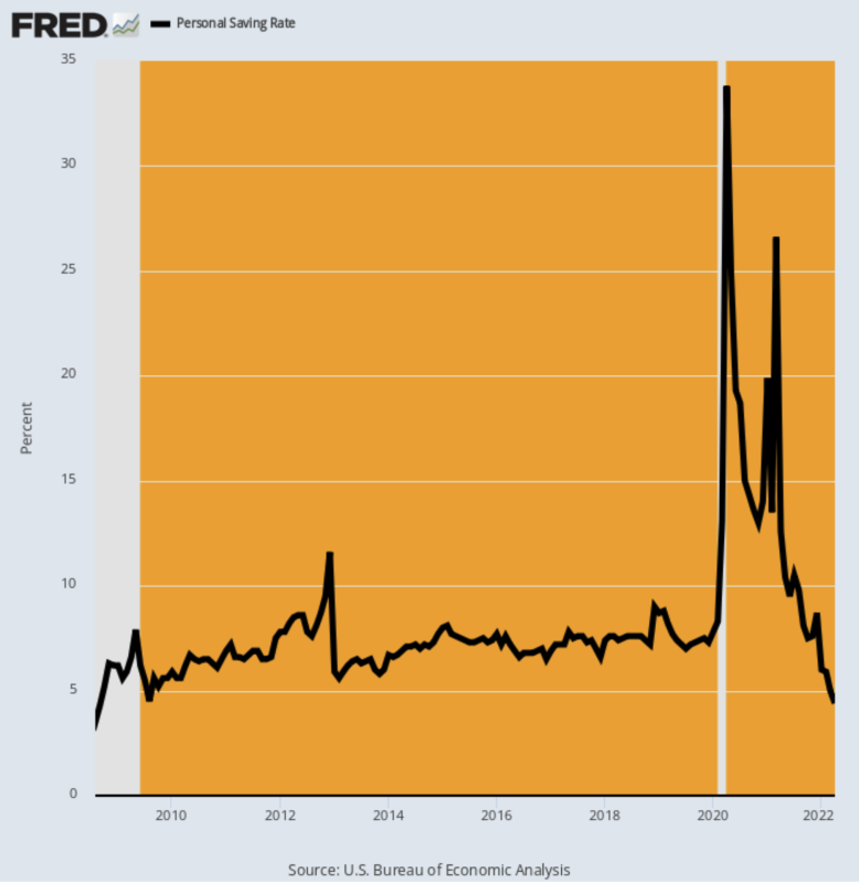
According to the Commerce Department, the abysmal 4.4% personal savings rate posted for April was the lowest level since August 2008, and we know what happened next!
Its also damn obvious from the chart that the triple whammy of the Covid-Lockdowns, the stimmy bacchanalia and red hot acceleration of global inflation and supply chain breakdowns has sent the standard economic numbers into a tailspin. After all, when the savings rate goes from an out-of-this-world 34% to a rock bottom 4% in just 24 months, you are not dealing with a standard economic cycle.
Instead, what you have is uncharted waters in every sense of the term. So more than ever, it is essential to pick through the statistical noise in order to identify the true fundamentals at work.
Personal Savings As A Percent Of Disposable Personal Income, August 2008-April 2022

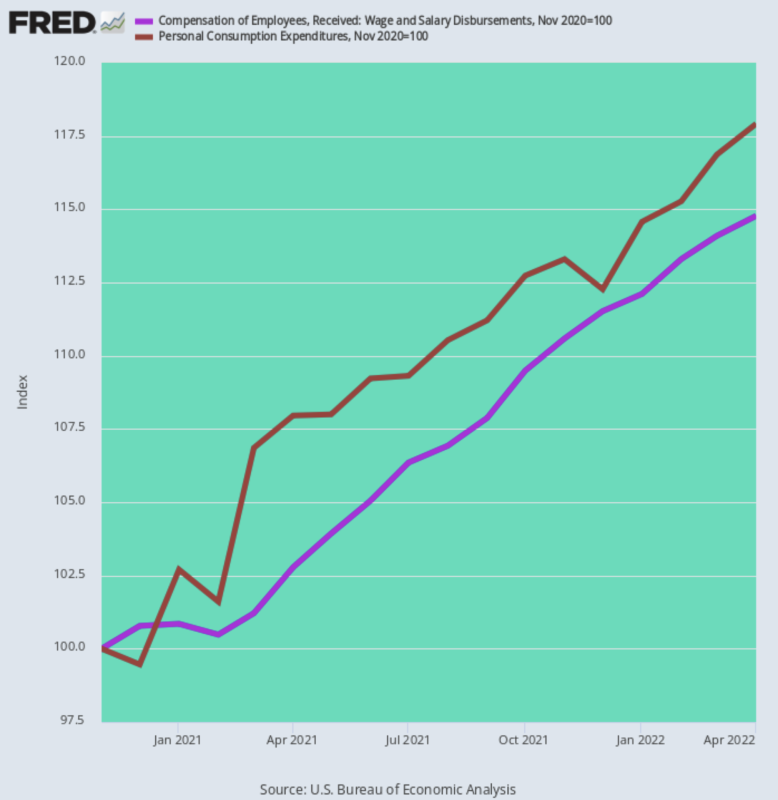
For our money, that investigation starts with the obvious truth that when you are drawing-down your savings rate you are spending more than you earn. And since November 2020, that’s exactly what has been happening.
Household wages and salary compensation (purple line) is up by 14.8% in nominal terms but personal consumption expenditures have risen by 21% more. That is, April PCE (brown line) was 17.9% above what was already a Trump “stimmy” bloated level in November 2020.
Wage And Salary Disbursements Versus Personal Consumption Expenditures, November 2020 to April 2022

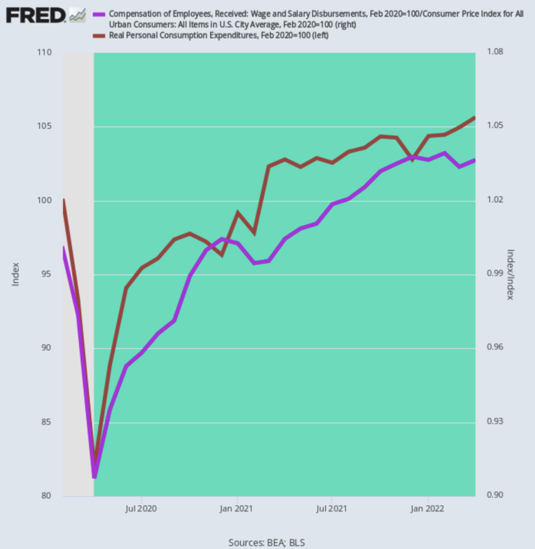
Moreover, these nominal numbers do not tell even half the story. When you wring out the inflation, what you get is some pretty midget numbers. That is, real PCE has been growing at only a 2.56%annual rate since the February 2020 pre-Covid peak—-$6 trillion of stimmies not withstanding.
The reason is no mystery: Inflation-adjusted wage and salary incomes are are up by only two-thirds that level at a 1.66% per annum rate. So to keep the spending game going, households are breaking into their piggy banks.
Change In Inflation-Adjusted PCE Versus Wage And Salary Income, February 2020-April 2022

So, no, we don’t think there is anything “strong” about household spending.
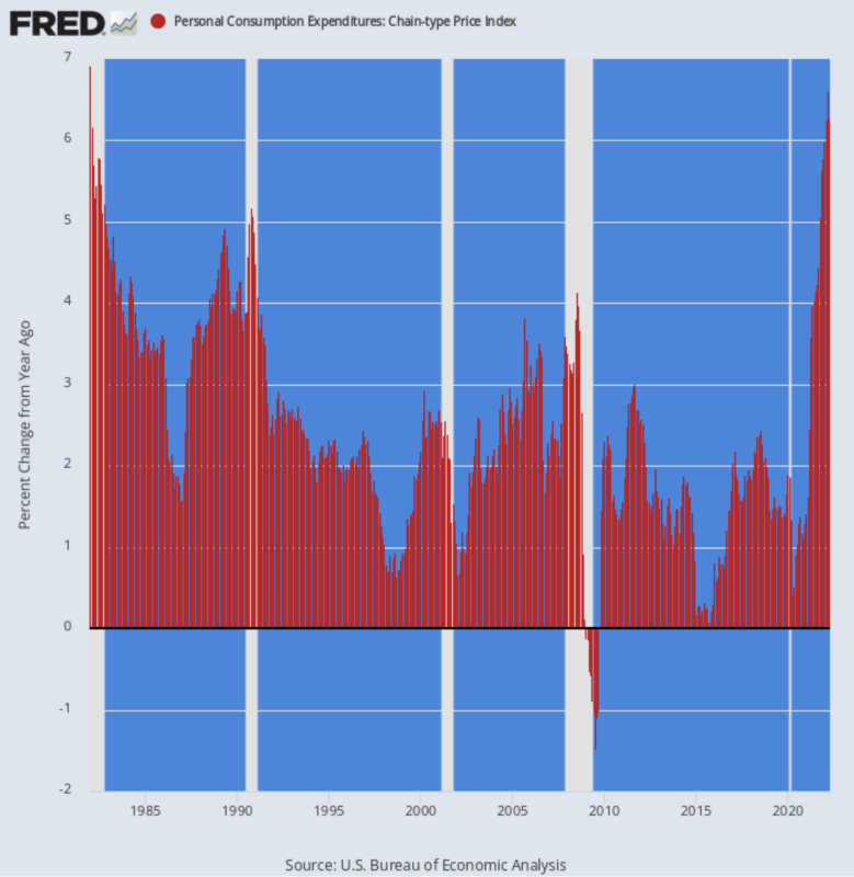
What is actually strong is the rate at which inflation has been eating into real purchasing power. Thus, what last week’s spending and income report also showed was that the headline PCE deflator continues to rise, posting at 6.27% on a Y/Y basis, the highest gain since January 1982.
That Y/Y gain compares to the 4.44% rate posted last October and the 3.58% Y/Y rate recorded last April. So that’s acceleration with a vengeance.
In fact, the PCE deflator first crossed the Fed’s sacred 2.00% inflation target in March 2021 and has essentially tripled since then.
Y/Y Change In PCE Deflator, 1982-2022

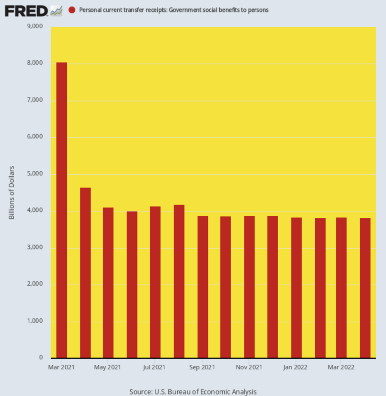
Still, the more revealing trend in the April spending and income report was the continued decline of the government transfer payments rate. After peaking at an otherworldly $8.05 trillion annualized rate owing to the Biden Stimmy in March 2021, transfer payments have come back to earth, posting at well less than half that level, $3.83 trillion, in April.
Consequently, further PCE growth will be dependent upon wage and salary income gains, which gains are currently being outrun by inflation.
Moreover, the apparent “normalization” of transfer payments shown in the chart below is not exactly what it appears to be. In December 2019, before the Covid and Stimmy perturbances knocked the numbers into a cocked hat, annualized government transfer payments stood at $3.11 trillion.
The gain during the 29 months since then, therefore, computes to a sizzling 9.31% annualized growth rate. Yet here we are with the consumer digging deep into savings because even $3.83 trillion of free stuff is proving insufficient to fund the household shopping machine.
Annualized Rate Of Government Transfer Payment, March 2021 to April 2022

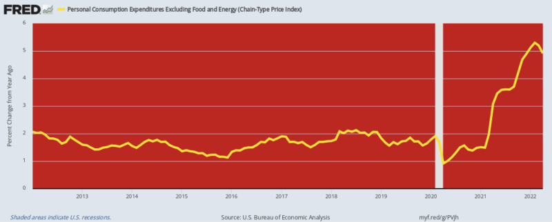
Of course, the Wall Street stock peddlers espied good news on the inflation front, claiming that the tiny hook on the right-hand margin of the chart below means that the Fed has already won the battle against inflation and that after the next two scheduled 50 basis point rate increases it will be in a position to “pause” its anti-inflation campaign in September.
Talk about lame rationalization. It just so happens that the 4.91% Y/Y increase posted in April for the PCE deflator excluding food and energy is a trivial 39 basis points below the February figure, but that’s not even the real point.
The fact is, there is a virulent food, energy and commodities inflation worldwide and there is no end in sight. So what counts is the total cost of living index, not one that excludes what is now approaching $5 per gallon gasoline and the highest grocery inflation in a generation.
Even then, the February to April postings for the PCE deflator excluding foods and energy were the highest increase since September 1983, which hardly amounts to a victory over inflation.
Y/Y Change in PCE Deflator Excluding Food And Energy, 2012-2022

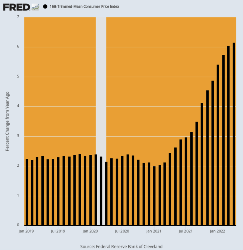
For want of doubt, consider recent postings for the 16% trimmed mean CPI. As we have often explained, if you want to remove the short-term volatility from the monthly index, do not pretend that food and energy don’t count, but instead take out the highest 8% and lowest 8% of inflation basket items each month.
That results in different exclusions each month on both the high and low extremes, thereby smoothing the index without falsely lowering the index reading when food and energy items are running high.
As shown below, the Y/Y read-out of the 16% trimmed mean CPI continues to accelerate.
Y/Y % Change:
- April 2020: 2.16%;
- April 2021: 2.45%;
- October 2021: 4.12%;
- January 2022: 5.42%;
- April 2022: 6.16%;
Y/Y Trimmed Mean CPI, January 2019-April 2022

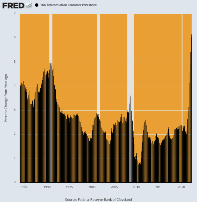
In fact, the April print was the highest reading ever recorded since this version of the CPI was initiated in December 1983!
Indeed, it’s not even a close call. The highest Y/Y rate during the oil price blow-off in mid-2008 was only 3.63% and during the first Gulf War crisis it topped out at 5.09%.
So when it comes to the ballyhooed Fed “pause” in September, fuggedaboutit!
The underlying inflationary momentum as shown by the 16% trimmed mean CPI is higher than it has ever been—including during the runaway inflation of the 1970s.
Y/Y Change In 16% Trimmed Mean CPI, 1983-2022

There are numerous reasons to expect no slowdown in the core inflation trend any time soon, but surely the lagging nature of the BLS’ rental components is a flashing red light.
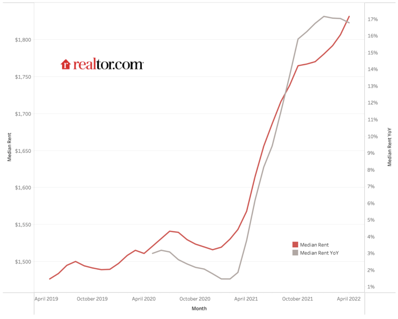
As shown below, nationwide median rents in the 50 largest markets have risen from $1,475 per month in April 2019 to $1,827 per month in April 2022. That’s a 24% gain, but so far the CPI rental index is up by only 10% during the same period, owing to the extensive lags built into its methodology.
The most authoritative private market rent index is up nearly two-and-one-half times more than the CPI rental component during the last three years.
But eventually the CPI will catch up to market realities, and especially to the fact that the April 2022 Y/Y gain in the realtor.com index was 16.7% compared to the 4.8% Y/Y reading reported by the CPI.
The fact is, 32% of the weight in the CPI consists of direct rental costs and the OER (owner’s equivalent rent) sub-index, which tracks rental market trends. So we have one-third of the CPI heading much higher, regardless of what happens to food and energy.
And when you look at so-called “core” inflation alone, the rental components weight is more than 40% of the CPI and 25% of the PCE deflator excluding food and energy.
In a word, the Fed won’t have any excuse to “pause” its anti-inflation campaign owing to temporary dips in the core index. Even the latter is totally unlikely to happen in a material and sustained manner.
Median Rents, realtor.com, April 2019-April 2022

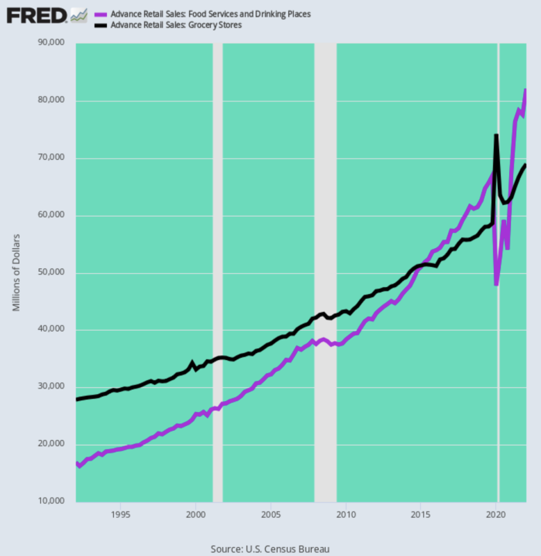
Another factor to consider is that food inflation is more inflationary than it used to be. What we mean is that the food-way-from-home sub-index has far more weight in the CPI than it did 30-40 years ago. That’s because the share of food purchased at restaurants and other food service establishments has skyrocketed.
As shown in the chart below, during Q1 1992, monthly food expenditures at restaurants amounted to just $17 billion or 61% of the $28 billion monthly spend at grocery stores. By contrast, during Q1 2022 the monthly spend at restaurants was $82 billion or 119% of the $69 billion spend at grocery stores.
Stated differently, during the past 30-years restaurant spending rose at a 5.4% rate per annum—far above the 3.1% annualized gain for grocery stores.
This huge reversal in where the food dollar is spent is important.That’s because under current circumstances restaurant food prices are at the heart of the low-end labor shortage, where hourly wages are now soaring, thereby adding further to the soaring food costs embodied in the restaurant tab.
US Monthly Food Spend: Restaurants Versus Grocery Stores, 1992-2022

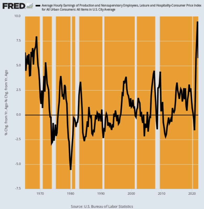
As to the labor cost element of restaurant pricing, the chart below leaves little to the imagination. Since February 2020, nominal hourly wage rates in the leisure and hospitality sector are up by 24%.When adjusted for inflation, this wage spike is the highest in history going back to the 1960s.
Inflation-Adjusted Y/Y Change In Hourly Wage Rates for Leisure & Hospitality, 1965-2022

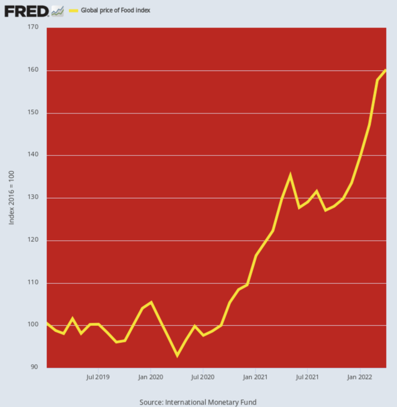
As for the other main ingredient of restaurant costs, the global food price index also tells you all you need to know. At the 160.2 level posted for April, it now stands 58% above it February 2020 level. There is no prior two year period that even comes close to that rate of increase—even during the mid-2008 commodity price blow-off the two-year gain was just 45%.
What this means, of course, is that the food inflation coming down the pipeline of producer and consumer prices still has a huge head of steam. So as the “runaway inflation” issue takes front-and- center in the fall Congressional campaigns, the Fed won’t have any political leeway to pause, either.
Global Food Price Index, 2019-2022

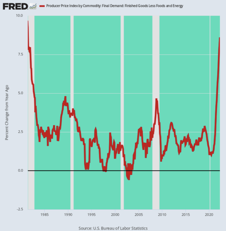
Finally, the inflationary gales coming in from the global commodity markets and manufactured goods supply chains show no signs of abating. Even when you set food and energy aside, the producer price index for finished goods excluding these two items was up by 8.6% in April—meaning that several months from now those globally-sourced finished goods pressures will be showing up in the CPI on top of surging food, energy and shelter costs.
Needless to say, April’s gain for this PPI sub-index was the highest since June 1981, meaning that the Fed is hostage to the inflation fight whether it wants to be or not.
Yes, there is nothing like a Paul Volcker within a country-mile of the Eccles Building today, but that doesn’t matter. The last thing these financial overlords want is to have their vaunted “independence” challenged by hopped-up politicians with a fresh electoral mandate.
Y/Y Change In Producer Price Index For Finished Goods Excluding Food And Energy, 1981-2022

Of course, the Fed’s involuntary anti-inflation policy will soon lead to a recession, but that’s now unavoidable. The die has already be cast.
Of all people, even the single-greatest bubble-rider of our times, Elon Musk, can see it coming. That leaves only the 12 dolts on the FOMC to catch-up to reality along with their shills and megaphones on bubblevision:
(Musk) was queried as to whether or not he thought a recession was on its way and told a Twitter user: “Yes, but this is actually a good thing. It has been raining money on fools for too long.”
“Some bankruptcies need to happen. Also, all the Covid stay-at-home stuff has tricked people into thinking that you don’t actually need to work hard,” he continued.
He said he thought a recession would last 12 to 18 months and, channeling his inner Milton Friedman, said: “Companies that are inherently negative cash flow (ie value destroyers) need to die, so that they stop consuming resources.”
You can call it ironic that Musk’s company would have likely been wiped out in a recession a couple of years ago, but for now the Tesla founder seems to have far more of a clue about economics than those in government and at the Fed.
Compare that clarity to this doozy from the minutes of the last Fed meeting. It’s surely wins the Oscar in the “you don’t say” category
(some participants)…….noted that a restrictive stance of policy may well become appropriate,” the minutes said.
Mr. Powell further signaled resolve to slow price increases by suggesting that the unemployment rate, at 3.6% in April, might need to rise as the Fed slows demand. “There could be some pain involved,” he said last week.
Well, at least he got that right.
Even Pusillanimous Powell now knows that last week’s ballyhooed “pause” doesn’t really stand a chance.
Reposted from the author’s page.
Join the conversation:


Published under a Creative Commons Attribution 4.0 International License
For reprints, please set the canonical link back to the original Brownstone Institute Article and Author.

