
Public Health is a vast sprawling enterprise funded to the tune of hundreds of billions of dollars each year by the federal government, plus substantial private donations by nonprofits and some of society’s wealthiest people. We are scolded that such a robust well-funded behemoth is absolutely vital and indispensable to maintaining and promoting the general health and welfare of the population. But what if there is an extraordinary, once-in-a-lifetime type of excess mortality that dwarfs the scope of drug overdose deaths, affecting the whole of society across all age and demographic strata, and…is totally ignored by public health authorities?
Shockingly, this is actually happening in real time. We managed to obtain the death certificates representing all deaths covering 2015-2023 in four states that we can publicly publish data from, and they show a disturbing story of continuing pandemic-level excess deaths still ongoing today among a variety of conditions, many at even higher levels than we saw in 2020.
To be sure, death certificates are a flawed tool for data construction. They are rife with errors, prone to biases, subject to capricious and sometimes deliberate manipulative policy changes from on high, and rarely tell the complete story of the decedent’s demise. They are under the aegis of state health departments and the CDC, which doesn’t exactly inspire confidence about their quality or integrity.
But neither is it an indefatigable Sisyphean task to extract useful, useable data from the information logged and recorded on these indubitably wanting instruments, although progress often creeps along slowly enough to give the illusion that Zeno’s motion paradox accurately describes reality. (It definitely describes how I’m feeling after sinking almost 15 hours putting this albatross together.)
The point of this article is to show the public actual trends of excess mortality in the following conditions or Causes of Death (CoD):
- Acute Renal Failure (ICD Code N17)
- Pulmonary Embolism (ICD Code I26)
- Hypertension, specifically the subset of Hypertensive Heart Disease (ICD Codes I11 & I13)
- Physical Trauma Injuries (Various ICD Codes)
- Diabetes (ICD Codes E10-E14)
- Protein Calorie Malnutrition (ICD Codes E43-E46)
- Sepsis (ICD Code A41)
These are far from the only conditions where there is clear excess mortality. However, these conditions are unique in that there is clear excess mortality in these conditions in every single state for which we have death certificates, and they affect a substantial number of deaths per year and are thus of great importance for public health.
Alas, if only we had public health authorities more interested in looking at evidence than deleting evidence.
Note: For some reason, Florida has refused to allow anyone access even to deidentified versions of their death certificates. Florida is the motherlode of mortality data, because of the population size and high concentration of seniors, the vast majority of whom were vaccinated with the mRNA covid vaccines. It seems very odd that the FL Department of Health continues to restrict public access. If we refuse to be transparent with the data in our possession, we cannot complain about the lack of transparency by the establishment. We thus call on Dr Ladapo and/or the DeSantis administration to allow public access to deidentified death certificates that will allow the public to see for themselves what the mortality data actually looks like. How can it be that the far-left states of MASSACHUSETTS and Vermont allow full unrestricted access to their death certificates by any citizen, but Florida won’t even allow access to redacted versions that don’t risk violating the privacy of decedents or their families??
I. ALL-CAUSE MORTALITY
The starting point for any exploration into the potential excess death phenomenon is first to see if there is actually excess death overall – are there more people dying than we would expect? If the answer is no, then excess deaths found within individual conditions or categories of disease may well be an ‘administrative phenomenon,’ i.e. they do not reflect a change in the circumstances of people’s health or deaths, but rather a change in how CoD’s are recorded.
Conversely, if there is excess mortality occurring, concomitant excess deaths found in specific CoD’s are presumptively representing an actual increase in the incidence and/or rate of death from these conditions.
All-cause mortality – in other words, all deaths from all causes – also provides a bird ’s-eye view of broad trends of who is dying at what rates, which can help identify novel factors affecting population mortality, which is very relevant for parsing mortality trends.
How to read the charts:
The bulk of this article is the charts, which follow the same basic design:
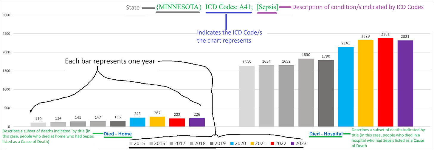
– each chart has a title on top that describes the parameters or conditions of the deaths shown by the chart
– charts can show deaths for a specific condition/s either by ICD 10 code, or by the text written on the death certificate itself
– “All ICD Codes”/”All Deaths”/”All Text CoD’s” in the title means that the chart shows deaths from all causes
– each bar represents the tally for one year
– the various shades of grey bars are for the years 2015-2019 (left to right)
– blue bar = 2020
– yellow bar = 2021
– red bar = 2022
– purple bar = 2023
– the number on the top of each bar indicates the number of deaths in that year that fit the conditions articulated in the title of the chart
Massachusetts All-Cause Mortality
The charts for each state are the same series, so we’re only going to explain them for MA in each condition (unless there’s a difference).
The following chart shows the total number of deaths in MA each year:
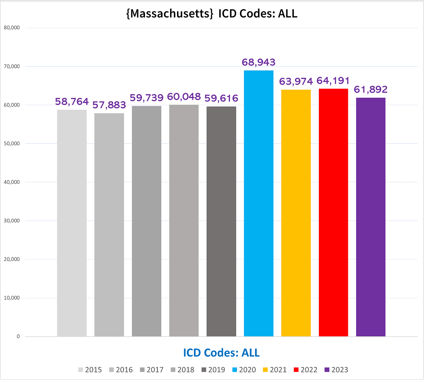
You can see right away that from 2020 onwards, the number of deaths is above the range in the pre-pandemic years (2015-2019). In other words, there were excess deaths in each year.
This is especially striking because of something colloquially referred to as the “pull-forward effect” (PFE). We would expect to see a mortality deficit following a year of substantial excess mortality if the “excess” deaths were predominantly people dying who were going to die very soon anyways.
The average age of Covid deaths being roughly the life expectancy is a good illustration of this – the people killed off, especially in 2020 were those who were frail and predisposed to die soon. Had they not died in 2020, they would have overwhelmingly died over the next few years. So in essence, 2020 “stole” deaths from 2021, 2022, 2023 (in decreasing amounts from each successive year). This means that there is a greater portion of the deaths in 2021-2023 that are above the expected total than merely following the pre-pandemic baseline would yield.
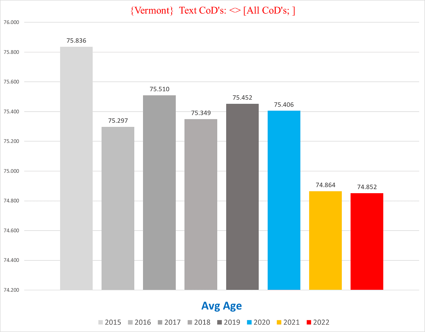
Next up, we have a chart showing the average age of decedents in MA:
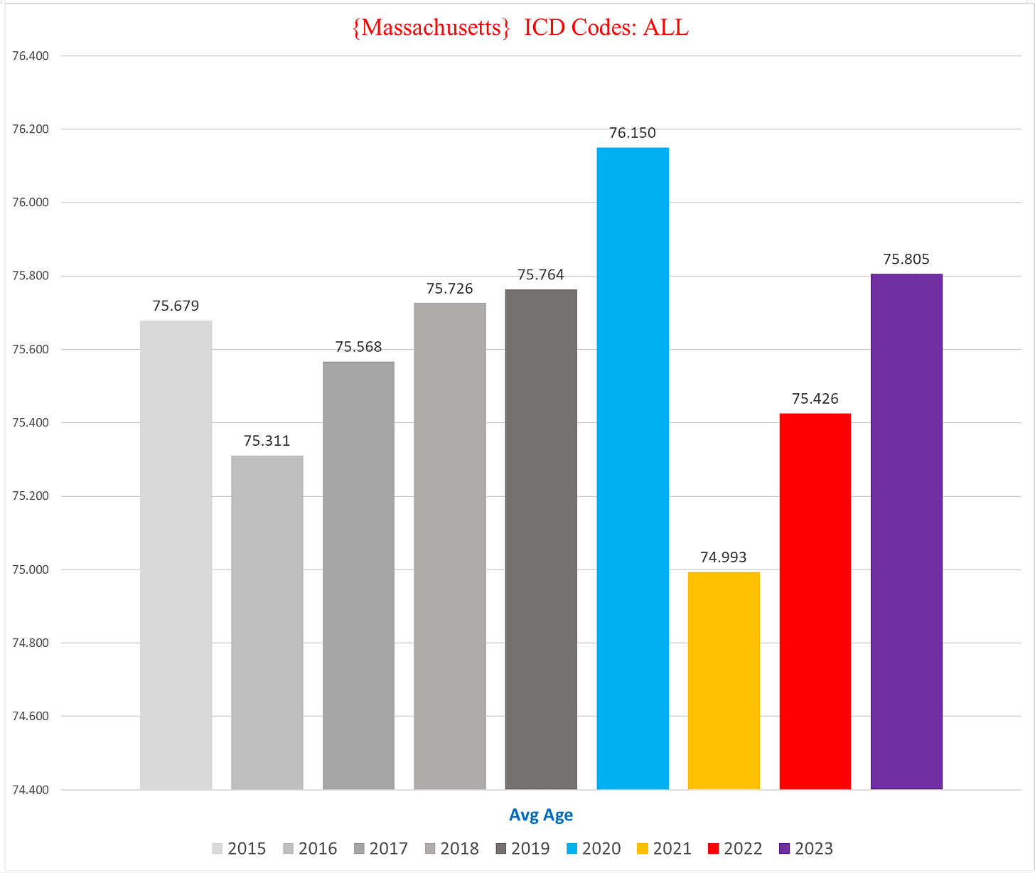
Whereas the average rises in 2020 well above prior years, the average age of death drops sharply in 2021 to lower than any of the prior five years (dropping more than a full year in the average age is bigger than it seems because it takes a lot of younger people dying to drag the average down when the vast majority of deaths are people in their 80s and 90s).
In other words, whereas 2020 deaths were among old and frail people, in 2021 the characteristics of decedents markedly skewed to younger people more than any prior year.
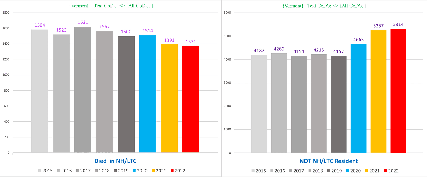
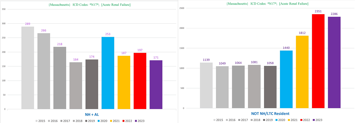
The most shocking and revealing conundrum of mortality trends – which we see in every state for which we have this data – is comparing deaths in nursing home residents (also includes similar type facilities such as assisted living or long-term care) to non-nursing home residents.
The following two charts show the total number of deaths of nursing home residents (left) and non-nursing home residents:
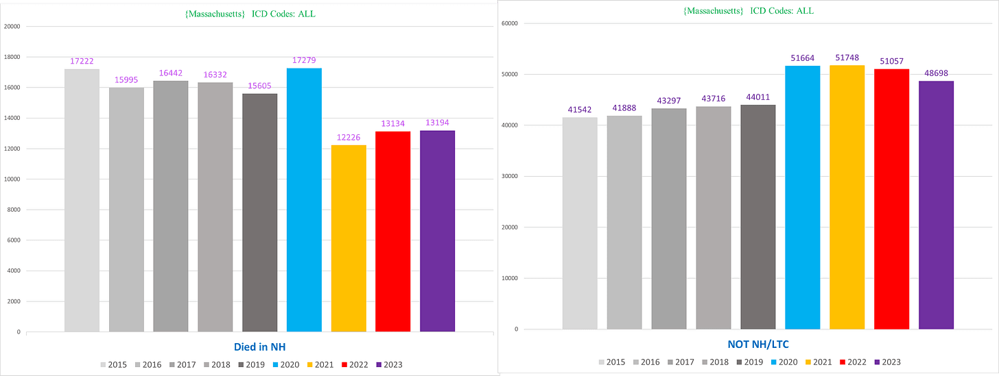
Separating them out shows that there is a far higher degree of excess mortality occurring in 2021-2023 outside of nursing homes that you can’t see in the total death count for the state because the depletion of nursing home deaths mostly cancels out the increase in deaths outside of nursing homes.
Keep in mind also that with the exception of Minnesota, we can only identify nursing home residents who died in the nursing home, but if they died elsewhere like in a hospital or hospice their nursing home residency is undocumented, so the discrepancy seen above is likely even larger in real life.
This dichotomy is also seen in the mortality trends for the majority of conditions, which we will document.
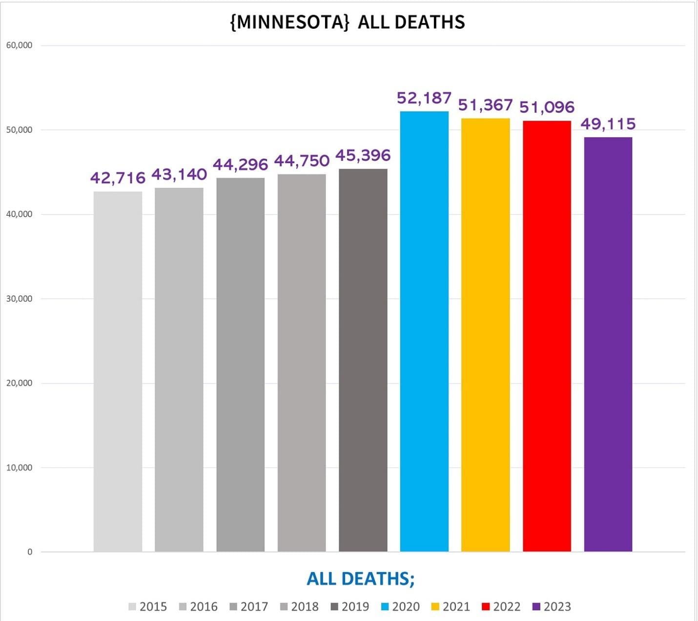
Minnesota
Minnesota’s overall excess mortality is more evenly spread out among the pandemic years compared to MA:
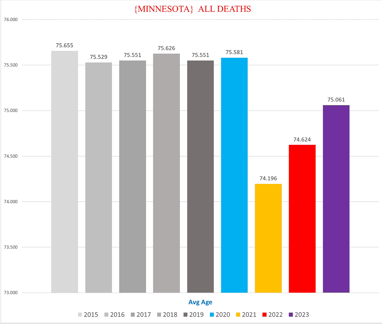
The average age of MN deaths however is even more anomalous:
NH/non-NH:
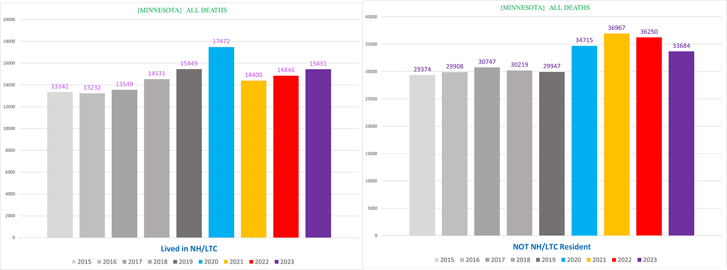
The following charts show side-by-side (1) the total number of deaths in non-NH residents (left), and (2) the total number of deaths in non-NH residents excluding all deaths which list covid as a CoD:
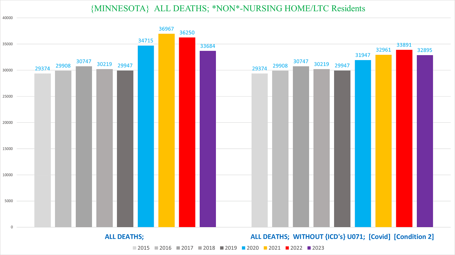
This is especially jarring, because there is clear rising excess death that has nothing to do with covid disease every year. This is not to say that all deaths that list Covid as a CoD are caused by Covid, which is patently false, but it highlights that even using the most upper limit of Covid deaths possible, there is still marked excess mortality occurring.
(I didn’t include this chart for MA because they over-attributed so many deaths to Covid that there is literally a mortality deficit in every year if you exclude all the Covid deaths. However, as we’ll see later we can show excess death in MA in individual conditions without covid.)
This final chart for MN ACM breaks down the non-NH resident deaths by men (left) vs women (right):
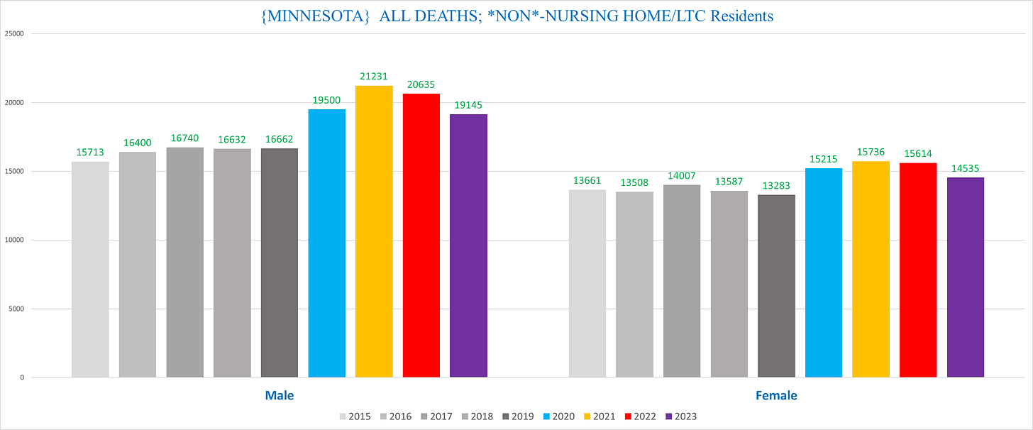
(I will include this chart where there is a substantial difference in the trends or overall number of deaths between men and women.)
Nevada
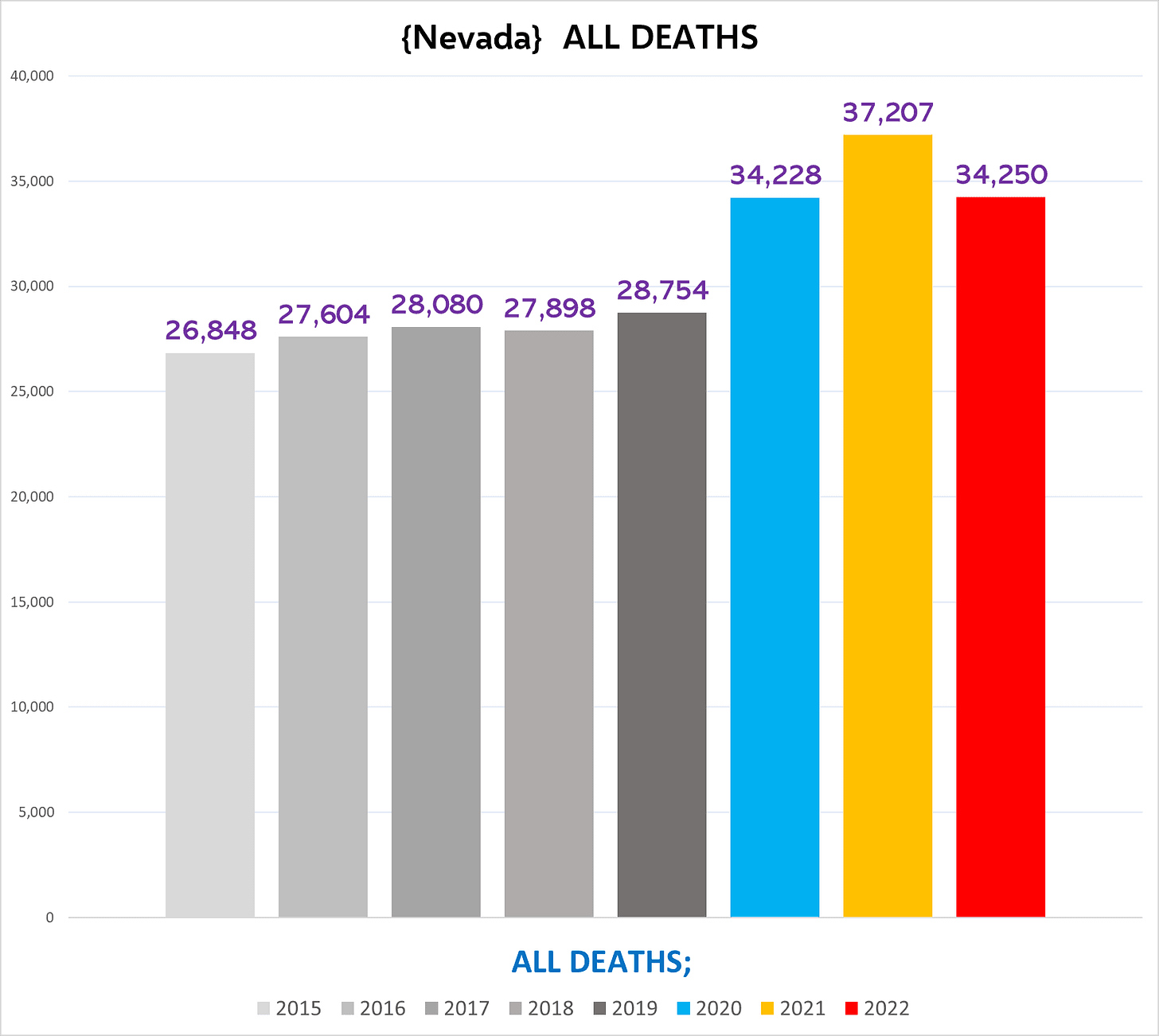
(Since we don’t have complete 2023 data from Nevada, we will only include 2023 where relevant.)
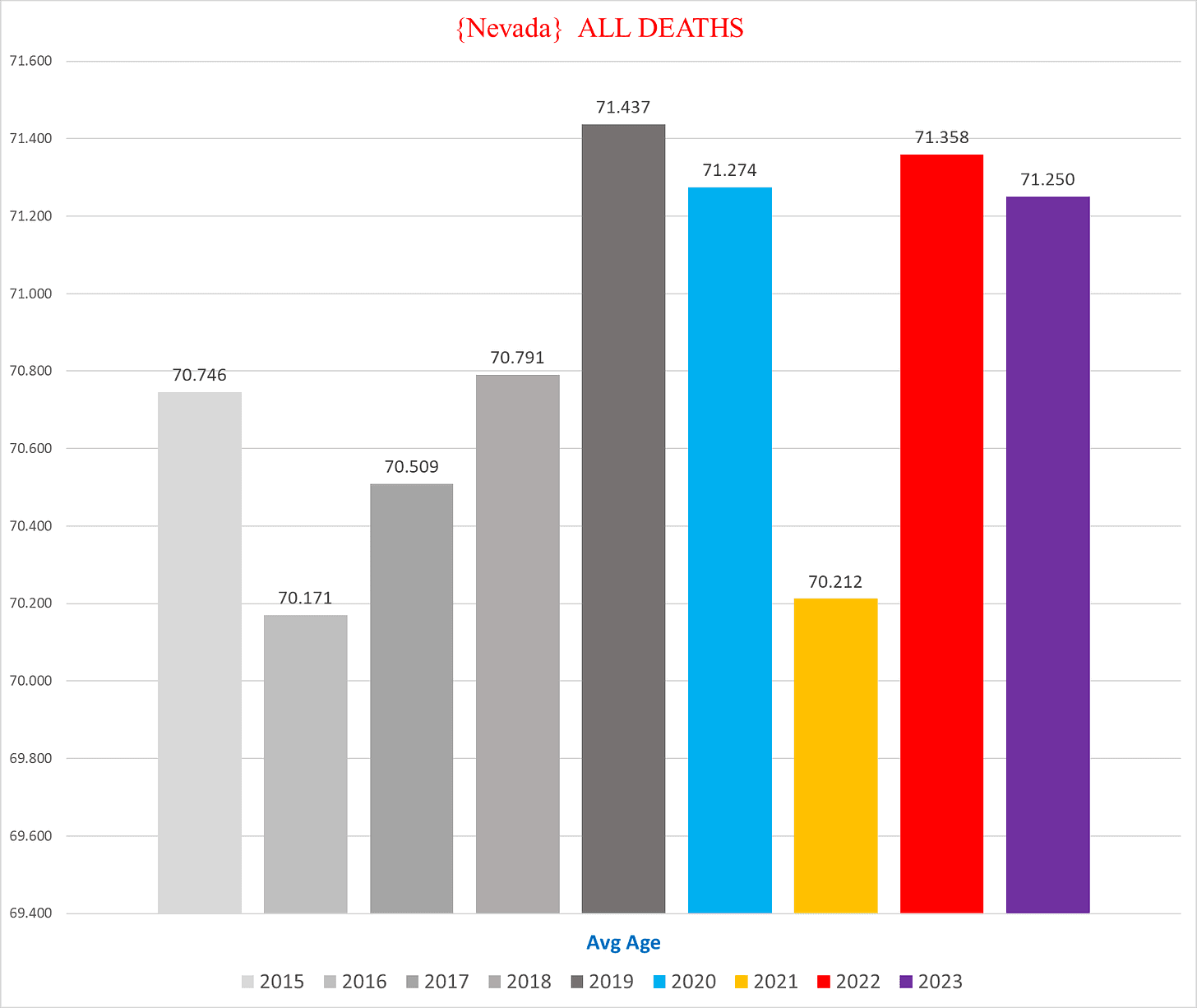
It’s interesting that the average age of death in Nevada is 3-4 years below the other states:
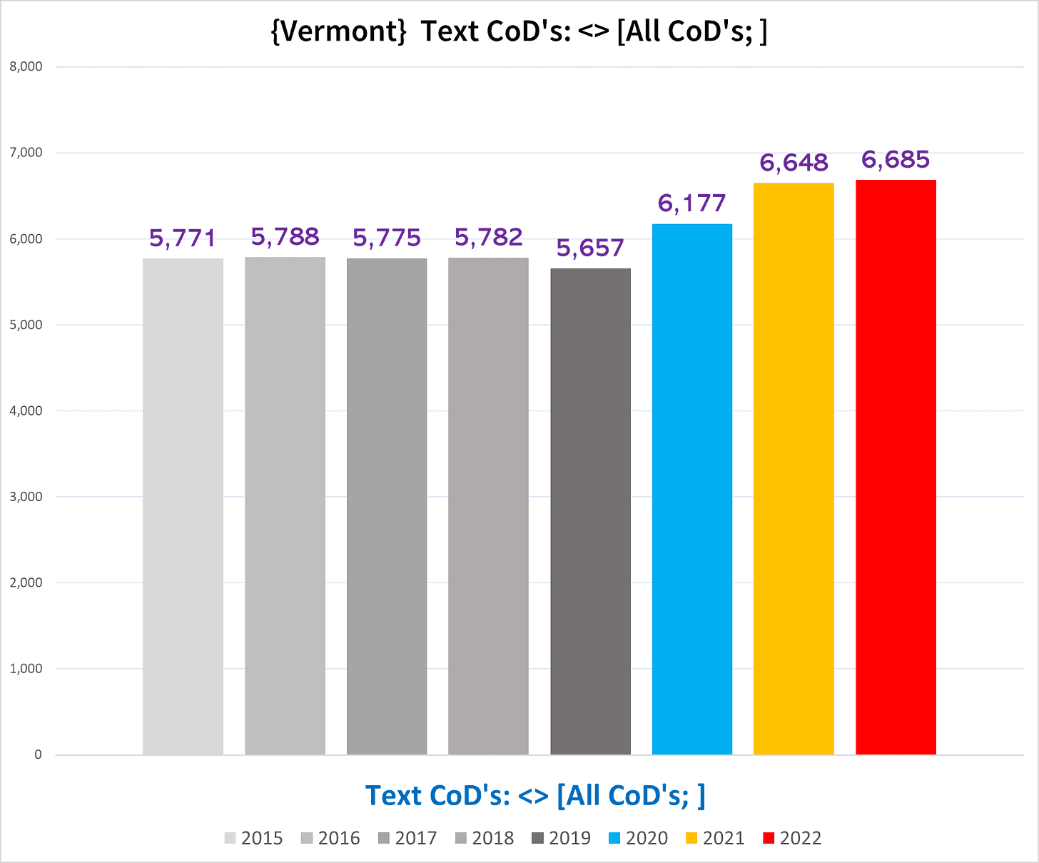
Vermont
Vermont has the fewest deaths overall by a wide margin, but has one of the worst post-2020 trends of excess death (Hopefully we will get the 2023 deaths soon, and we’ll be able to update this):
Even removing the Covid deaths there is clear excess mortality going on:
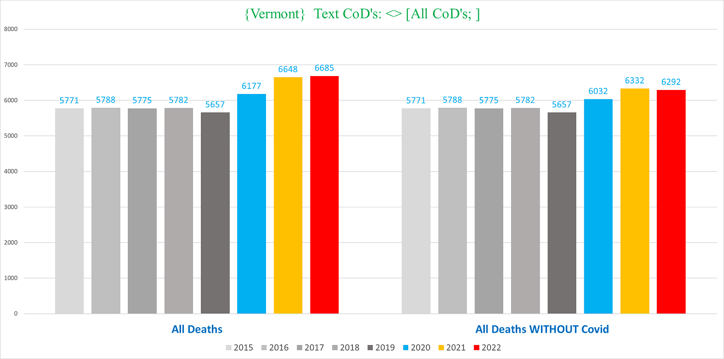
The upshot from all these states is that mortality levels have still not yet come back down to the old baseline, and this trend is especially pronounced in non-NH deaths.
II. ACUTE RENAL FAILURE (ICD 10 code N17)
The most dramatic trend of excess mortality in any specific condition is probably deaths involving acute renal failure (ARF). The degree of excess is wildly elevated, and this condition accounts for >60,000 deaths annually in the US (extrapolated across the whole US the rate of excess we’re going to see would equate to ~150,000 excess deaths involving ARF)
Despite the variety of idiosyncrasies and customs unique to each state’s methods of documenting causes of death, the trend of excess ARF is visible across the country.
I recently wrote an article for Trial Site News documenting ARF excess deaths on a more granular level.
It is especially damning to Public Health that this signal was first noted by John Beaudoin – a private citizen with no connection to or training in public health or epidemiology – when he obtained Massachusetts’ death certificates back in 2022. It’s now 2024, and all we have are the crepitations of public health officials trying to FOIA-proof their emails but apparently cannot be bothered to investigate a doubling of ARF deaths in the span of a mere two years.
Massachusetts
The following chart shows the total number of deaths that list N17 as a CoD:
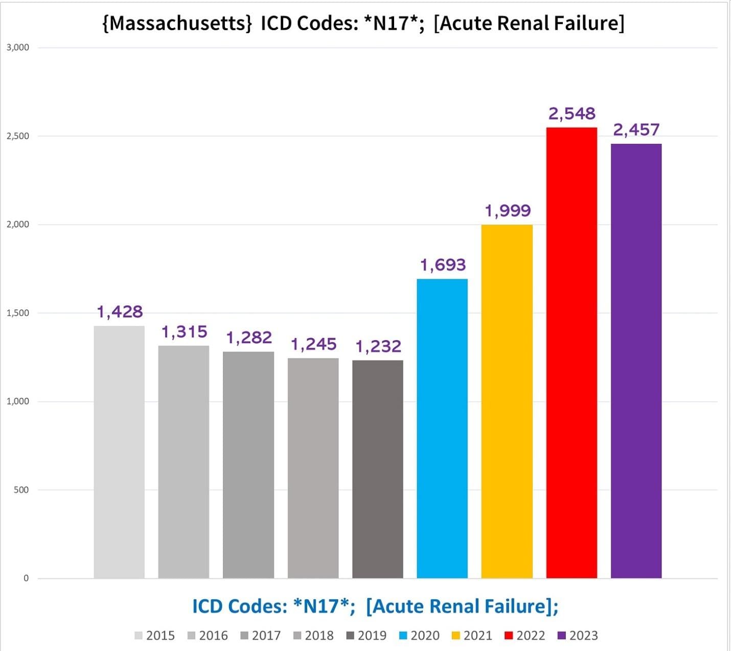
This trend speaks for itself.
The next chart shows the percentage of all deaths in MA each year that have N17 as a CoD:
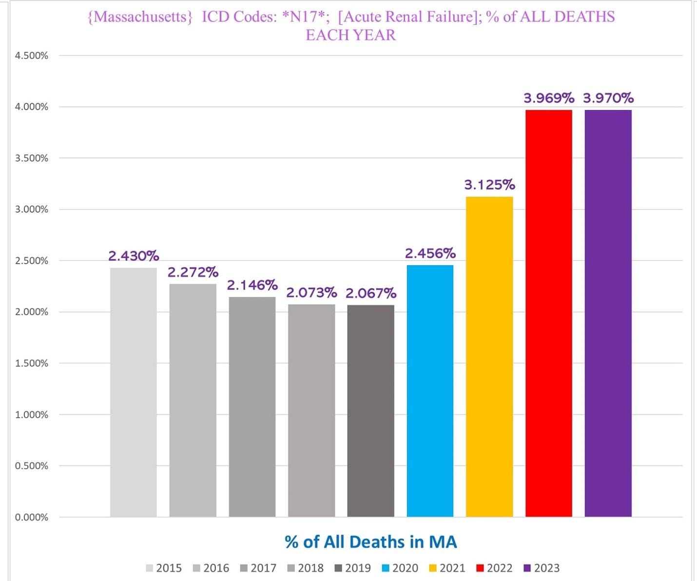
A change in the percentage of deaths with a given CoD is a good indication that there is probably excess morbidity and mortality from that condition, especially if the percentage of deaths increases more than the rate of excess deaths increases overall.
When we look at the non-NH resident deaths (right), 2022 reaches well above double the baseline to a nearly unthinkable 250% excess (!!):
Critically, even in MA, the trend of ARF deaths looks almost identical even if we exclude all deaths that have both N17 AND U071 (covid) on the death certificate:
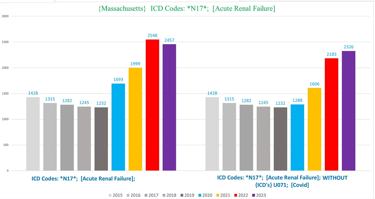
In other words, these are overwhelmingly deaths that have nothing to do with Covid, or even Covid treatments (any patient treated for Covid who died would definitely have Covid on the death certificate).
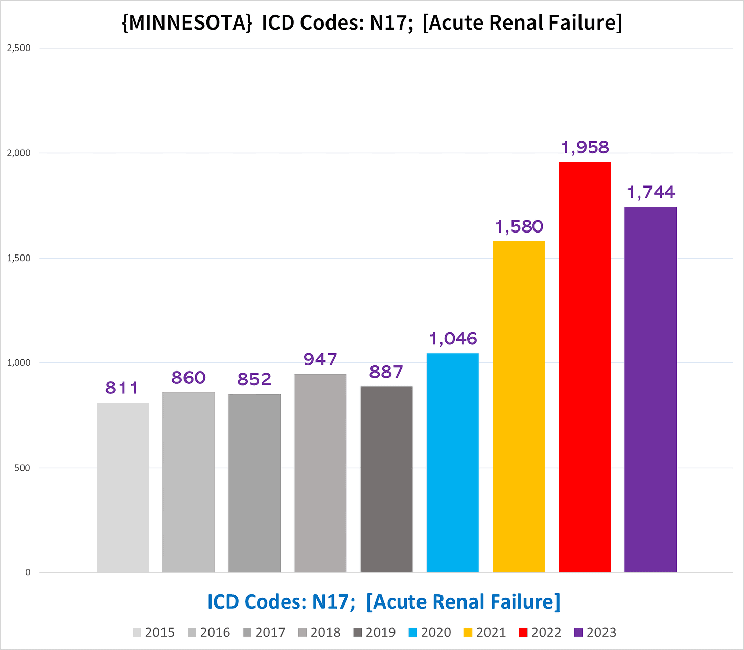
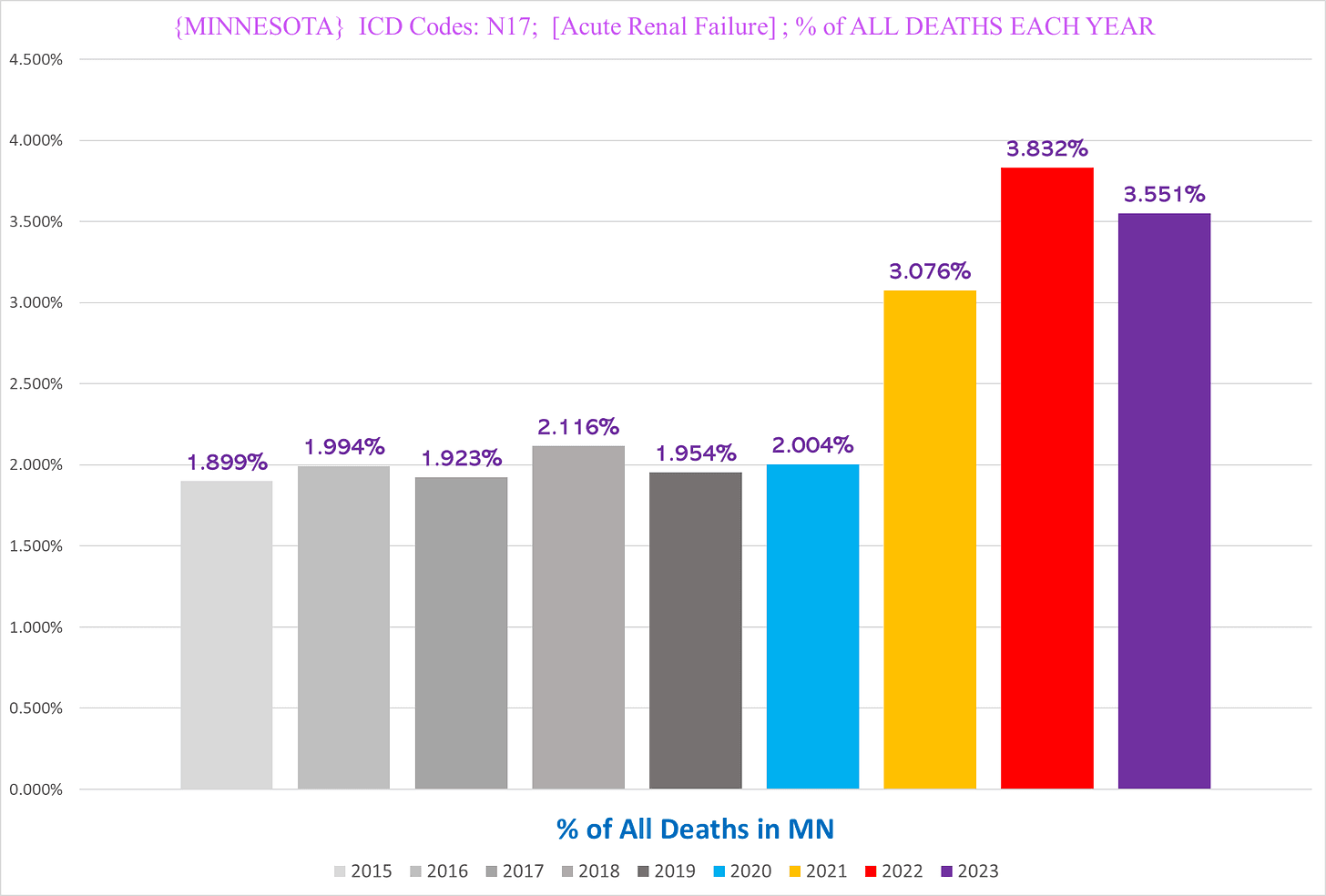
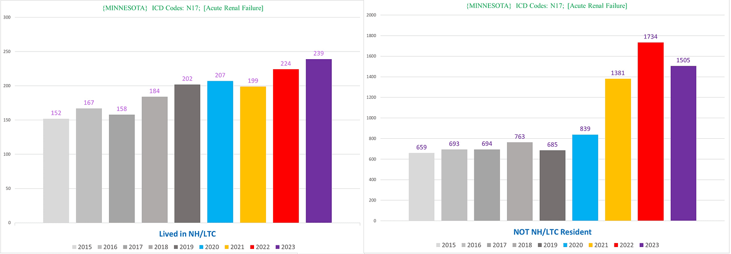
Minnesota
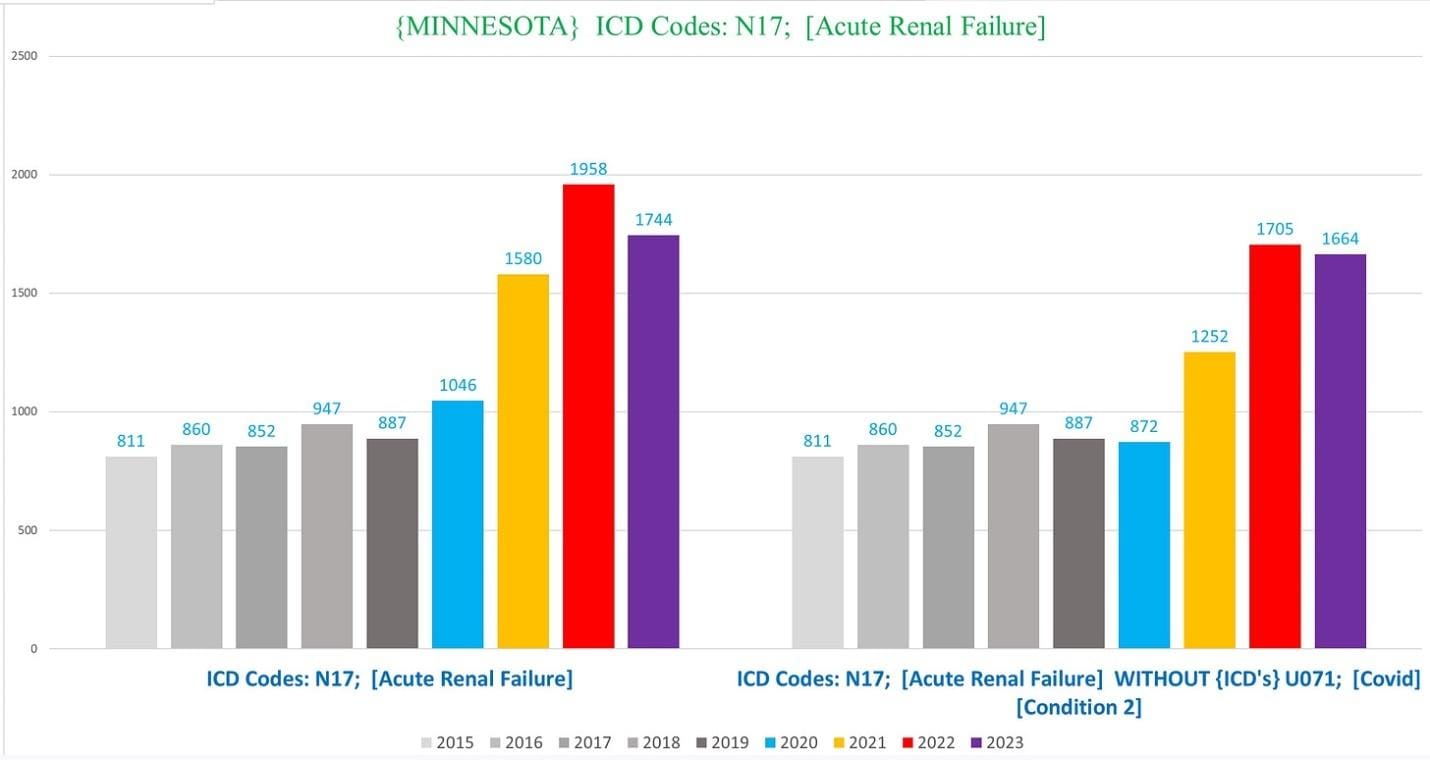
We see a remarkably similar trend of ARF deaths in Minnesota:
And also a similar trend in the percentage of deaths with ARF each year:
Minnesota has the dubious distinction of reaching 300% excess in 2022 in the non-NH residents (it’s possible that MA would as well if we could exclude the NH residents who died in hospitals):
And also like in MA, the shocking scope of the excess persists even excluding all of the ARF deaths that also list covid as a CoD:
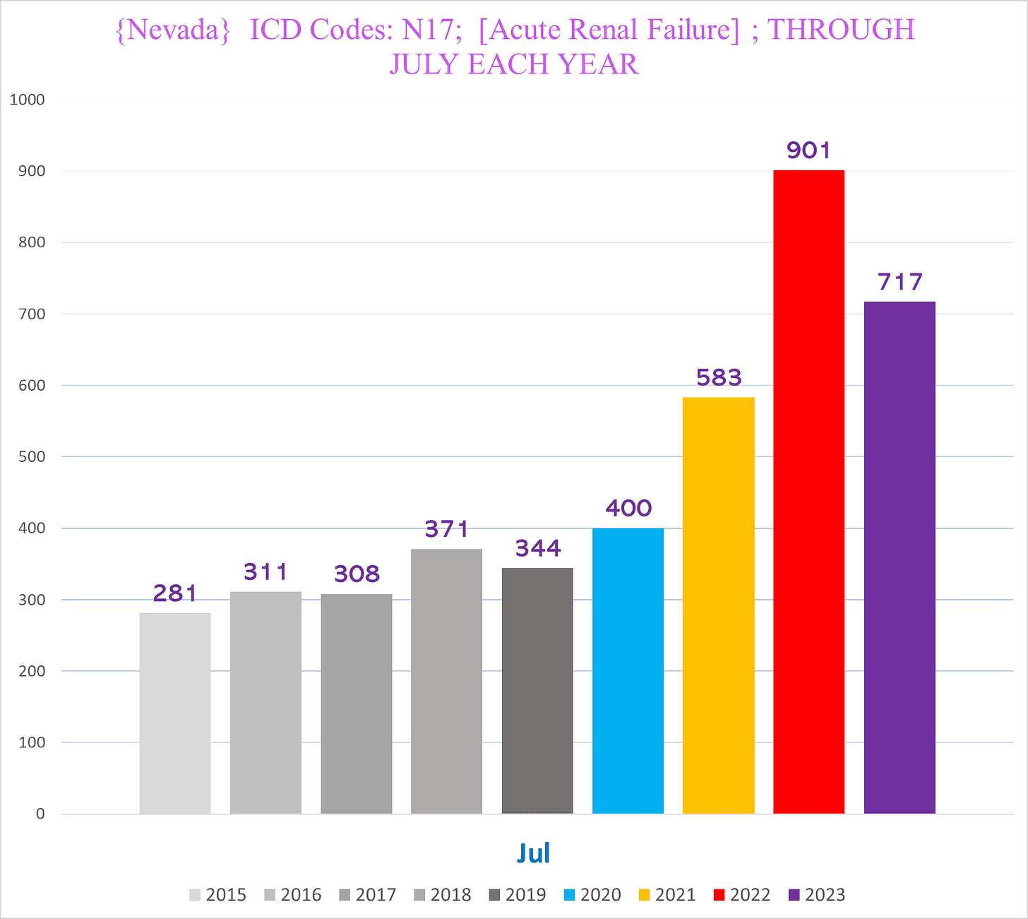
Nevada
Nevada looks just as bad:
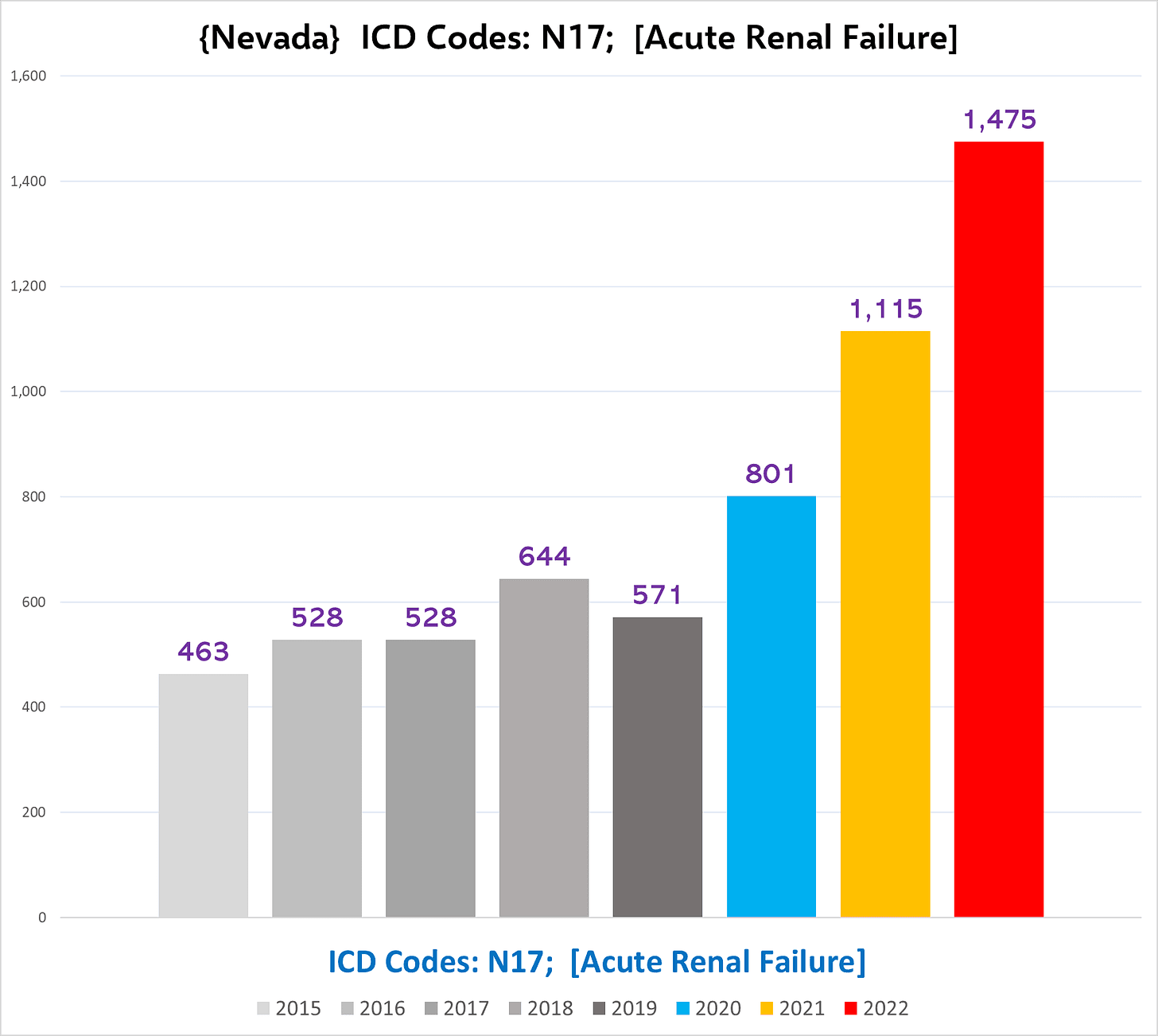
The following chart shows the total number of ARF deaths each year in Nevada from Jan-July, for which we have 2023 death certificates – which shows that so far 2023 is shaking out to be worse than 2021, albeit at least in NV 2023 seems noticeably lower compared to 2022:
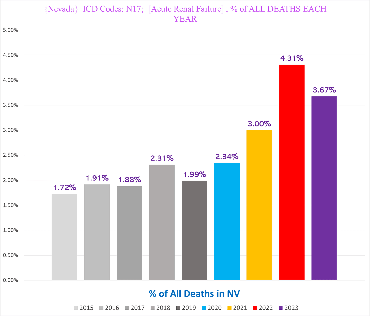
Nevada claims the prize for the highest total percentage of deaths in any one year with N17 (2022) out of all the states we have:
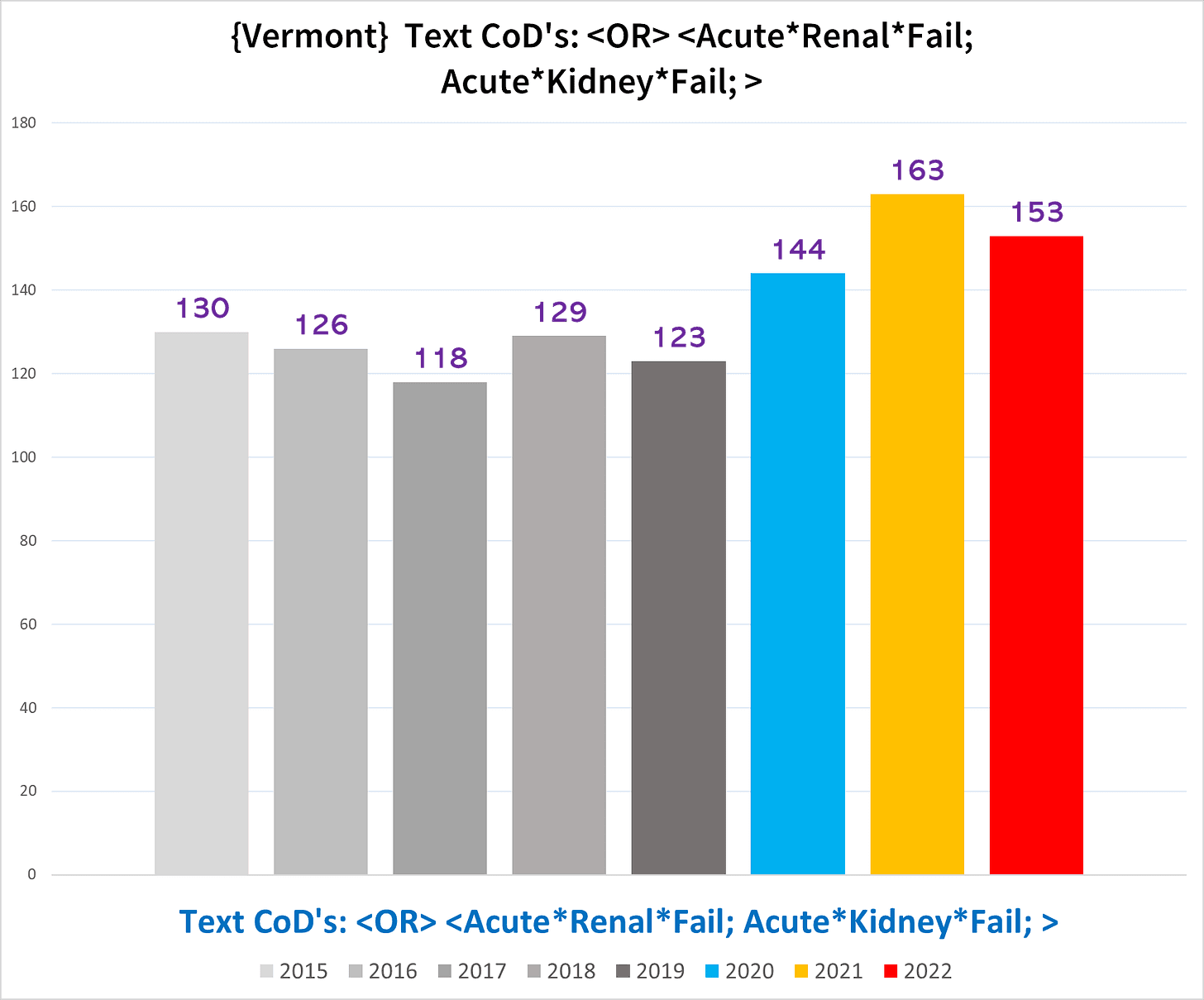
Vermont
Since Vermont doesn’t have the ICD codes assigned to the death certificates, we are forced to use text parameters instead, which are usually not ideal for comparing states to each other.
Vermont shows the overall weakest trend in excess deaths with acute renal/kidney failure –
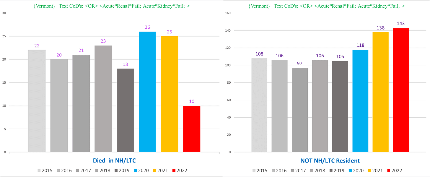
– although it becomes stronger once you exclude the NH ARF deaths (left) from the non-NH ARF deaths (right):
Clearly there is something causing a spectacular increase in the incidence of deaths with acute kidney failure….
PULMONARY EMBOLISM (ICD Code I26)
We chose Pulmonary Embolism – a blood clot in the lungs – in part because it is a common complication attributed to both Covid and Covid vaccines, and there is clear excess going on in all of the states we have death certificates from.
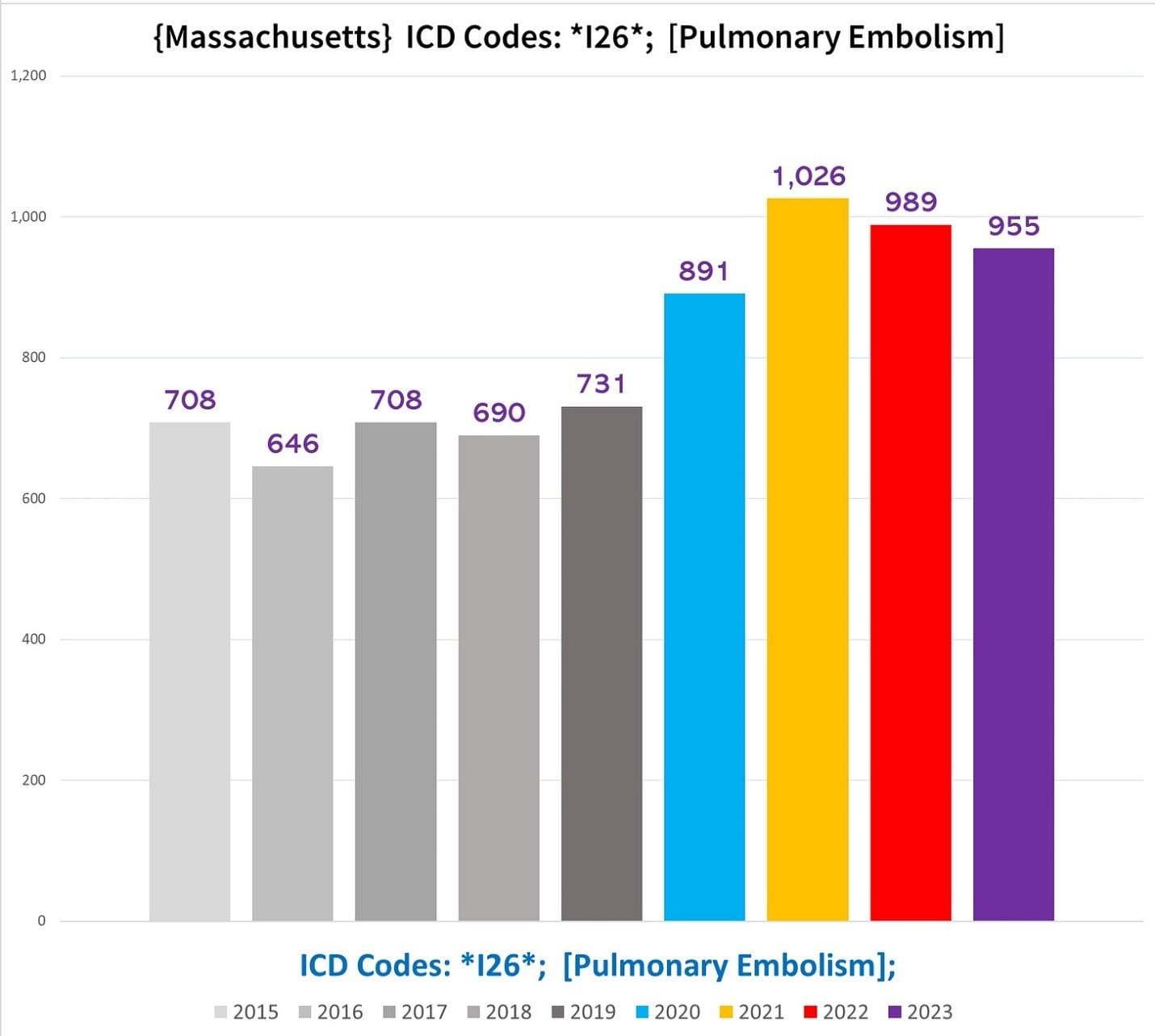
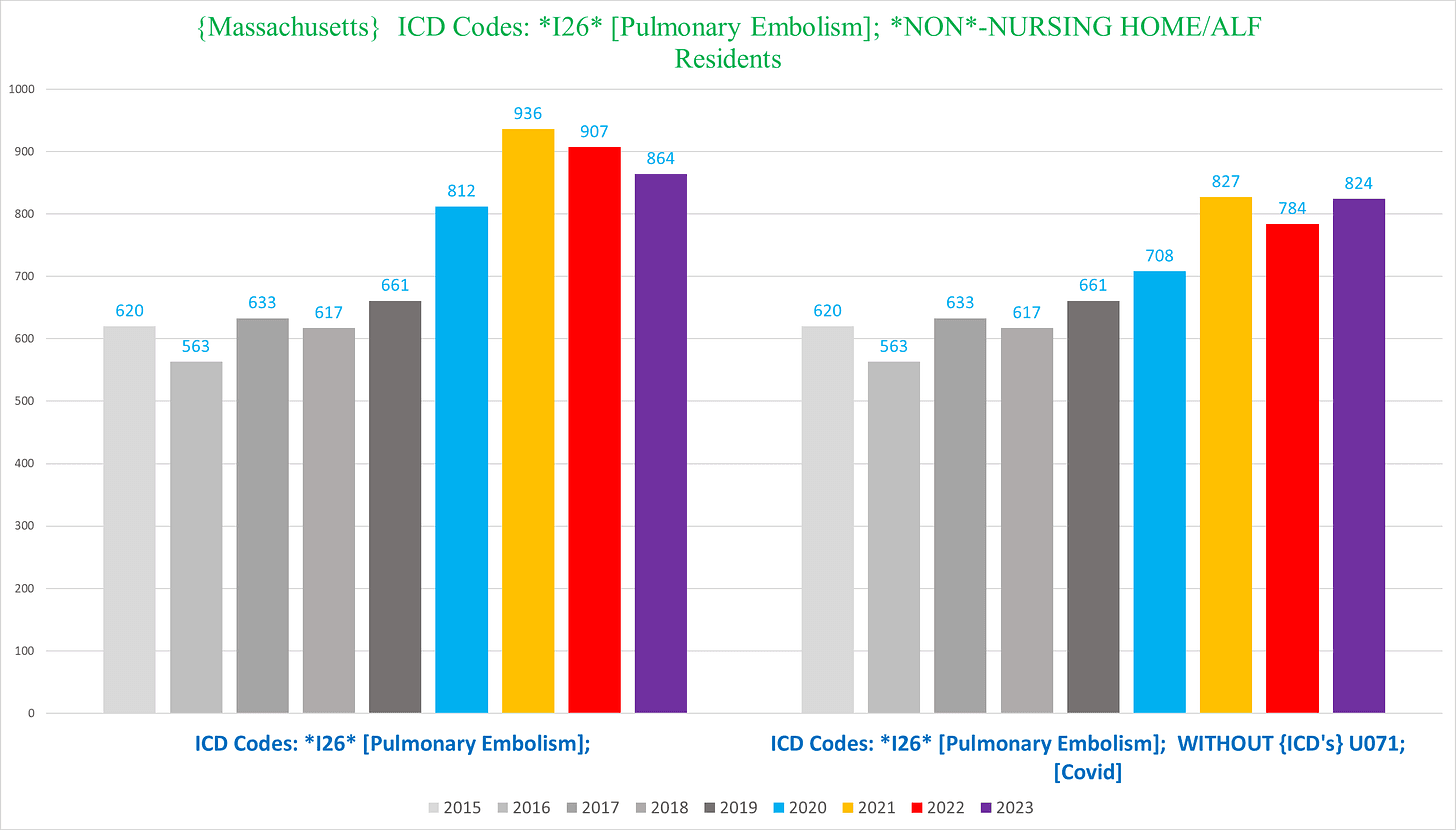
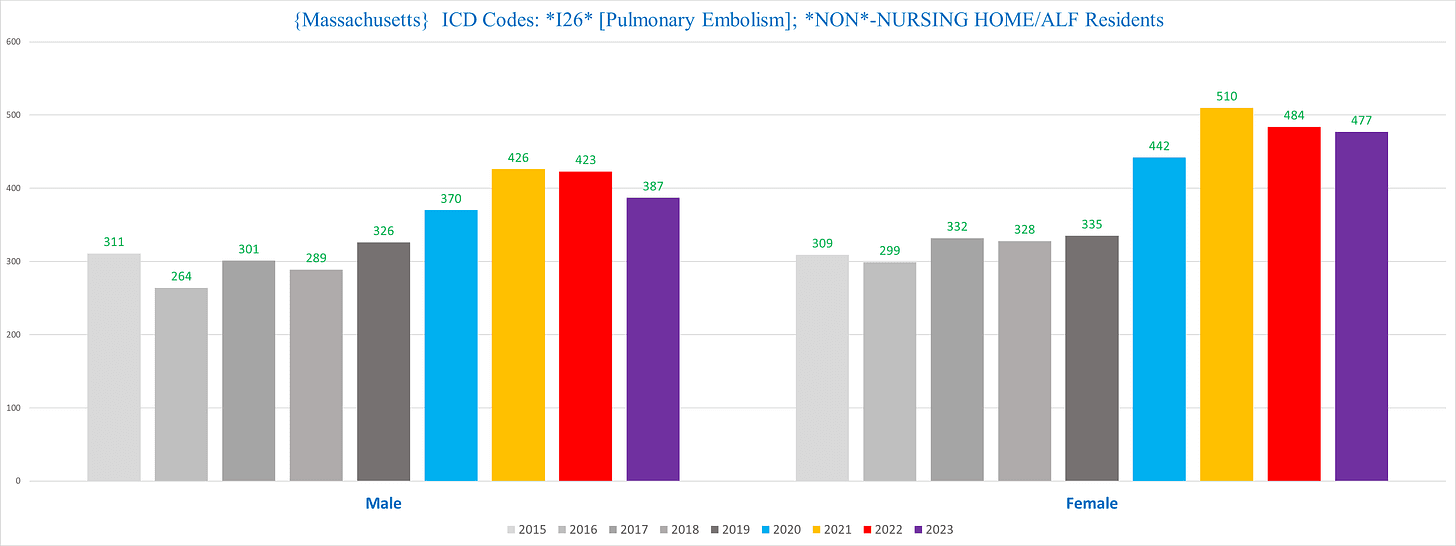
Massachusetts
The following chart shows the total number of deaths with I26 listed as a CoD each year:
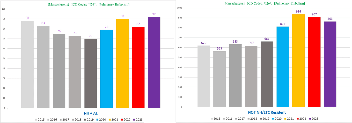
Surprisingly we can even see clear excess in the NH PE deaths (left) in all pandemic years, although it’s nowhere near as sharp as the non-NH PE deaths (right):
If we exclude Covid deaths, the excess trend almost vanishes. However, does it make sense (using official narrative premises) that after vaccinating almost all the seniors and the substantial majority of adults, the mildest covid variants cause a higher incidence of PE’s? (Again this is even granting that all the “Covid deaths” are actually Covid deaths, which is presumptively erroneous.)
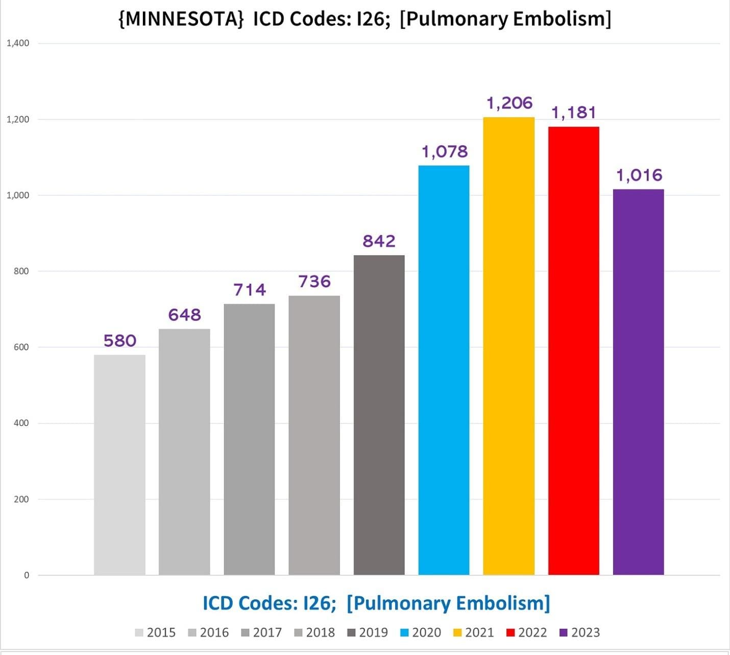
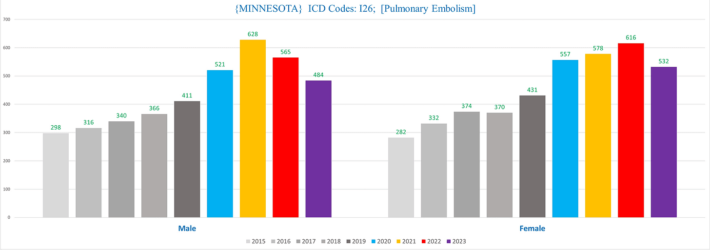
Minnesota
This is a good illustration of how different states document individual CoD conditions differently (or perhaps simply document a smaller percentage altogether).
Despite Minnesota having ~15,000 fewer deaths per year than Massachusetts, there are actually more deaths per year in MN with PE listed as a CoD (except for 2015):
Are there “missing” PE’s from Massachusetts death certificates? Does the CDC or other academics using the national mortality data bother to sort out differences in states? How do you even sort out what’s going on here?
All good questions.
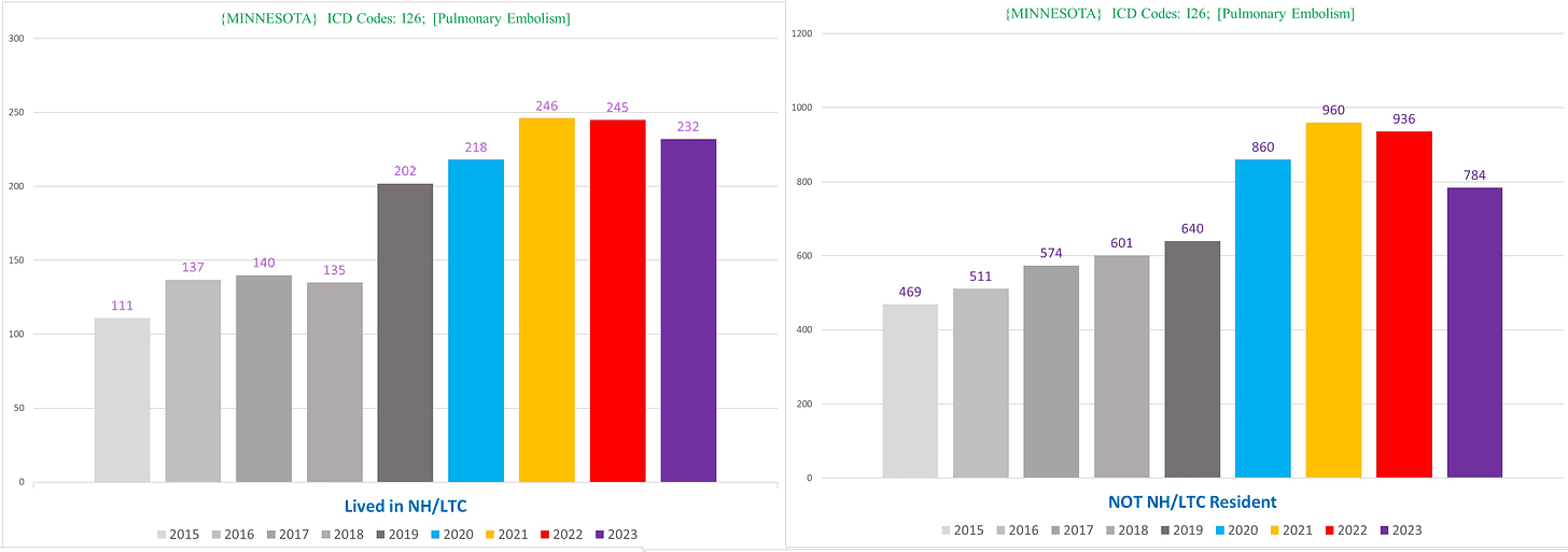
If we look at NH vs non-NH PE deaths, we see a similar picture to MA – there’s clear excess even in the NH deaths, but far less pronounced than the non-NH deaths.
Interestingly, there seems to be clear excess PE deaths among NH residents in 2019.
The following chart shows men (left) vs women (right):
Unlike Massachusetts, there is clear excess in MN PE deaths in the non-NH population even if we exclude all the PE deaths with covid listed as a CoD (right):
Another interesting tidbit here is that the contrast between men and women is even greater among the non-NH deaths:
This is noteworthy because typically, the disparity between men and women roughly hews to the NH vs non-NH dynamic because women make up a disproportionate percentage of NH residents (longer life expectancy), yet here the difference between men and women becomes greater by excluding NH resident PE deaths.
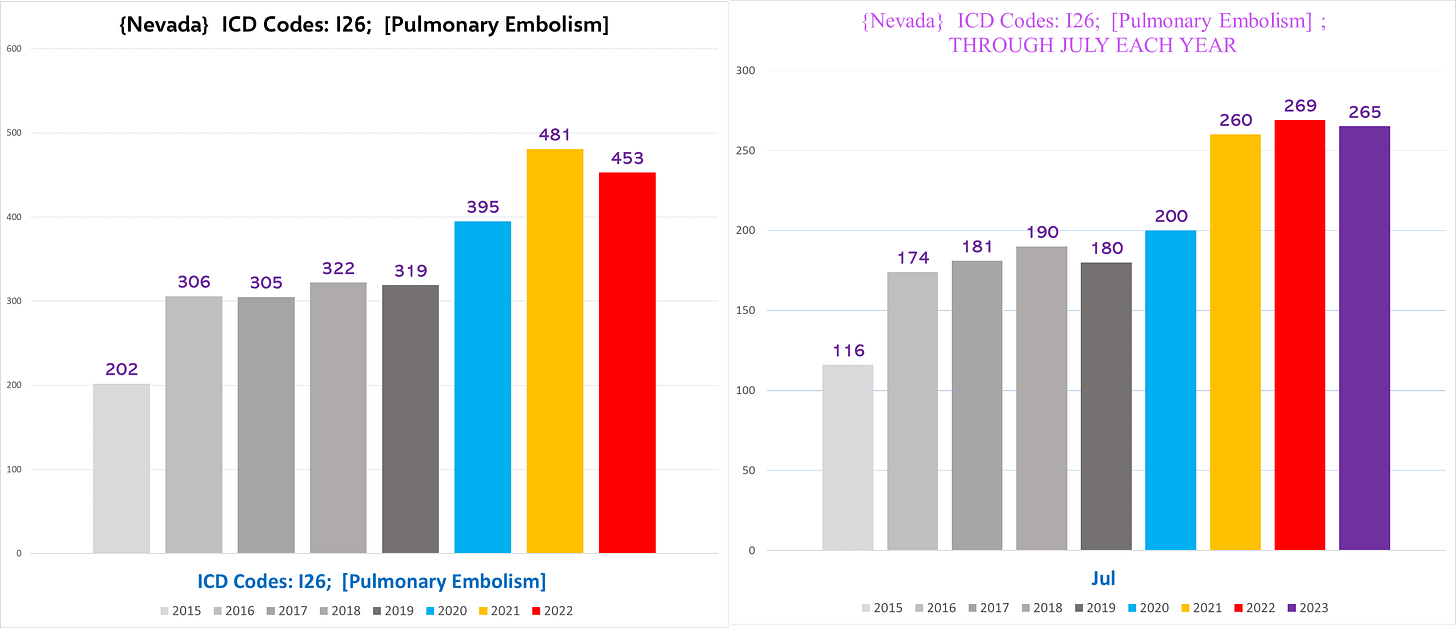
Nevada
The left chart shows the total number of PE deaths for the entire calendar year each year, and the right chart shows the total number of deaths from Jan-July each year to normalize for 2023 as we showed for ARF deaths before:
The excess exists even excluding all the PE deaths with Covid, although much more muted:
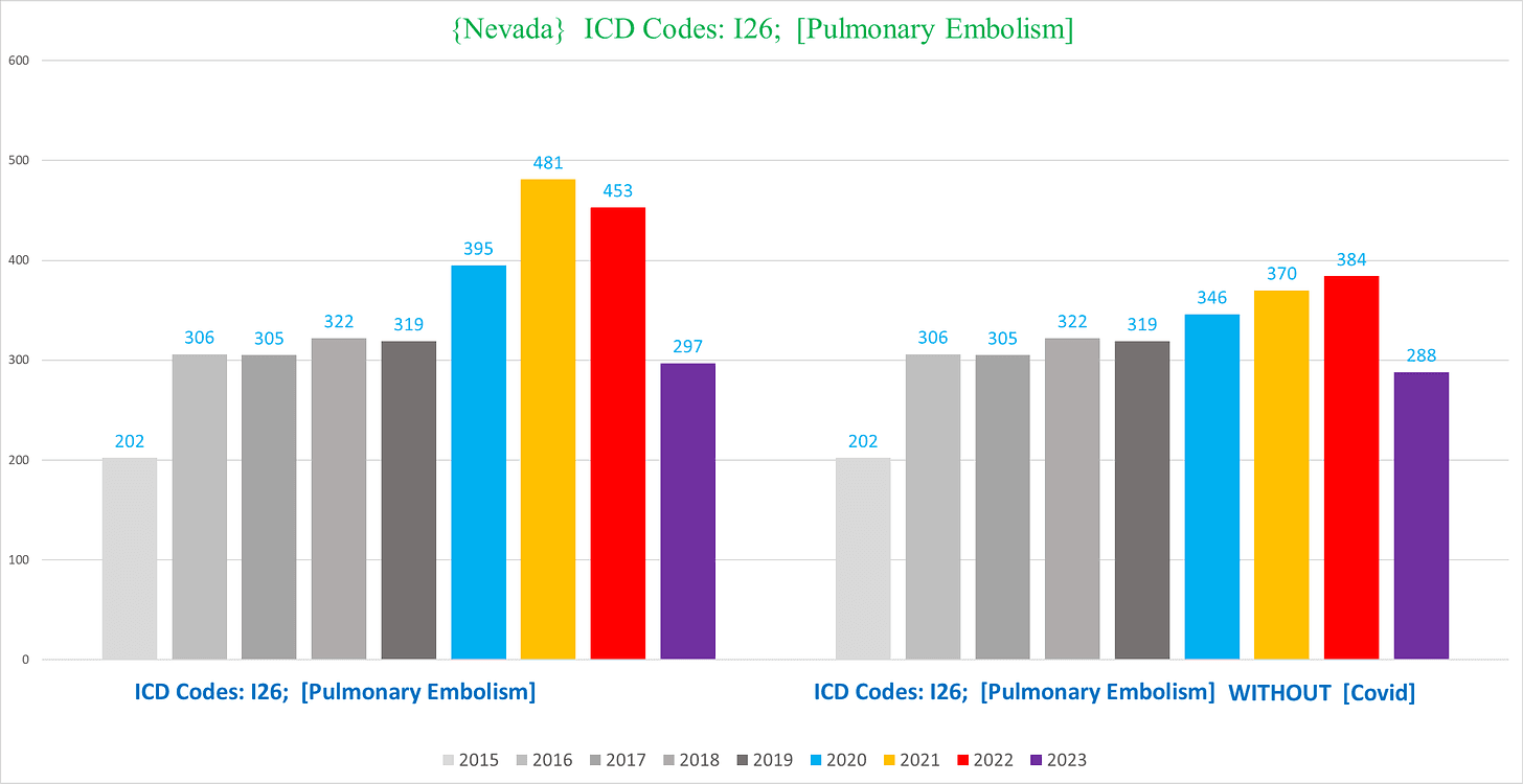
(Keep in mind that rampant overcoding of Covid on death certificates artificially deflates the degree of excess when you exclude Covid.)
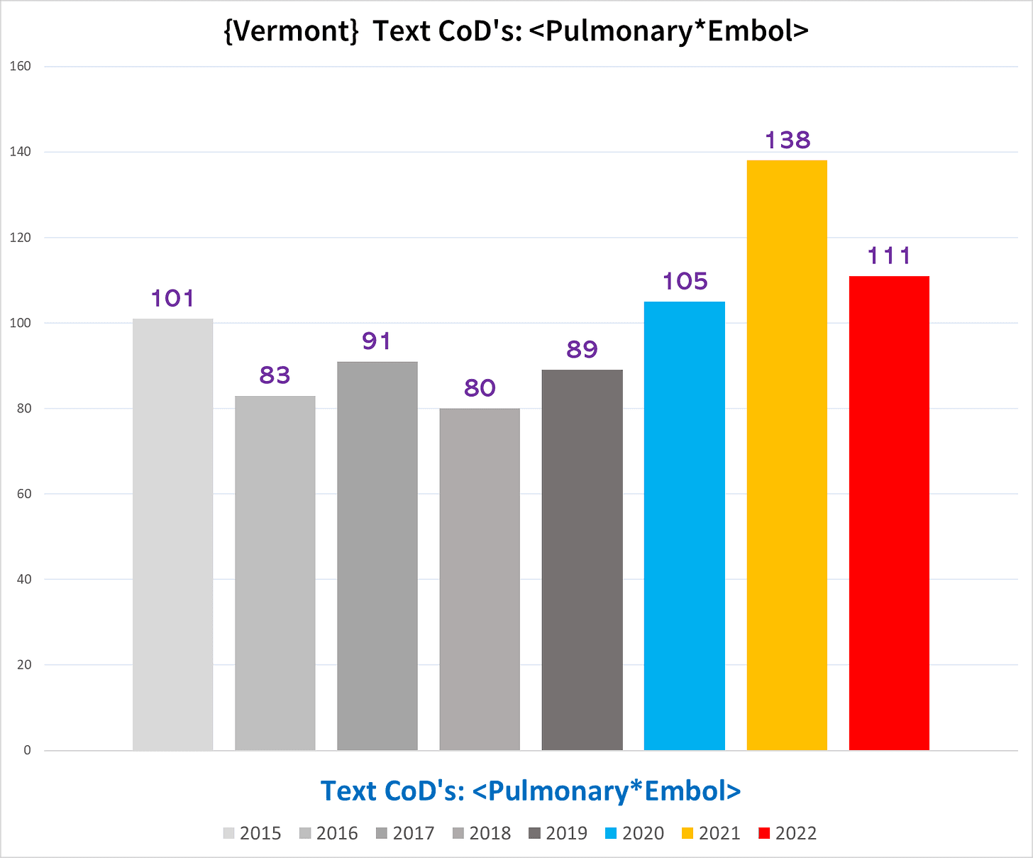
Vermont
For Vermont, we tried to capture deaths with a PE by using the text of “Pulmonary*Embol,” which allows for variations of embolism, emboli, and embolus. (Unfortunately, we can’t use “PE” or even “PE ” because many other words that appear in CoD fields have ‘pe’ or ‘pe ’ in them, e.g. “type”):
Unlike the other states, in VT there is no significant excess of PE deaths in the NH pop (left), which accentuates the degree of excess in the non-NH resident population (right):
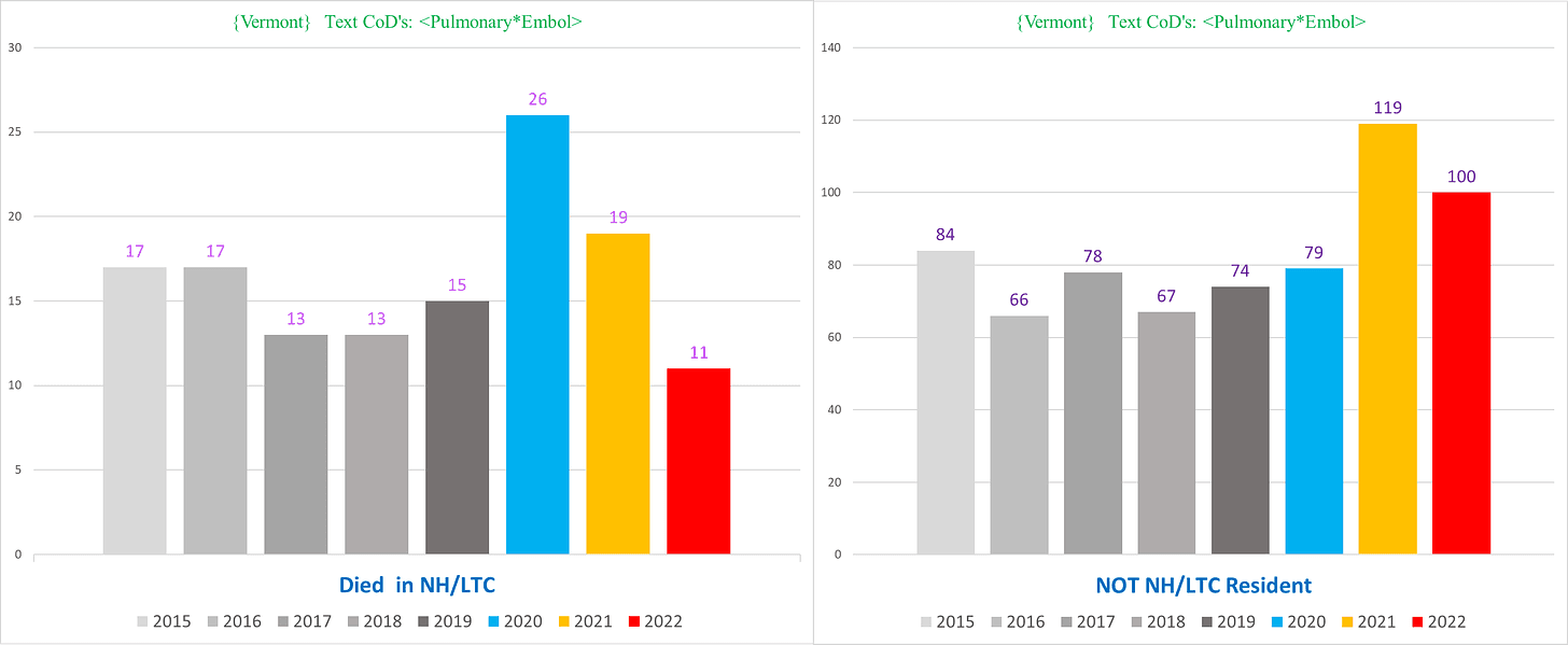
Notice also how there are no excess non-NH PE deaths whatsoever in 2020. It is exclusively a 2021 phenomenon.
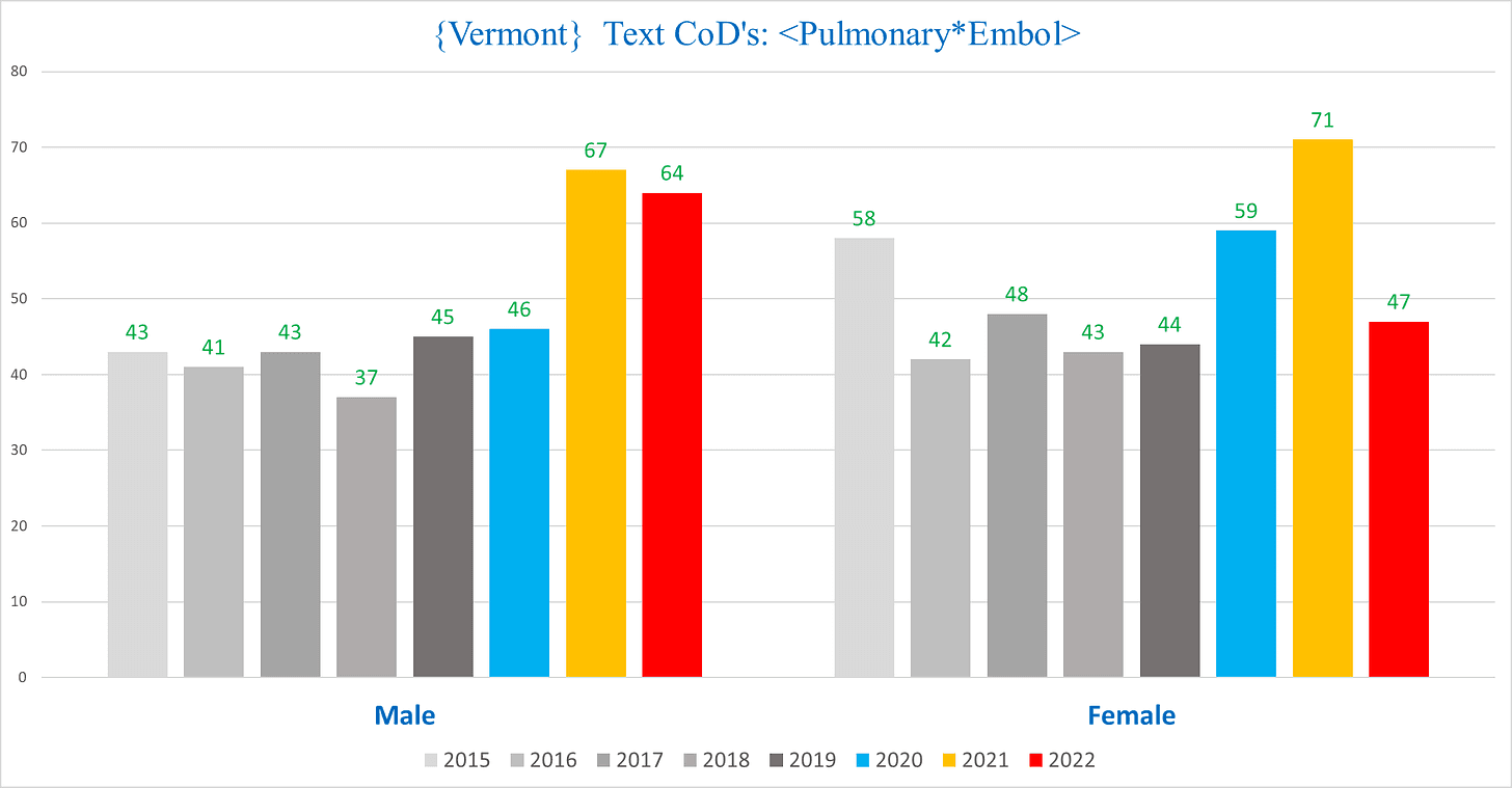
The men vs women in VT is also remarkable, skewing the opposite direction from the other states:
III. HYPERTENSION
Hypertensions are one of the most frequent conditions listed on death certificates, far more than ARF.
I was going to only focus on a subset of Hypertensions – Hypertensive Heart Disease, which shows a considerably more rapid rate of escalating excess. However, in order to normalize a comparison with Vermont where HHD isn’t really a thing, I also generated charts for all states using a text parameter of any death that had either “hypertension” OR “hypertensive” in a text CoD.
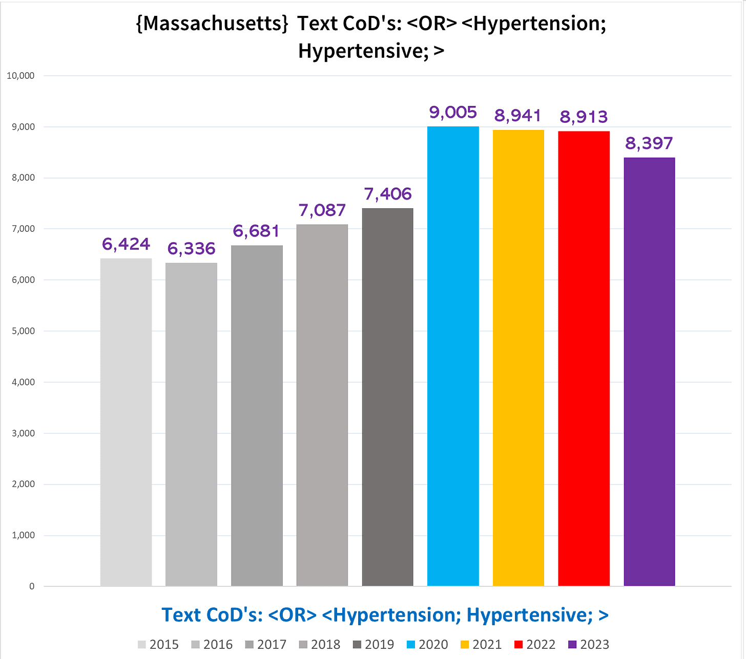
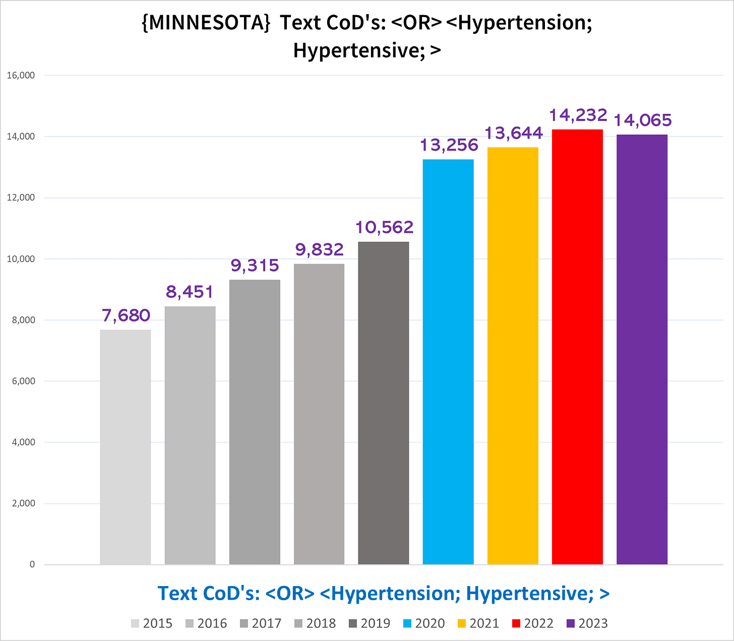
Massachusetts
The following chart shows the total number of deaths each year with either the text “hypertension” or “hypertensive” as a CoD:
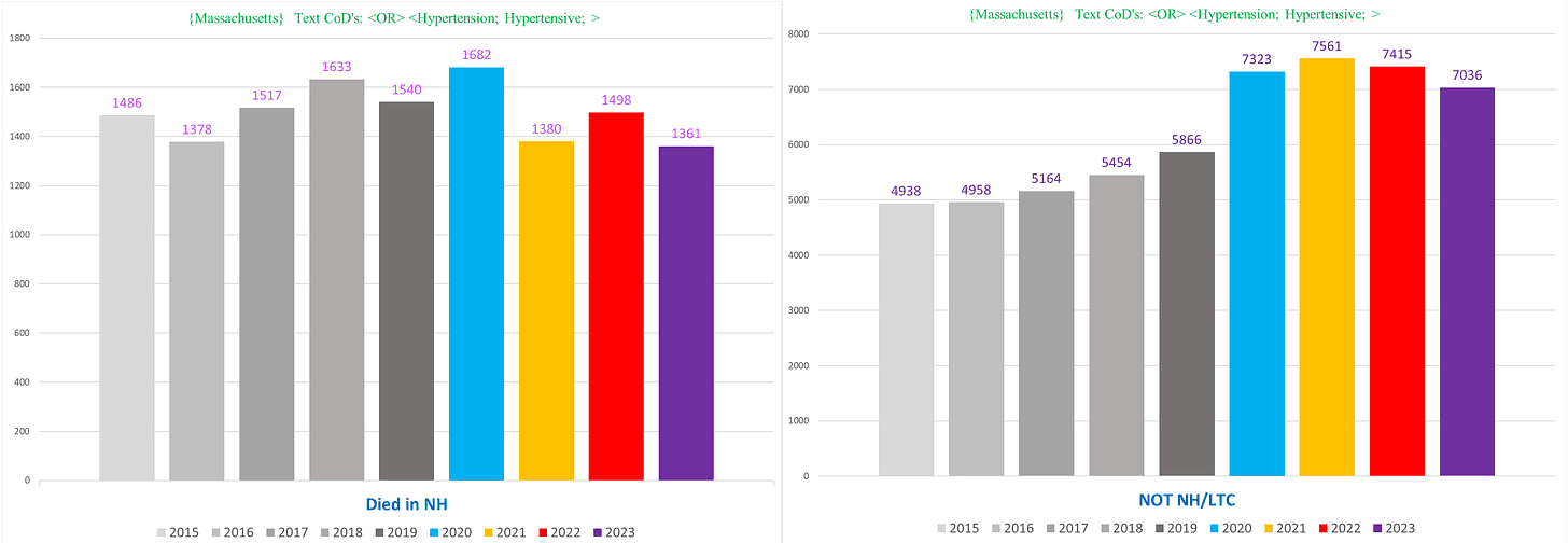
NH vs non-NH deaths:
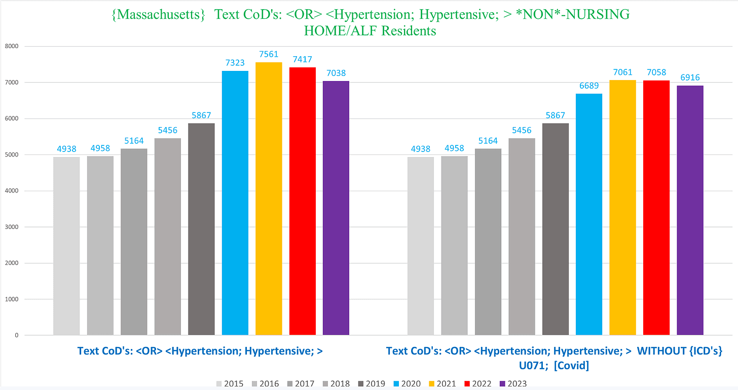
“Hypertension”/“Hypertensive” deaths total (left), and excluding all such deaths that also had ICD code U071 [covid] (right):
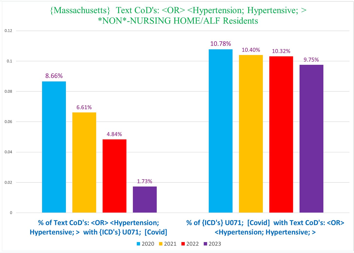
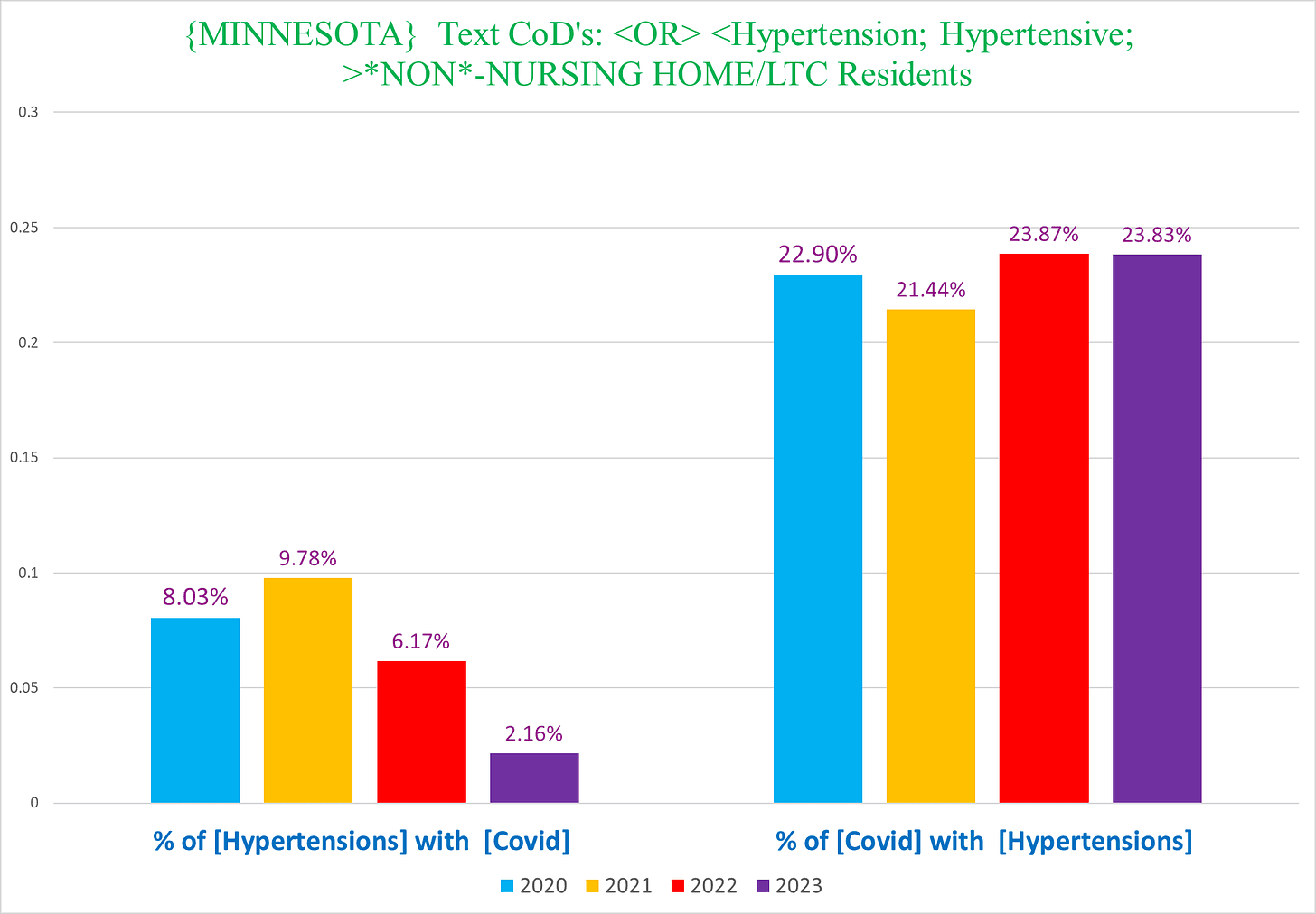
The following stat is probably instructive. This chart, covering only the years 2020-2023 for NON-NH deaths, shows:
- LEFT SIDE: the percentage of deaths with text of hypertension/hypertensive that also have covid as a CoD
- RIGHT SIDE: the percentage of Covid deaths that also have the text of hypertension/hypertensive
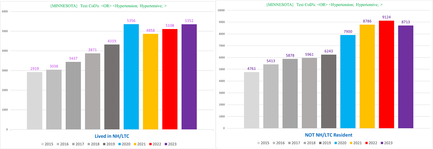
Minnesota
Same parameters as for MA:
NH residents vs non-NH residents – the trend in MN for the non-NH residents (right) is more dramatic compared to MA:
“Hypertension”/“Hypertensive” deaths total (left), and excluding all such deaths that also had ICD code U071 [covid] (right):
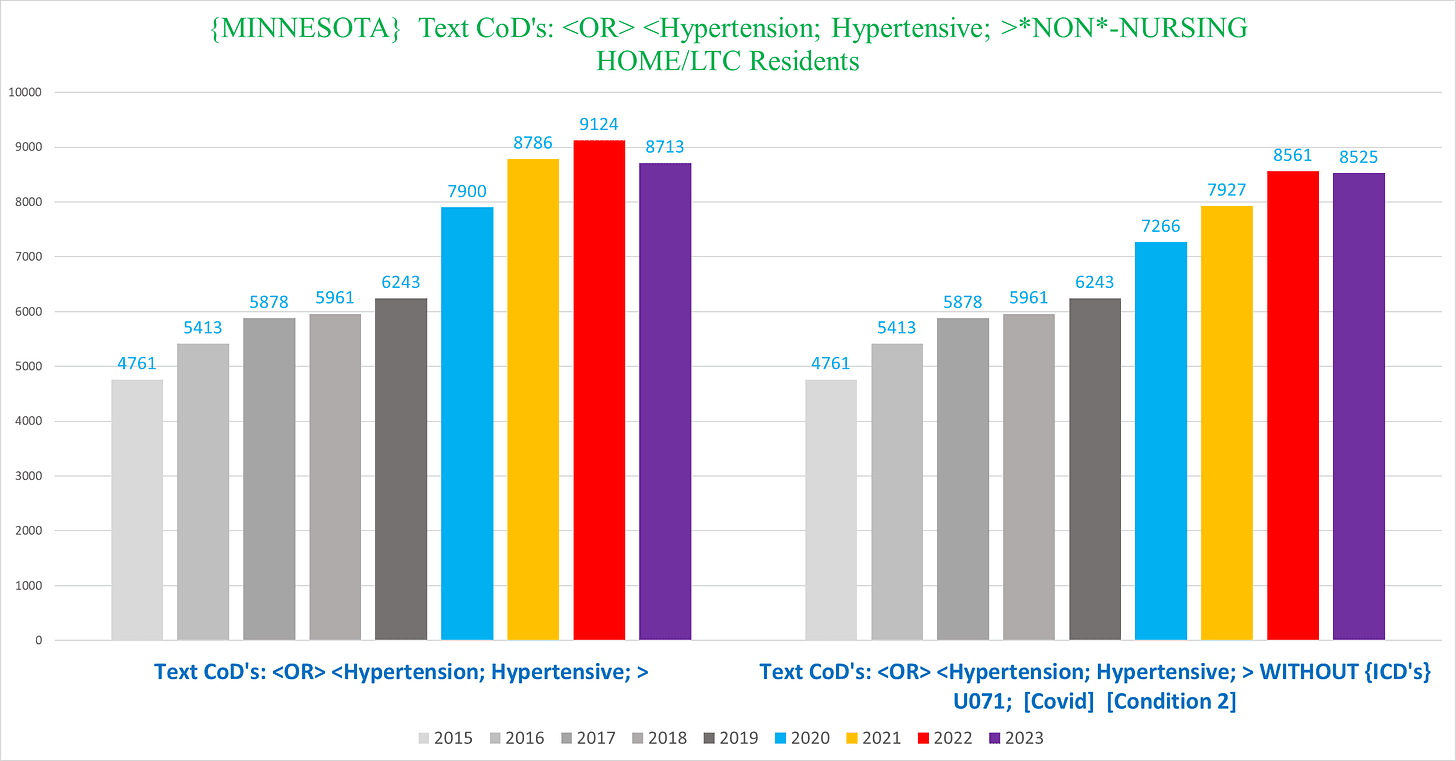
This is a very worrying trend even after excluding all the “Covid” deaths.
Finally, while the percentage of hypertension/hypertensive deaths with Covid in Minnesota (LEFT SIDE) is pretty similar to Massachusetts, the percentage of Covid deaths that have a text of hypertension/hypertensive in Minnesota (RIGHT SIDE) is about DOUBLE the percentage of covid deaths with this language in MA:
Lastly, in Minnesota, if we focus on the 18-44-year-olds, we find something very shocking illustrated by the following chart that shows the number of deaths with the text hypertension/hypertensive in 18-44-year-olds for men (LEFT) and women (RIGHT):
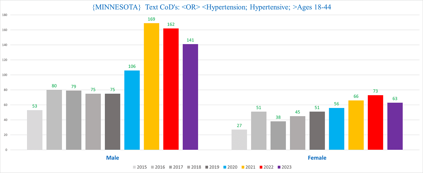
This seems like a disturbing trend, to say the least.
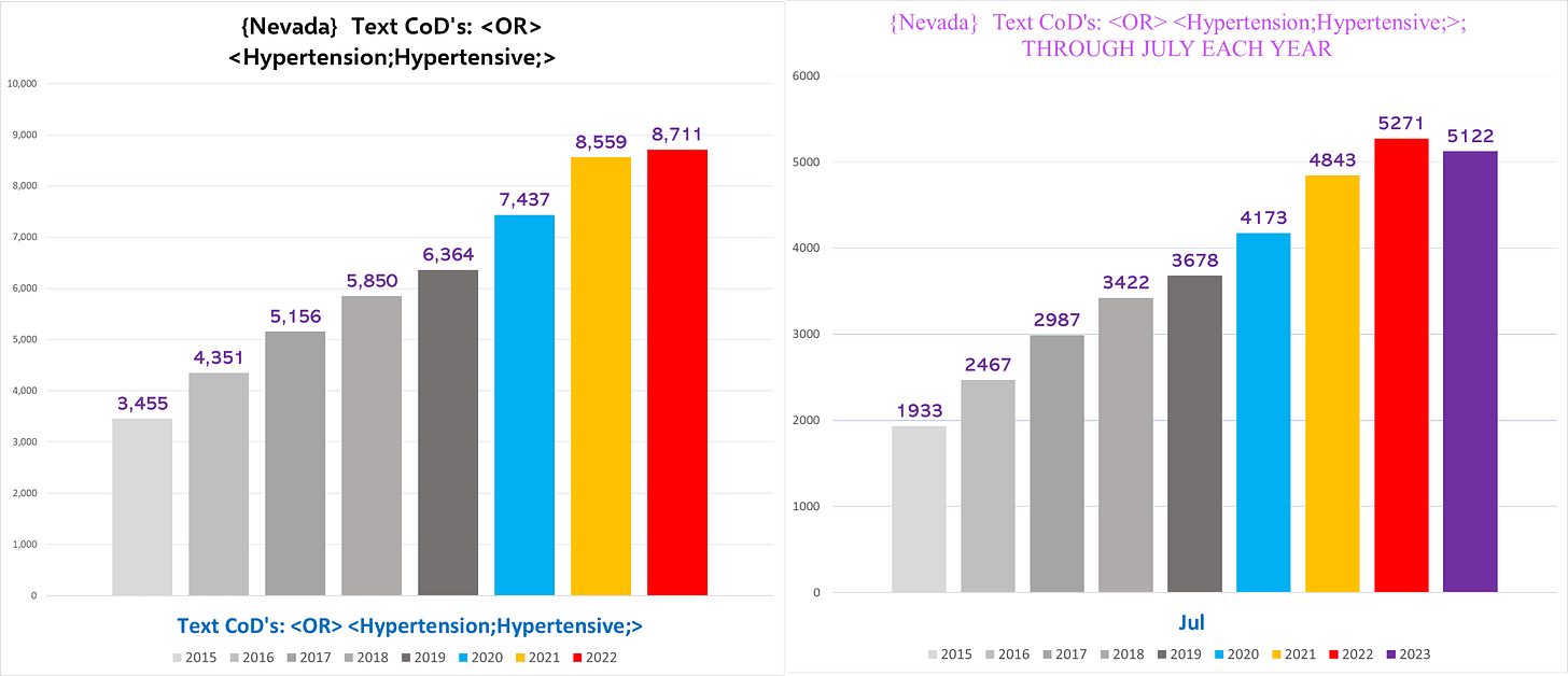
Nevada
For, Nevada it is hard to find a clear signal because the difference between any two years is so big:
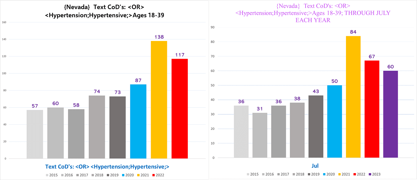
However, if we only look at such deaths in 18-39-year-olds, we do see a very clear sudden spike of excess deaths with the language “hypertension”/“hypertensive:”
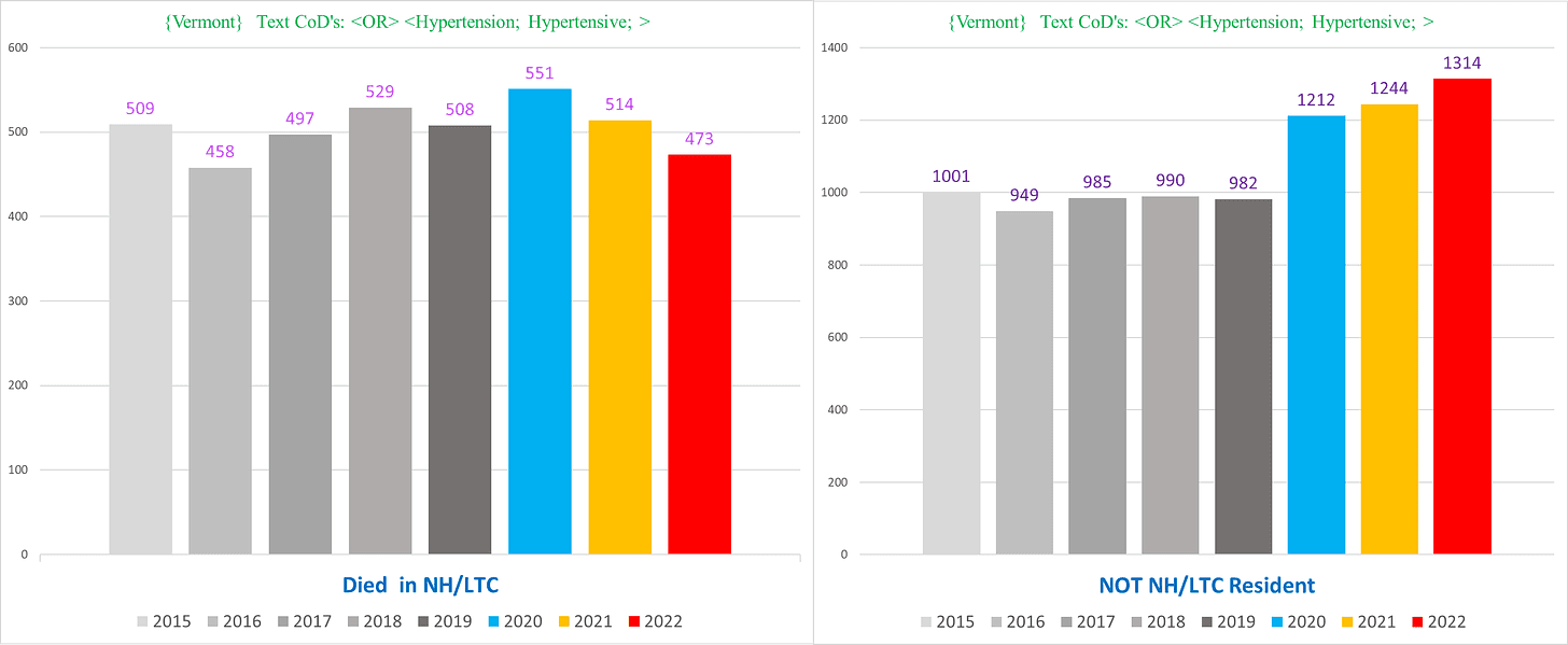
Vermont
Finally, we have Vermont:
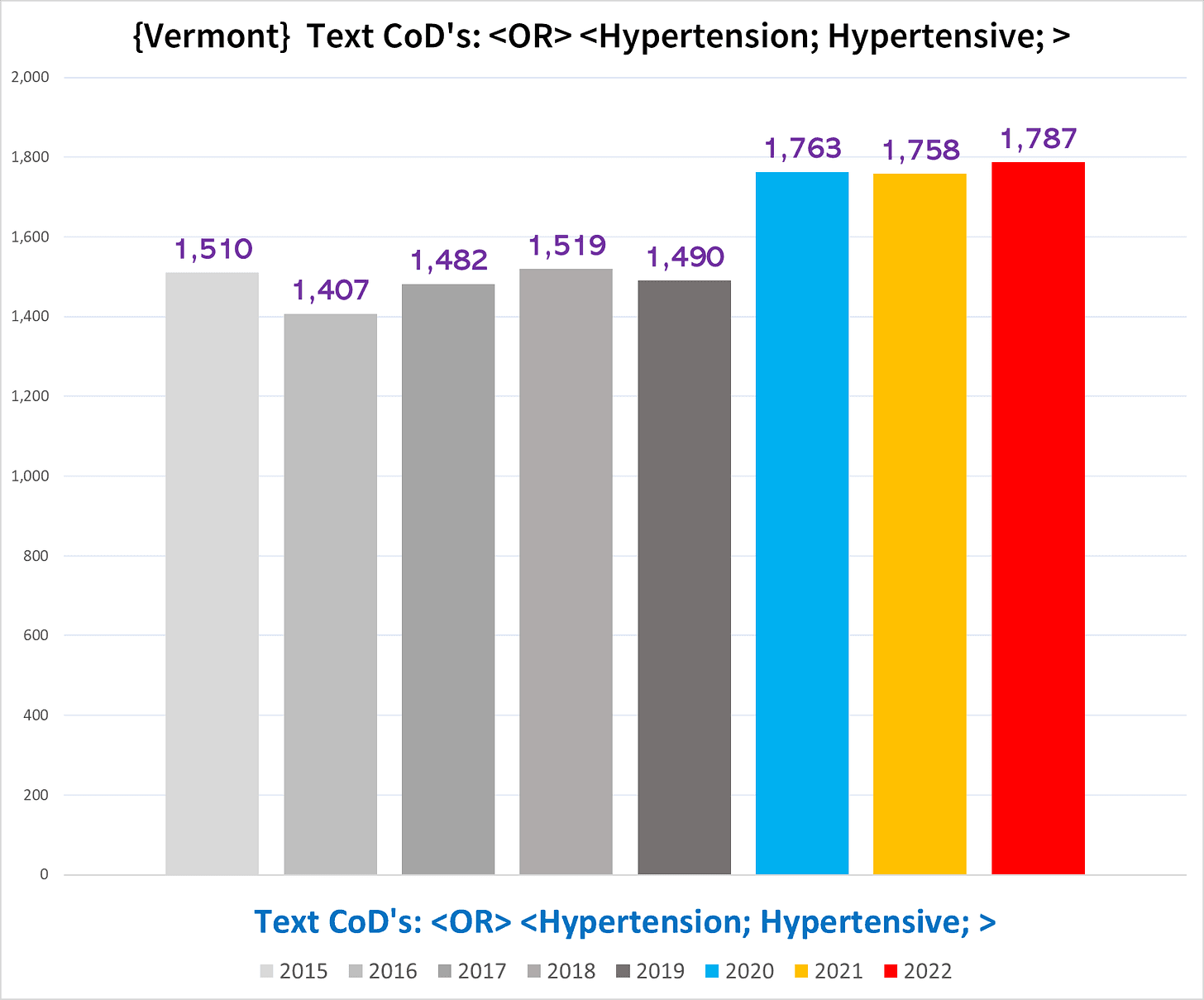
Where the excess is entirely from the non-NH deaths:
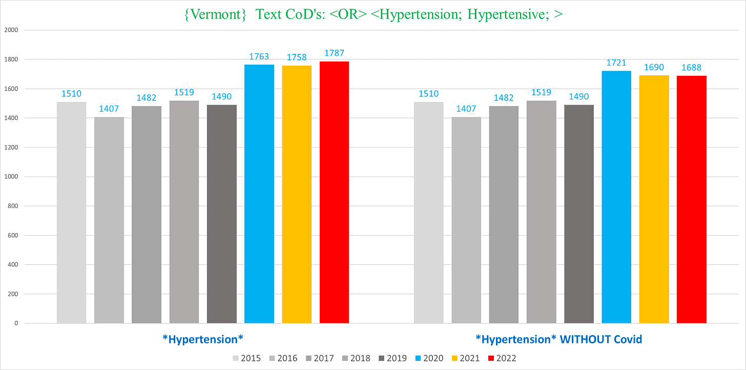
And vanishingly few of these deaths have any text variation of “Covid” (we went through all the potential Covid deaths individually by hand to calculate this):
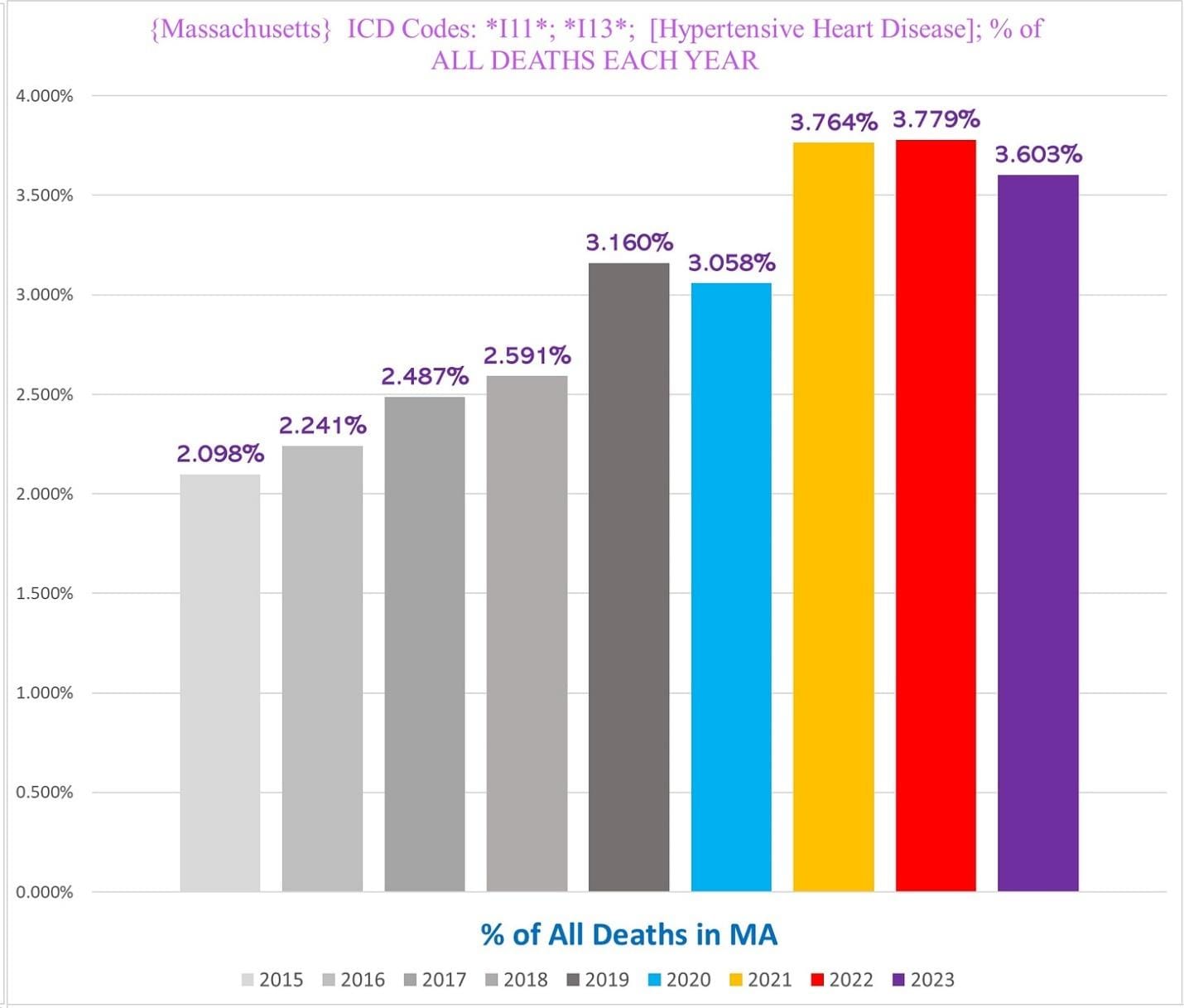
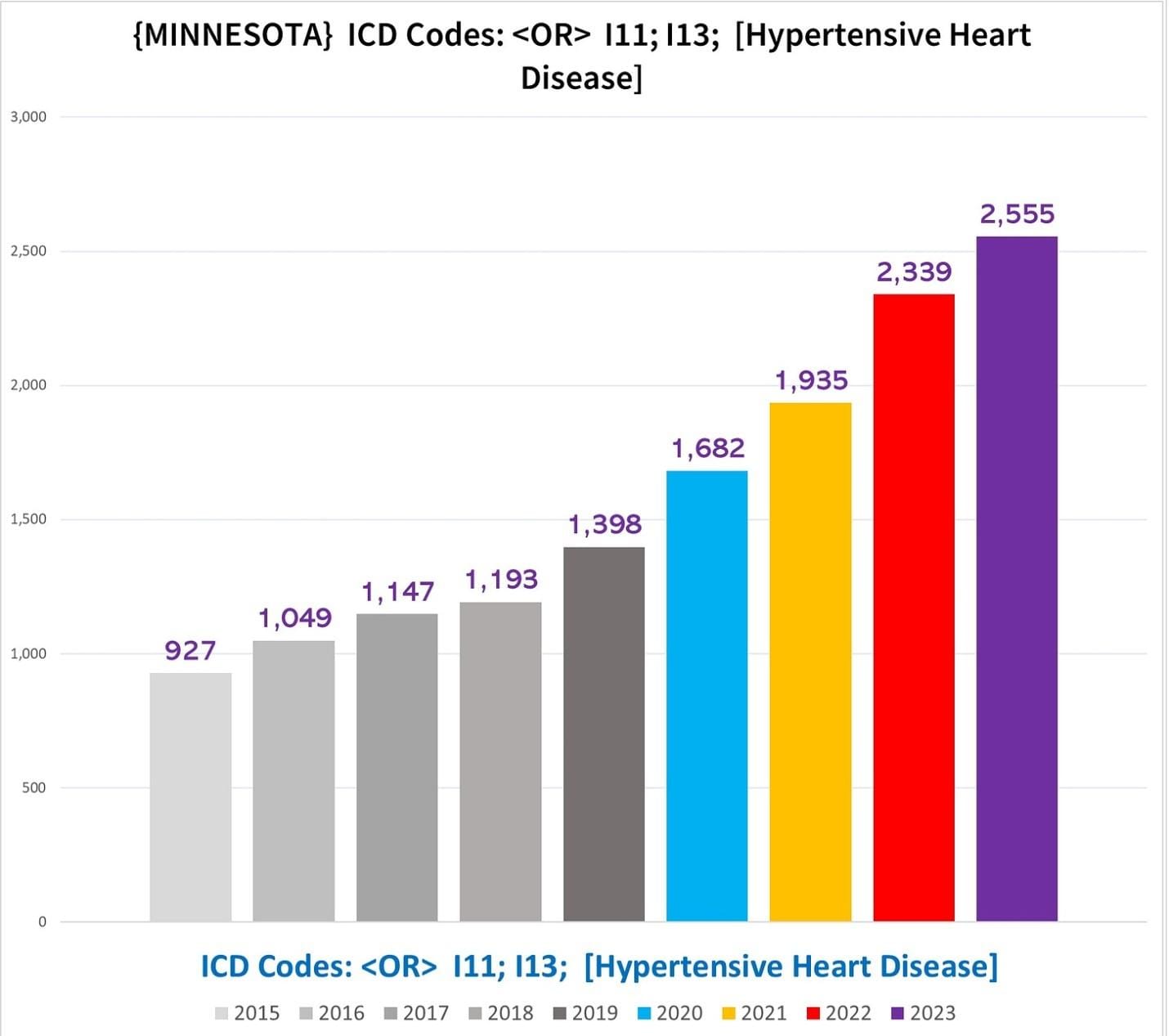
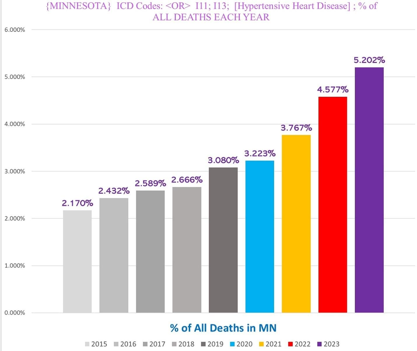
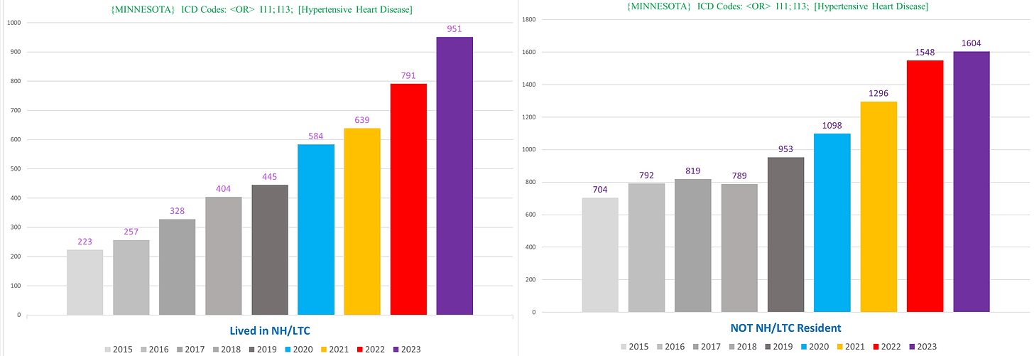
HYPERTENSIVE HEART DISEASE (ICD Codes I11 & I13)
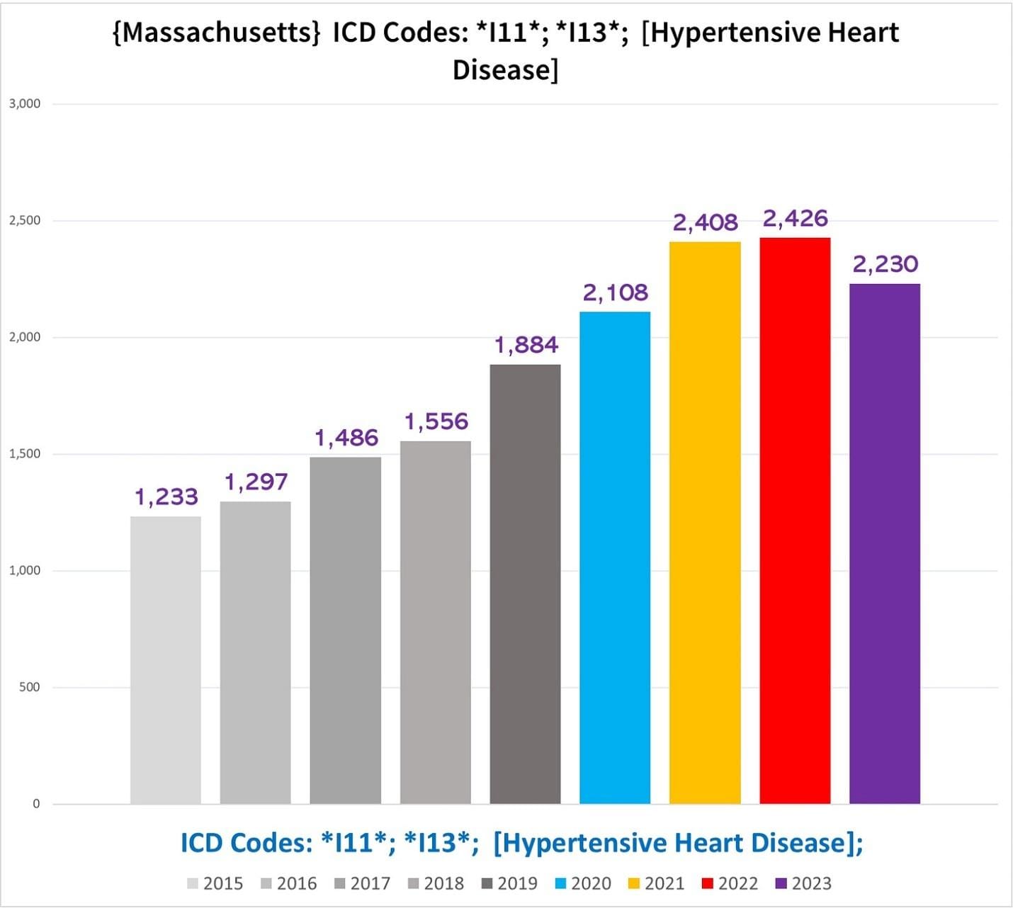
Massachusetts
Minnesota
In Minnesota, the excess deaths with HHD is almost as bad and extreme as the excess ARF deaths:
Which is reflected in the percentage of deaths each year that have either I11 or I13 as a CoD:
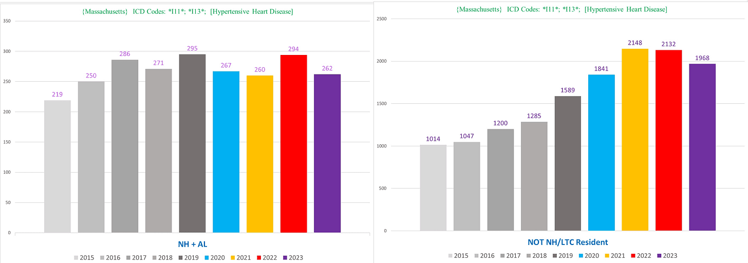
Very shockingly, there is a massive spike in these deaths even in NH residents (!!) (left), roughly tracking with the dramatic spike in non-NH deaths (right):
We can see the extraordinary degree of excess in young people we saw in the text deaths of “hypertension”/ “hypertensive” above in this age group, illustrated in the following chart showing the number of deaths among 18-49-year-olds with HHD:
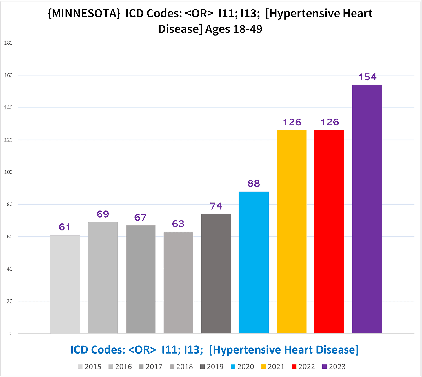
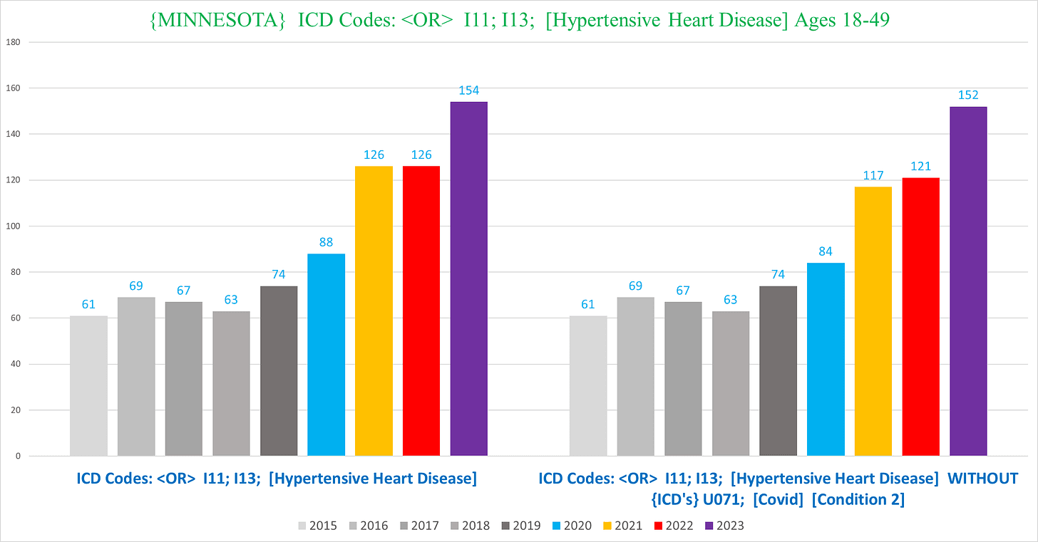
And almost every single one of these deaths did NOT have Covid – you can barely see a difference between the two charts below showing the total HHD deaths including those with Covid (left) and excluding those with Covid (right):
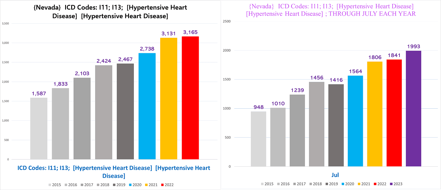
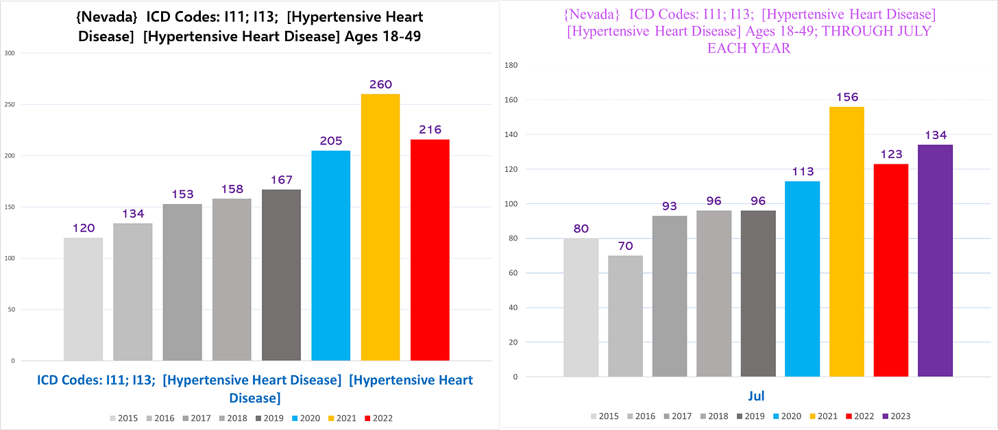
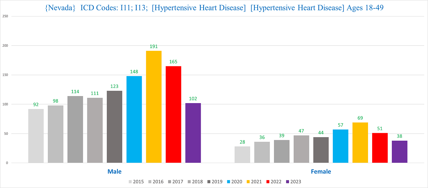
Nevada
Nevada pretty much parallels the text version above:
IV. KINETIC INJURIES / PHYSICAL TRAUMAS
Kinetic injuries is just a name for all sorts of accidents involving physical trauma of some sort.
This is the only category in this article where for the most part it is hard to find, and there certainly isn’t really a commonality between states.
Physical injuries are spread out over dozens of different ICD codes, and the increases that we’ll show don’t really show up as well using an ICD code or combination of codes.
For each state, we will use a unique combination of text and/or ICD codes, the fruits of surveying thousands of death certificates to get a sense of the different phrases and ICD codes used to identify physical trauma injuries.
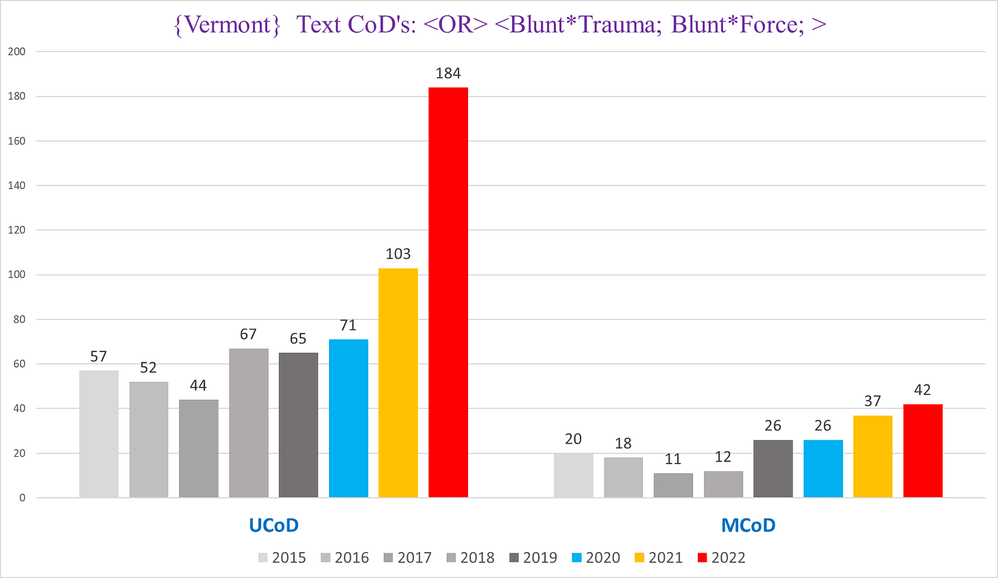
Vermont
We’re going to start with Vermont, because it is the simplest state and it was the genesis of discovering this trend.
I was shocked to discover the following trend when I searched for blunt force traumas in Vermont – the chart below shows the number of deaths that contain either the words blunt and trauma, or the words blunt and force (sometimes ME’s write “Blunt Trauma, and sometimes they write things like “Blunt Force Injury”):
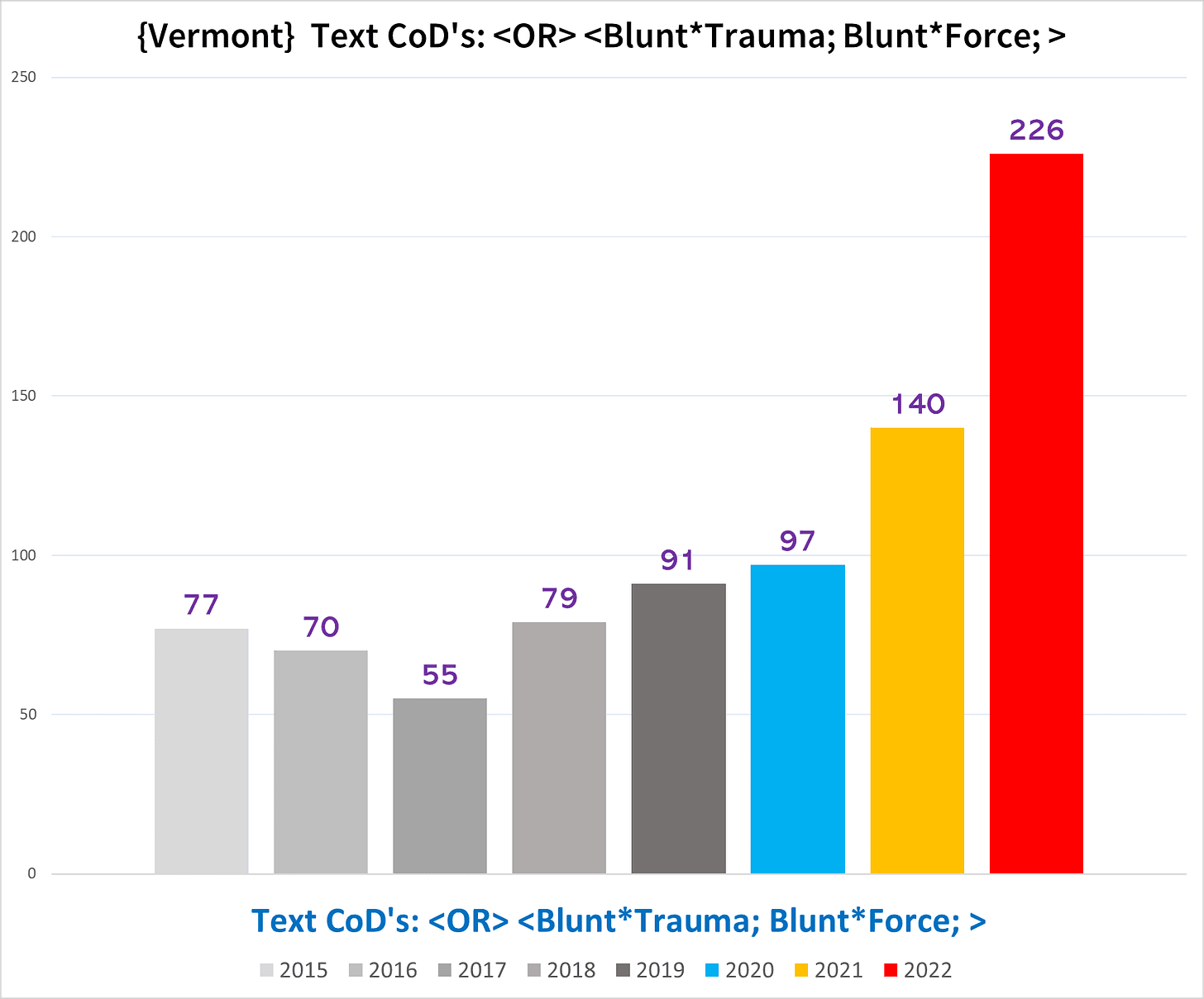
This trend is eye-popping.
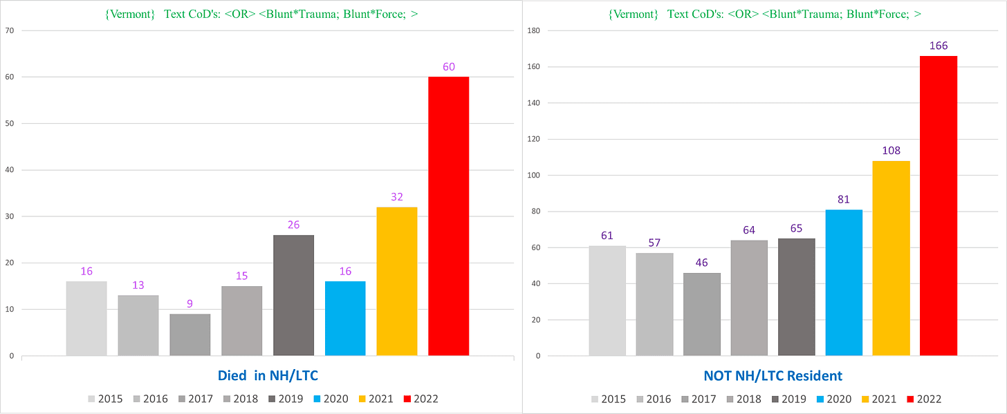
Moreover, it is also present in the NH deaths (left) in 2022, not just the non-NH deaths (right):
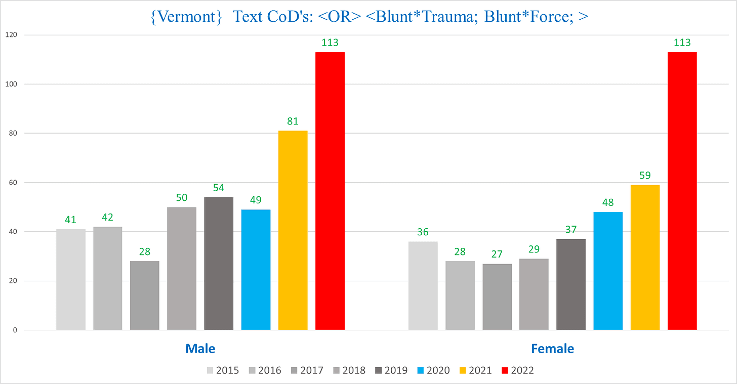
It affects both men and women:
Strikingly, for the vast majority of these deaths, the physical injury is documented as the Underlying Cause of Death [UCoD] (left), which is basically the primary cause of death; however there is also excess seen among deaths where the physical injury is listed as a “Multiple Cause of Death” [MCoD] (right), i.e. any additional cause of death that isn’t the UCoD:
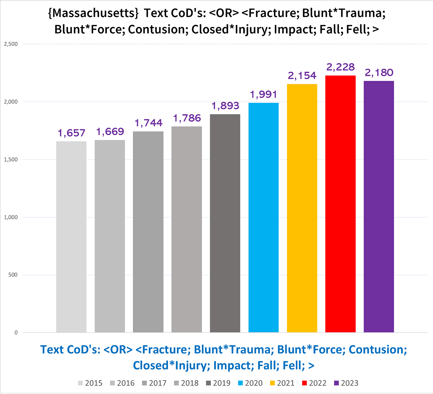
Massachusetts
Massachusetts was a big mess for the most part, with lots of different phrases used.
The following chart shows the total number of deaths each year with at least one of the words or phrases indicated by the title:
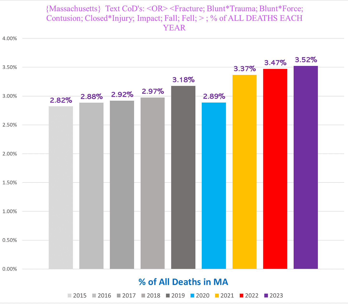
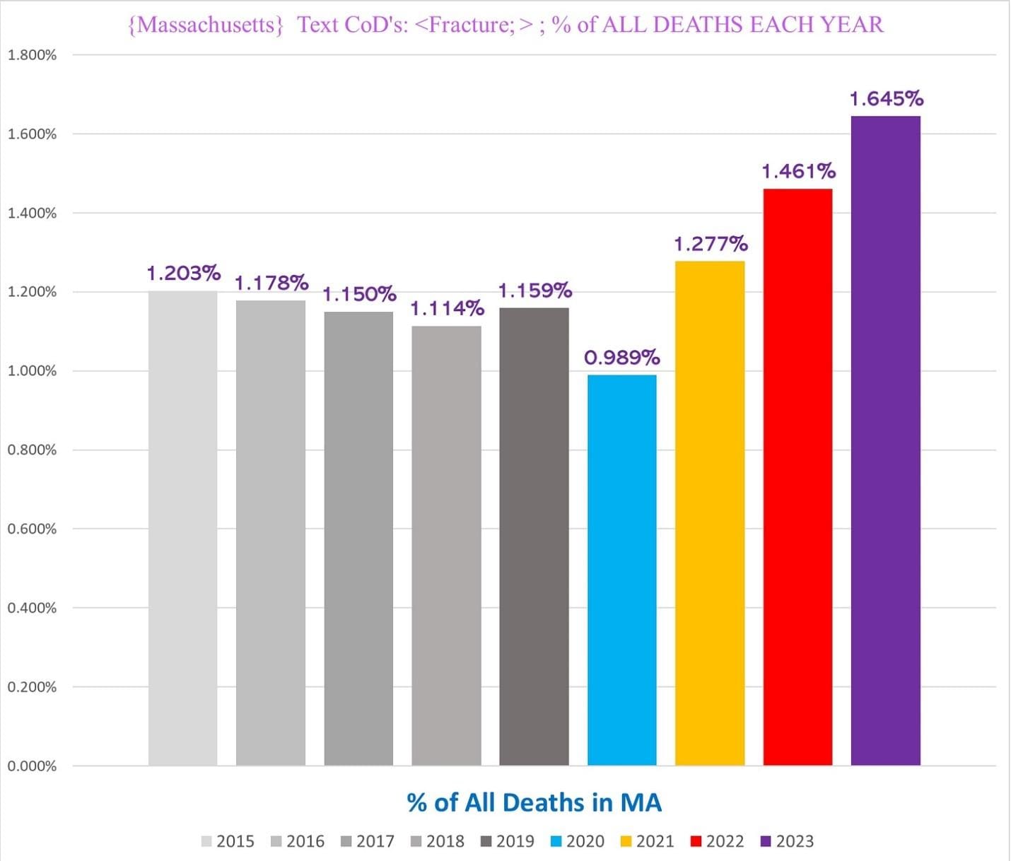
There is a subset of deaths in Massachusetts that show a very clear and obvious trend of excess mortality: deaths that use the word “fracture” in a CoD description:
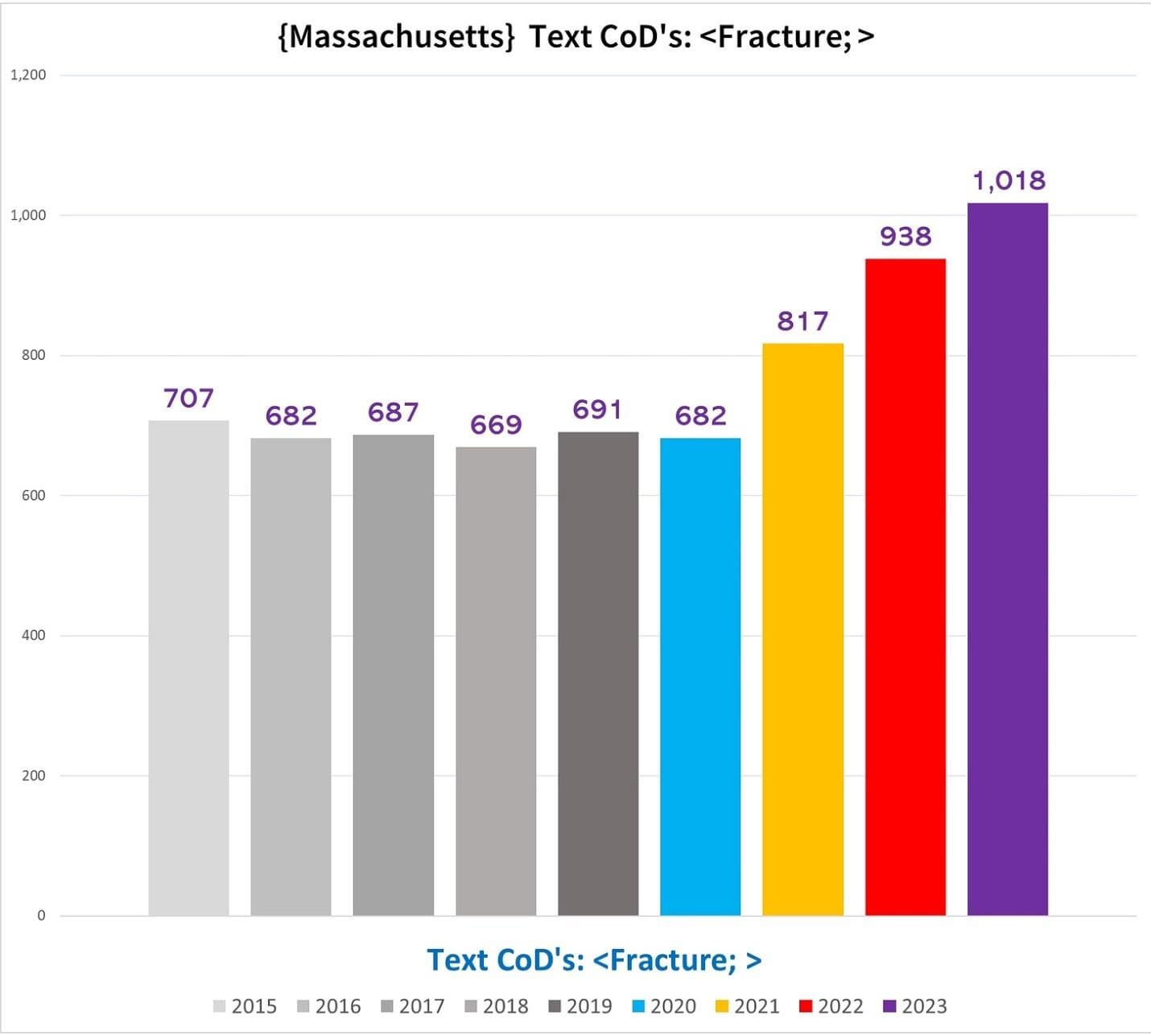
This trend eclipses the rate of All-Cause Mortality:
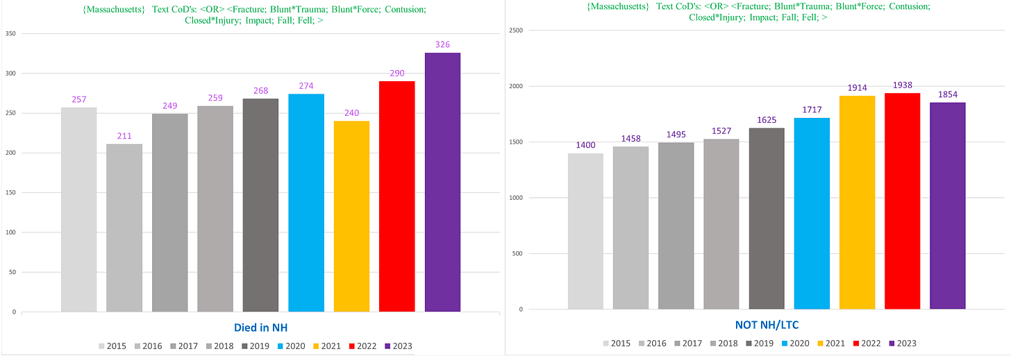
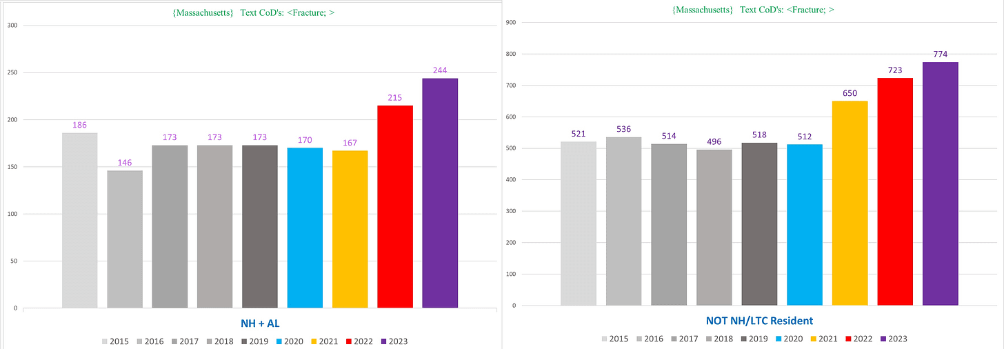
And most surprisingly, we see excess in the NH population starting in 2022 (left), closely mirroring the excess of 2022/23 we see in the non-NH deaths (right):
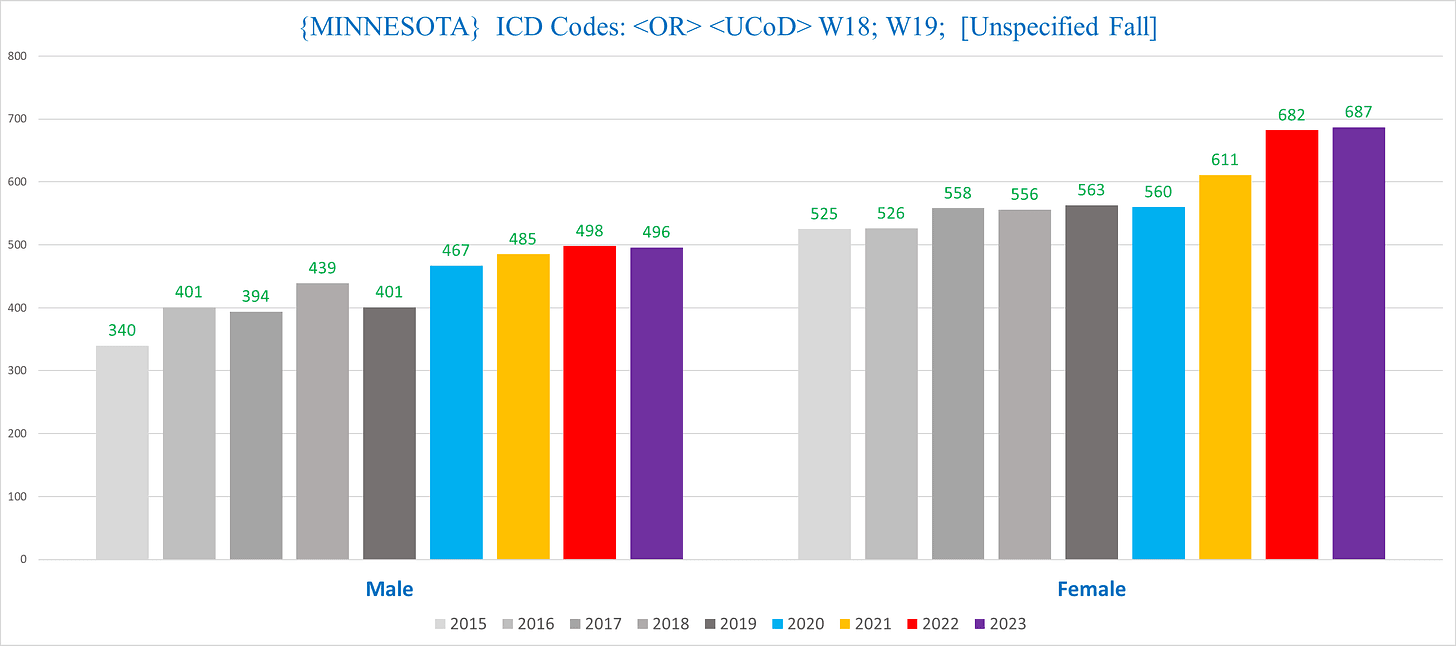
Minnesota
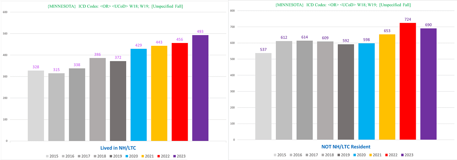
Minnesota actually has a few ICD codes that do show a clear trend – the W18/W19 combo that indicates unspecified falls. I wrote an article about this a while back before we had complete 2023 data.
Here are the salient charts for W18/W19 deaths –
NH vs non-NH:
Men vs women:
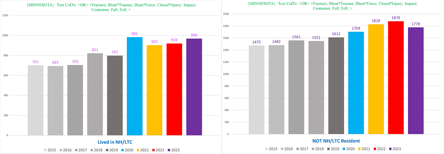
When we use the same wide-ranging text search as we did in MA, we see the following:
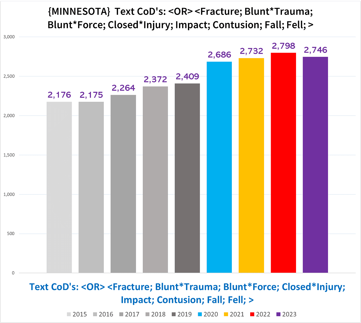
We see excess in both the NH and non-NH deaths:
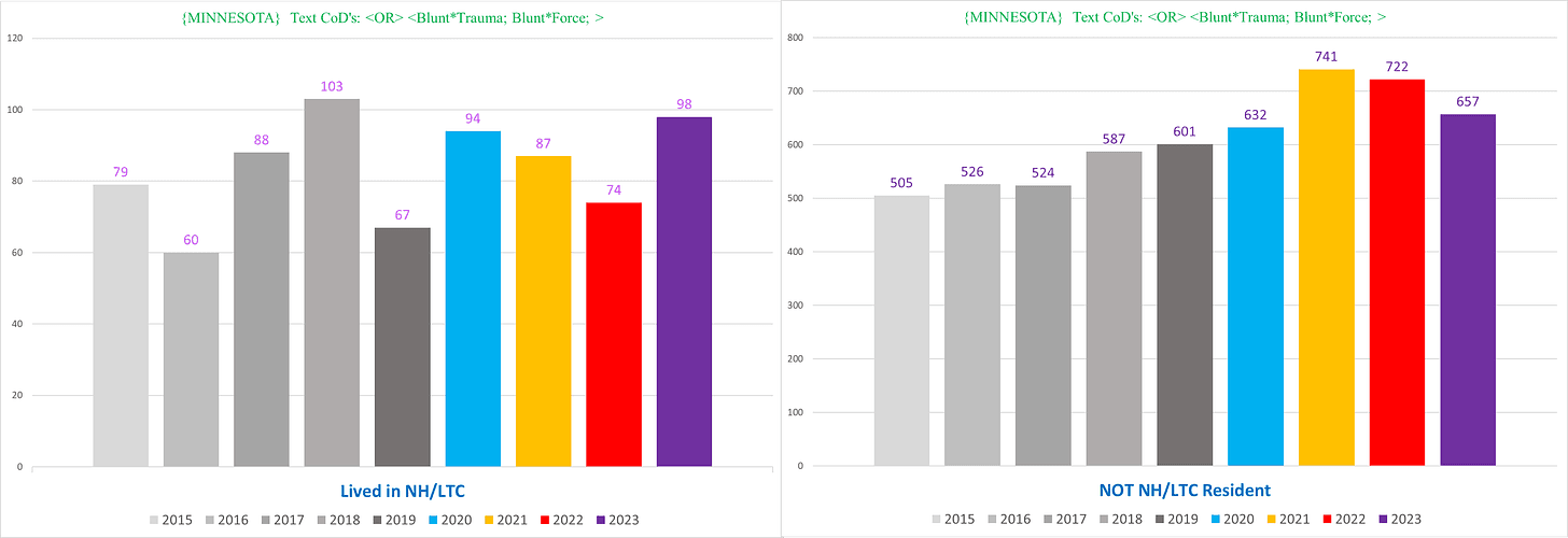
However, when it comes to the text of blunt force or blunt trauma – the parameters we used in Vermont – we only see excess in the non-NH deaths (right):
Nevada
I previously wrote about Nevada and physical trauma injuries.
Here’s the basic idea:
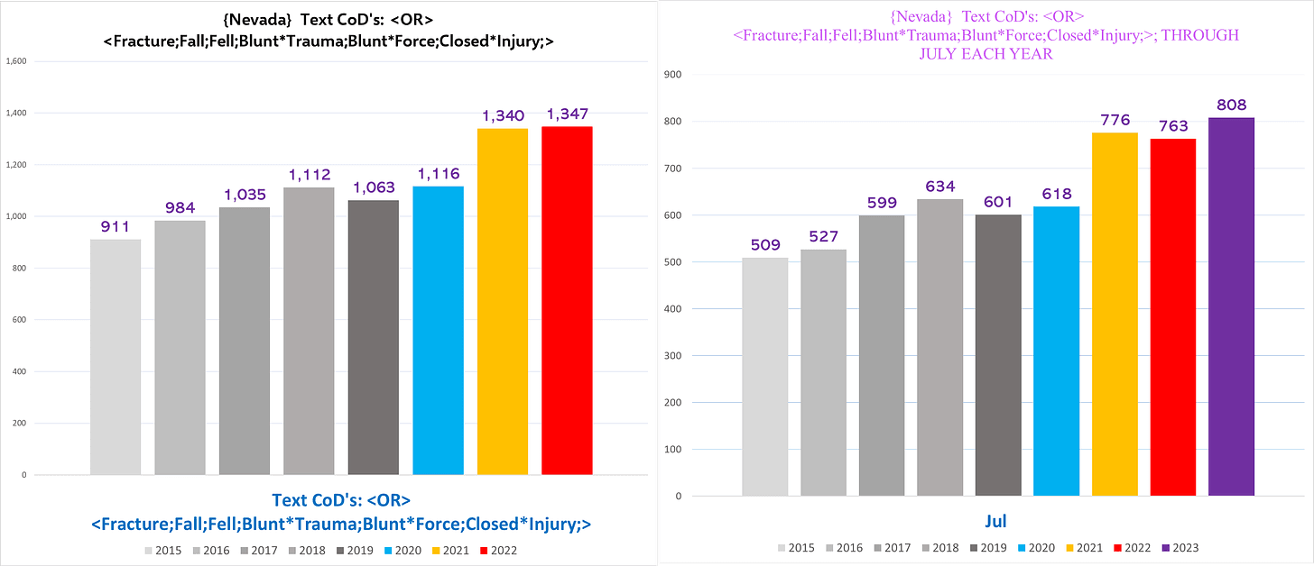
Nevada is like Vermont, where there is no excess in 2020 but 2021 spikes up; and so far, in Nevada this trend of excess mortal kinetic encounters continues through 2023 at an even higher clip than 2022 through July.
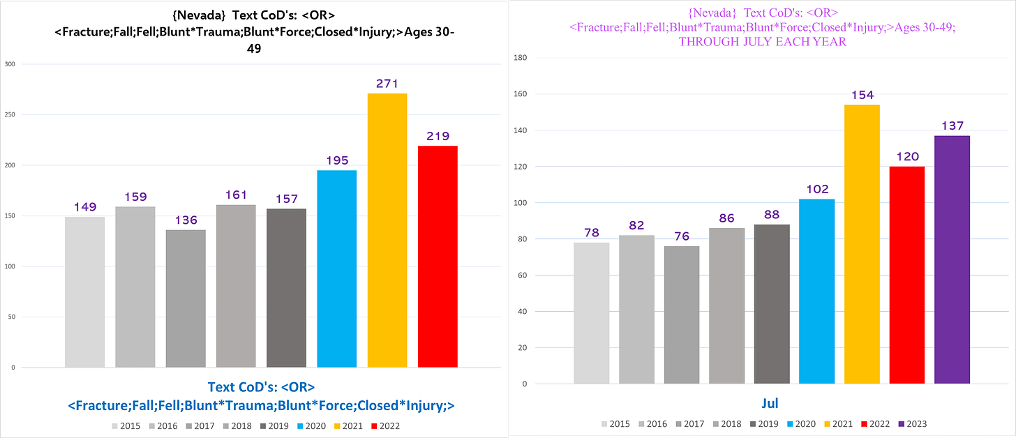
Physical trauma injury deaths in ages 30-49 stands out in Nevada:
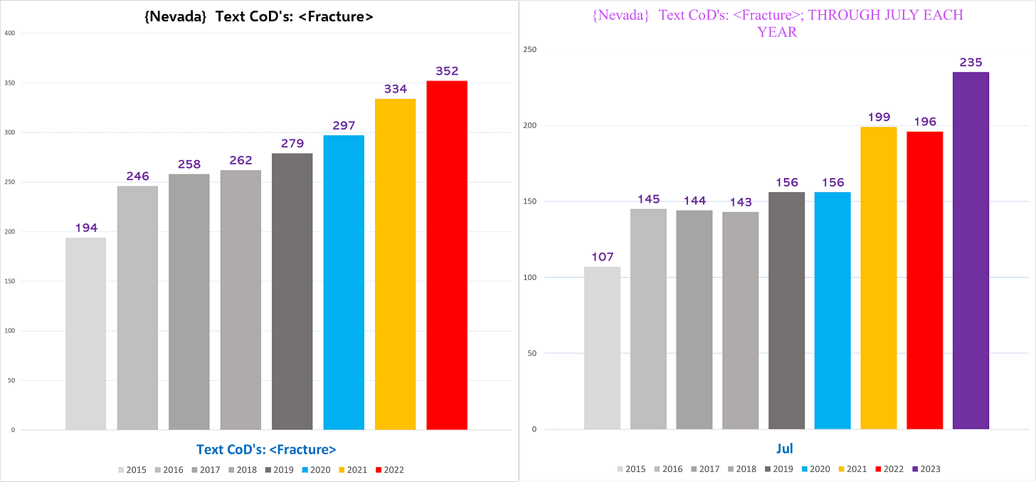
Nevada also shows clear excess in deaths with the word “fracture:”
V. DIABETES (ICD 10 Codes E10-E14)
Diabetes is one of the leading killers of Americans every year. Which would make a dramatic boondoggle of extra diabetic fatalities noteworthy.
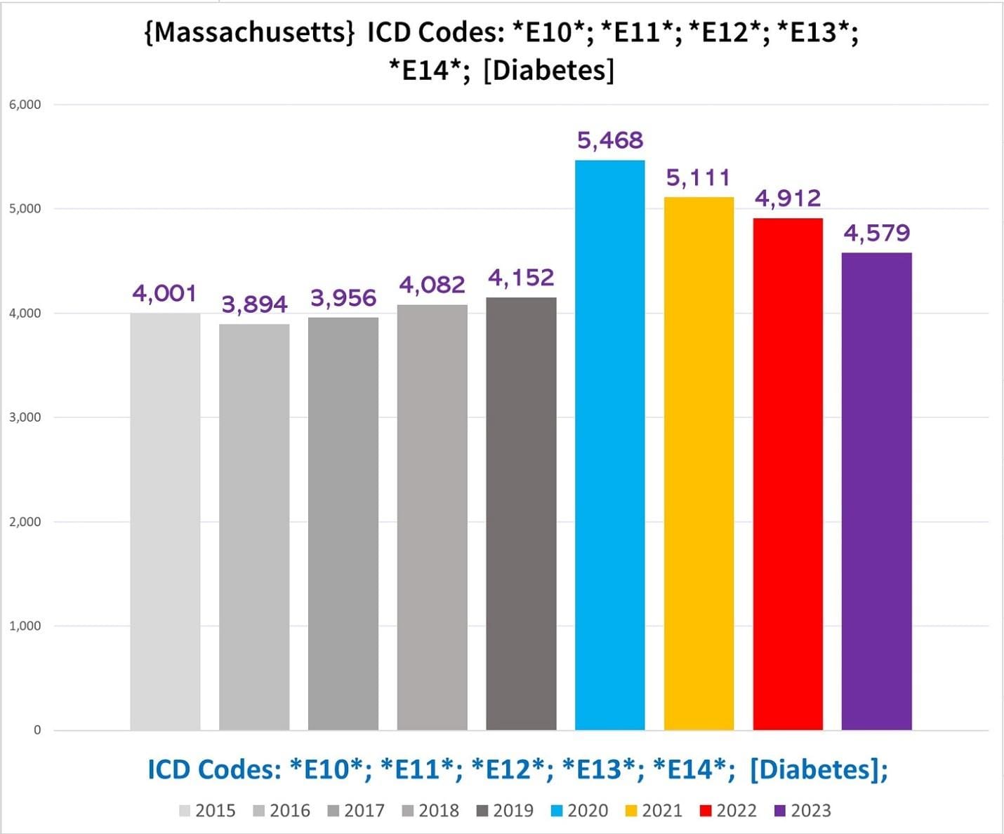
Massachusetts
The following chart shows the total number of deaths with one of the diabetes ICD codes:
Splicing out the NH from the non-NH levels out the excess in the non-NH deaths after 2020 (right):
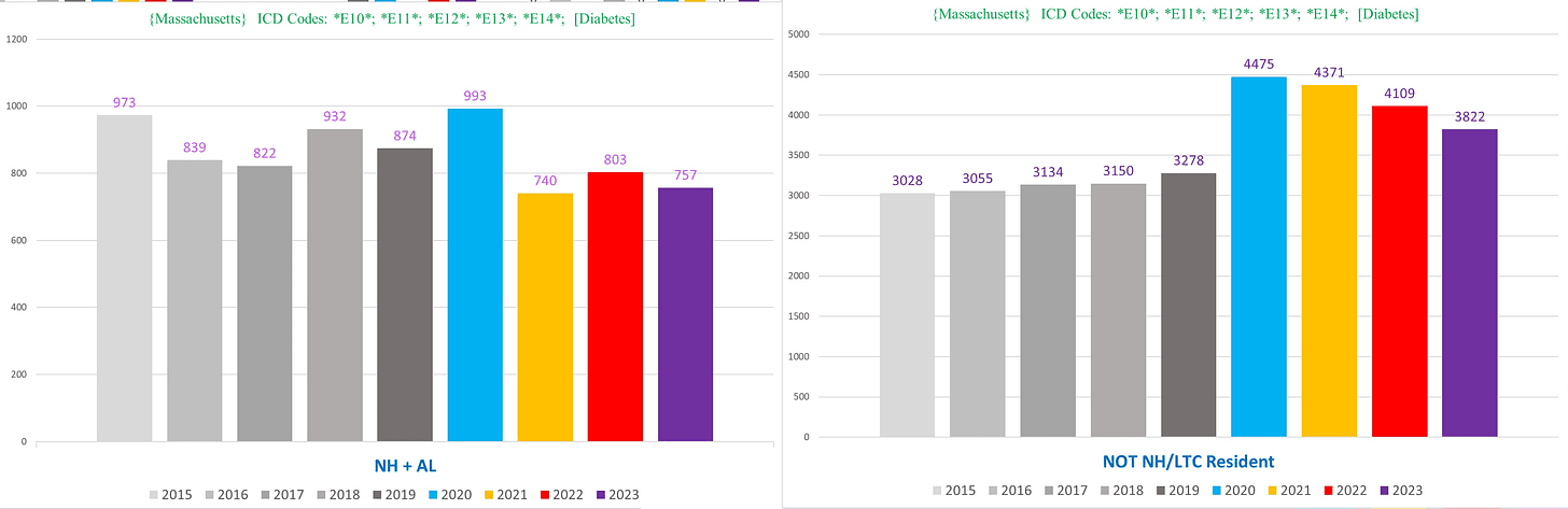
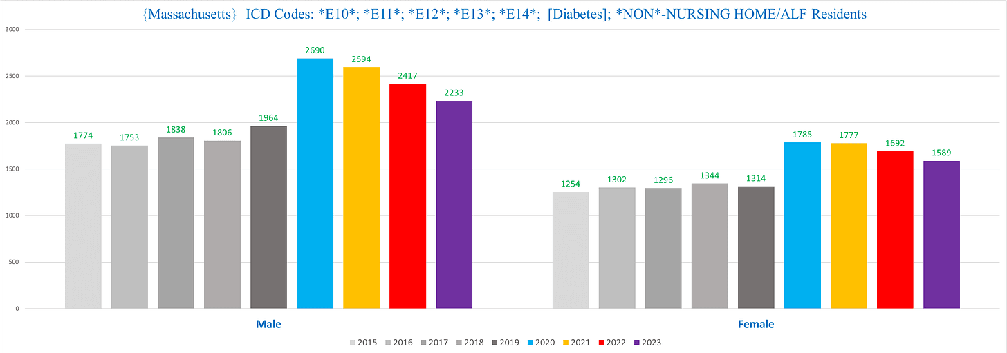
Non-NH diabetes deaths, men vs women:
Here’s the kicker: if we exclude the deaths that list covid as a CoD from the diabetes deaths in the non-NH deaths, we see a pretty consistent substantial excess starting in 2020 and continuing through the present (right):
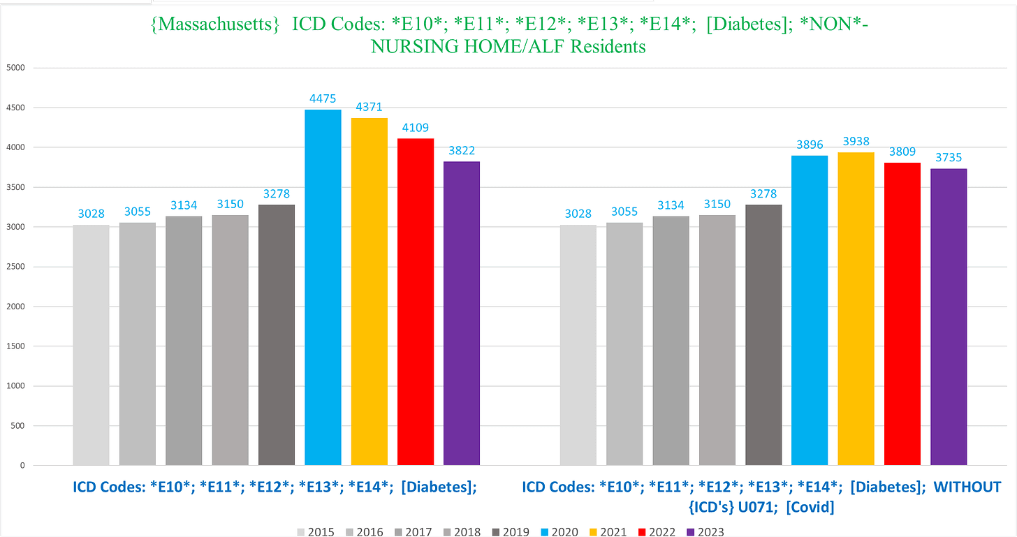
In other words, this looks like a lot of excess diabetes deaths in 2020 and even 2021 were people killed by covid/covid policies (and maybe also covid vaccines) where diabetes was a comorbidity that predisposed them to bad outcomes, but in 2022/23, the excess might be attributable to increased diabetes incidence itself.
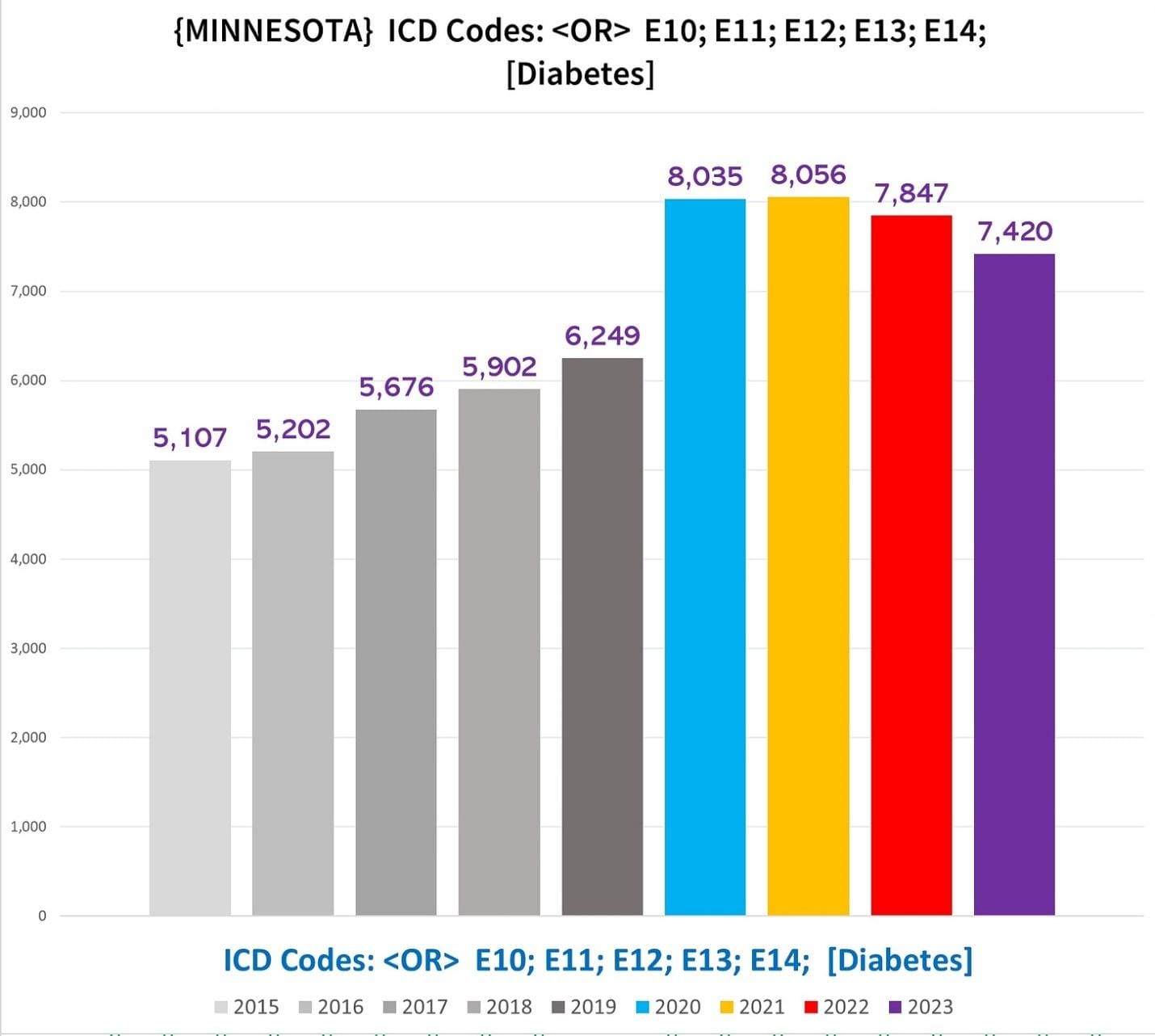
Minnesota
Minnesota diabetic deaths are far more even overall compared to MA before we start disaggregating deaths into subgroups:
NH vs non-NH shows a very stark difference here:
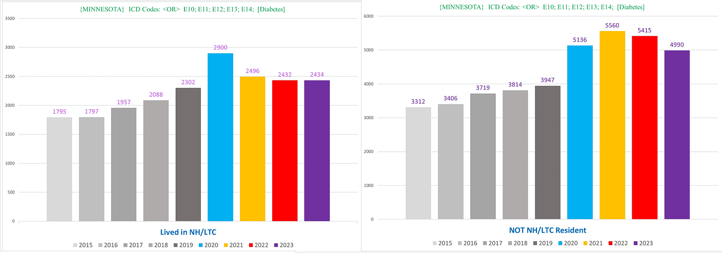
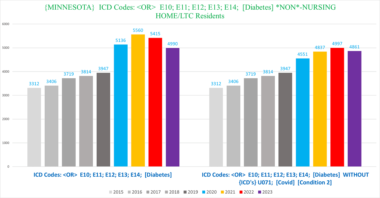
Within the non-NH diabetes deaths, if we exclude covid deaths, we still see a glaring trend of excess mortality (right) continuing after 2020 through 2023:
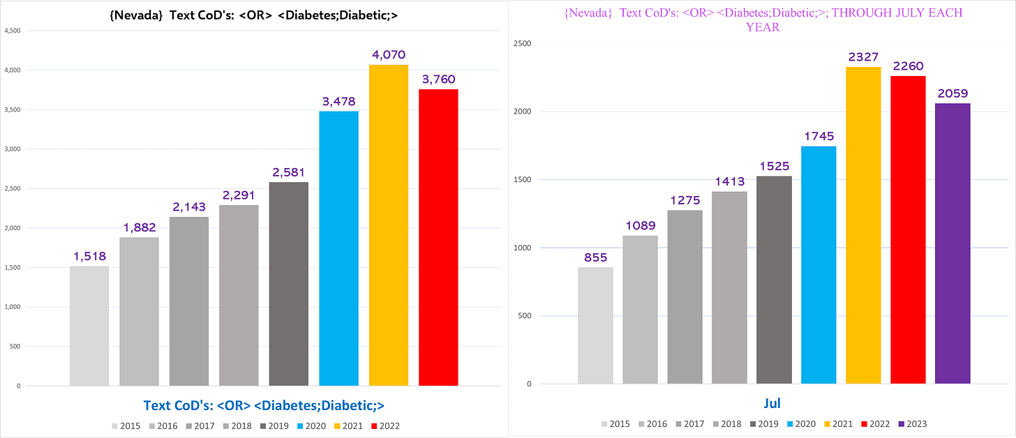
Nevada
I used the text of Diabetes/diabetic for Nevada, because it caught a significantly larger number of deaths (Nevada has a unique issue that a bunch of the death certificates are missing the ICD codes. While this doesn’t always make issues, here there was a substantial difference, so I went with the text instead):
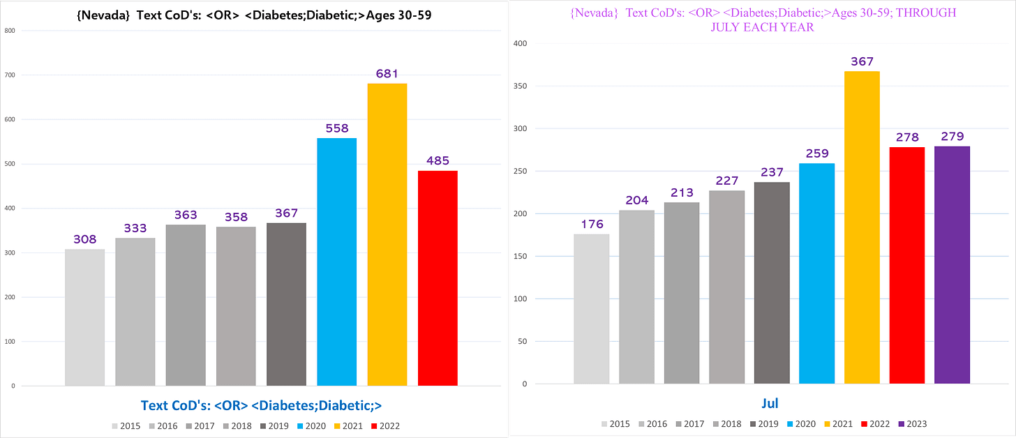
Nevada also shows quite a startling trend of excess in the 30-59-year-olds (and what’s with the first half of 2021?):
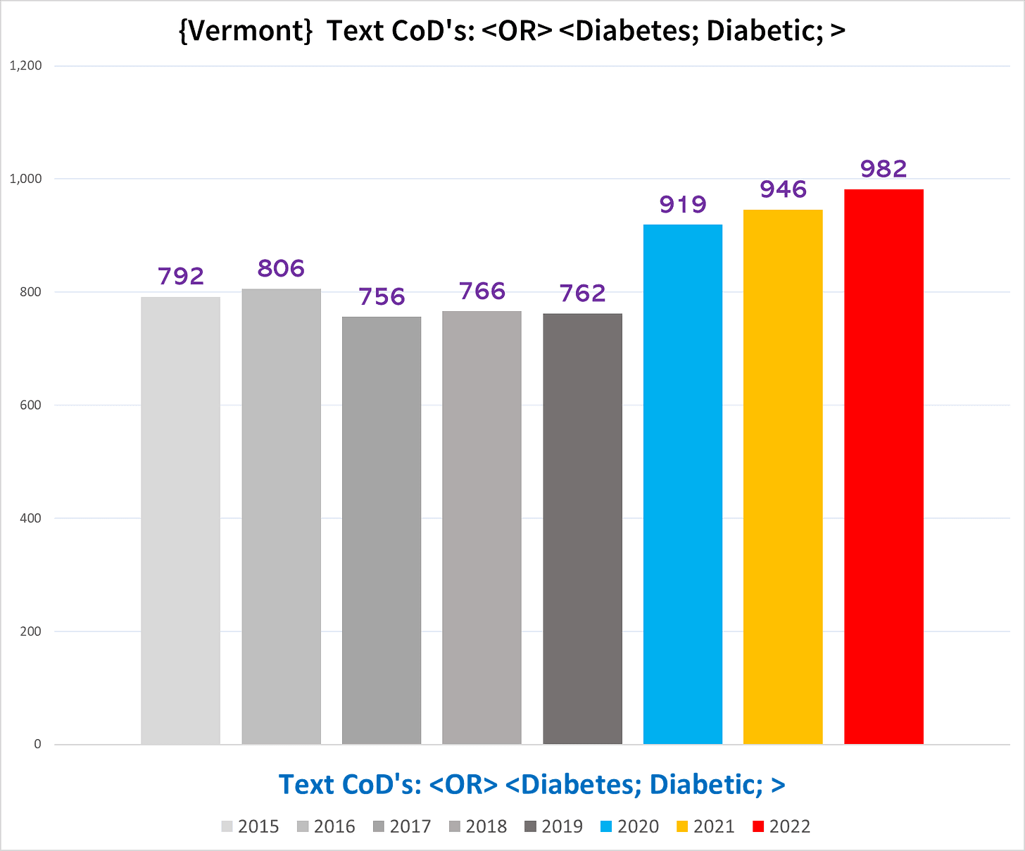
Vermont
The Vermont trend speaks for itself:
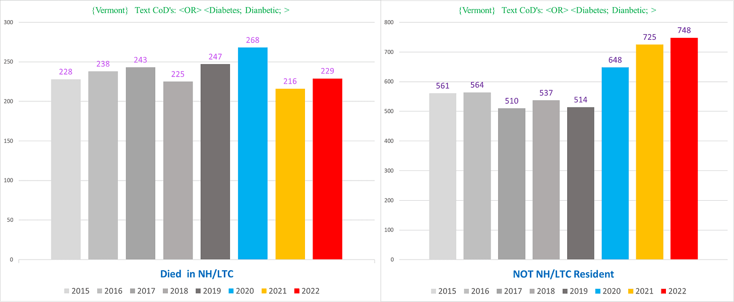
NH vs non-NH:
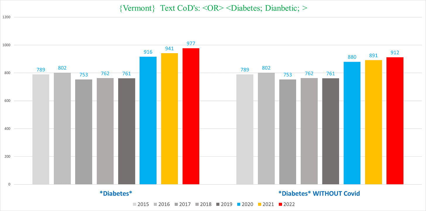
And when we exclude Covid deaths, we still see lots of excess even in 2020 (right):
VI. PROTEIN CALORIE MALNUTRITION (ICD Codes under E4)
This condition struck me as completely random to manifest the craziest pound-for-pound degree of excess mortality of any major condition.
Then I came across a study containing the following line:
“Cancer patients often experience weight loss caused by protein calorie malnutrition (PCM) during the course of the disease or treatment.”
So…it may not be so random after all.
It is also significant because there was a massive increase in deaths listing PCM as a CoD BEFORE the pandemic hit…in every state we have (!!).
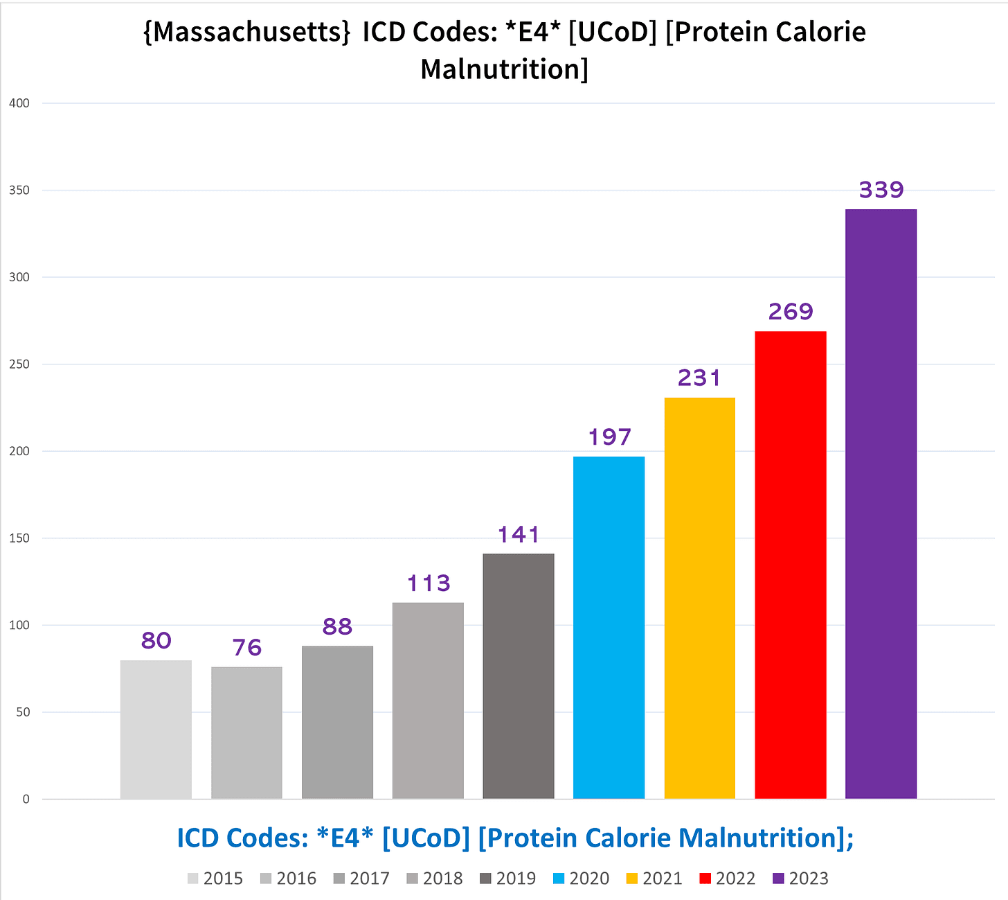
Massachusetts
From 2015 to 2019, the number of PCM deaths almost doubled, from 370 to a staggering 623.
Then it actually doubled from 2019 to 2023 cresting at an earth-shattering 1,222 (!!).
This should have raised a few eyebrows over at the CDC? (And as we’ll see, every state is like this):
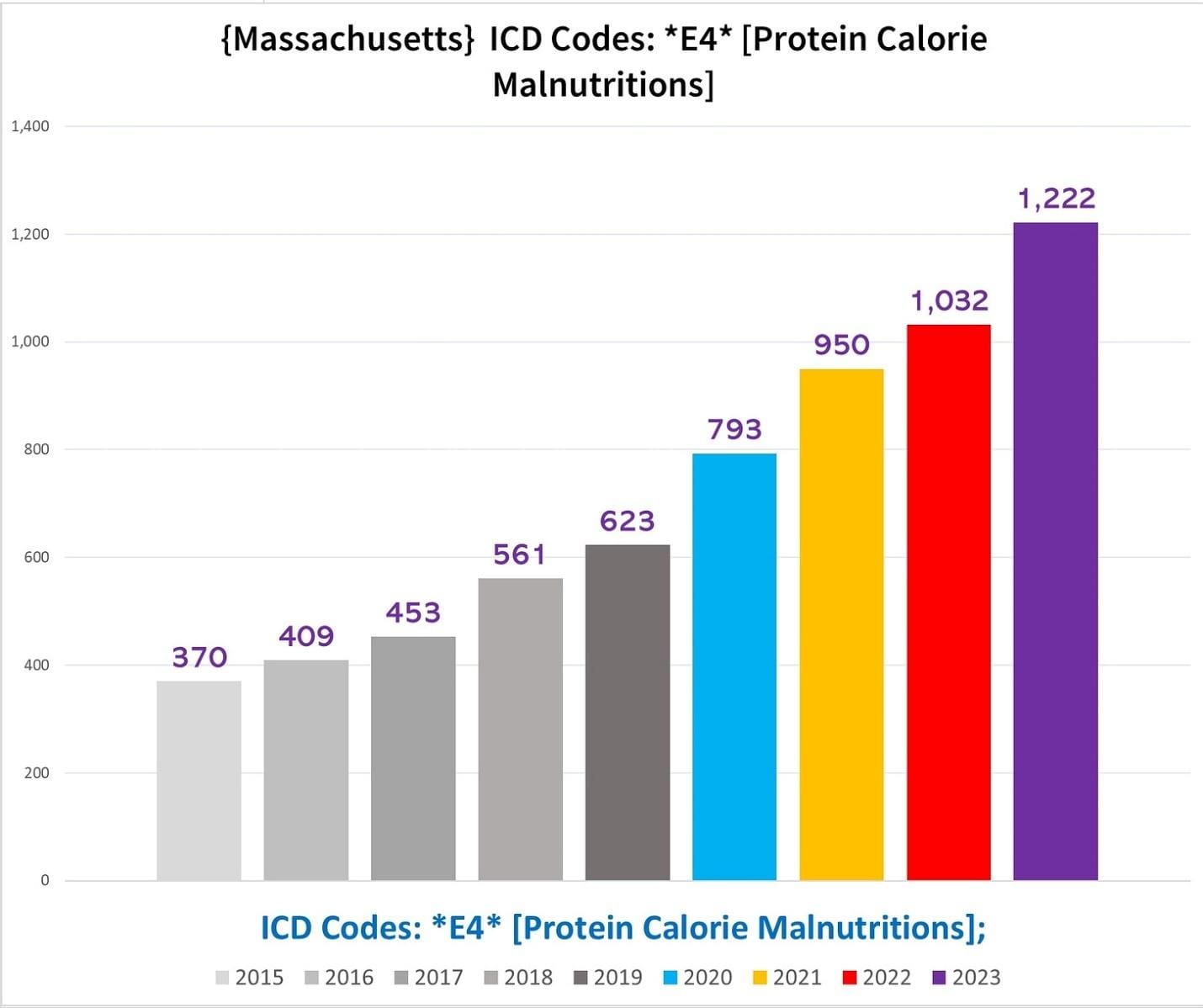
This chart shows the total number of deaths each year where the UCoD (primary CoD) was PCM:
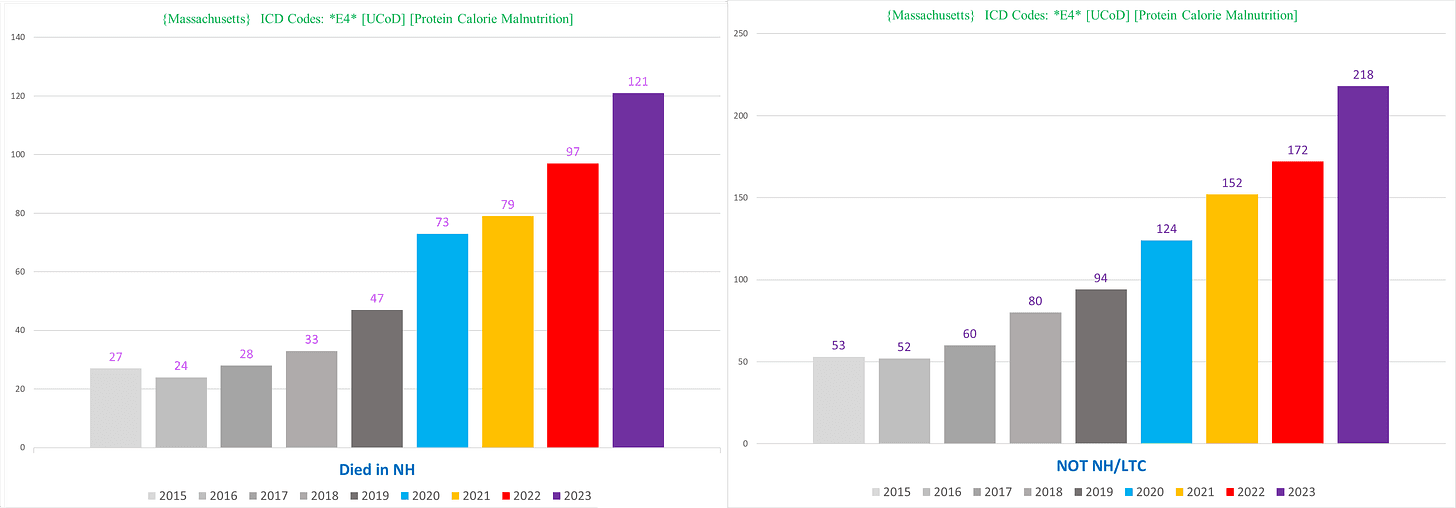
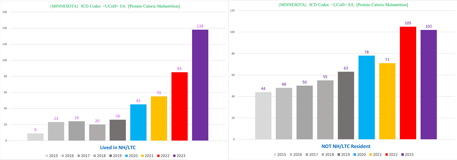
And here’s the UCoD deaths broken down between NH vs non-NH – the trend is identical (!!!):
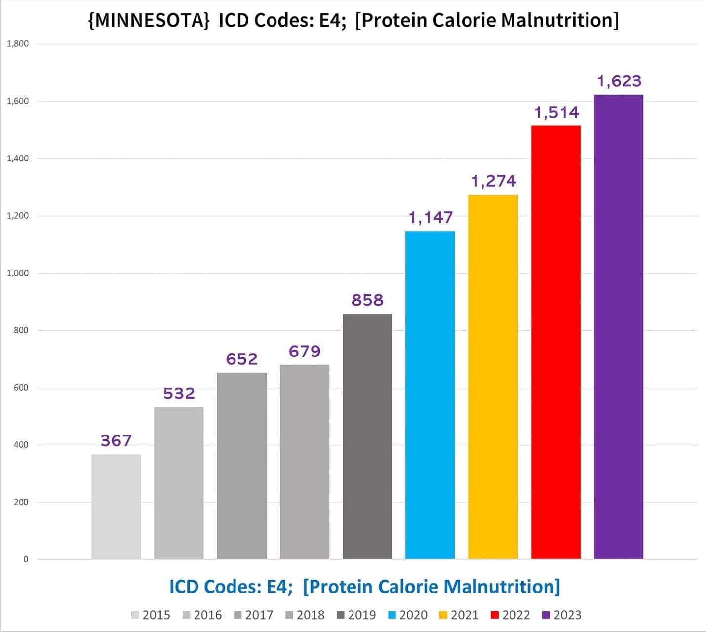
Minnesota
Minnesota saw an even zanier staircase from 2015 to 2019, going from 367 PCM deaths to a more than 250% increase of 858 by 2019.
Which then itself nearly doubled to hit 1,623 by 2023:
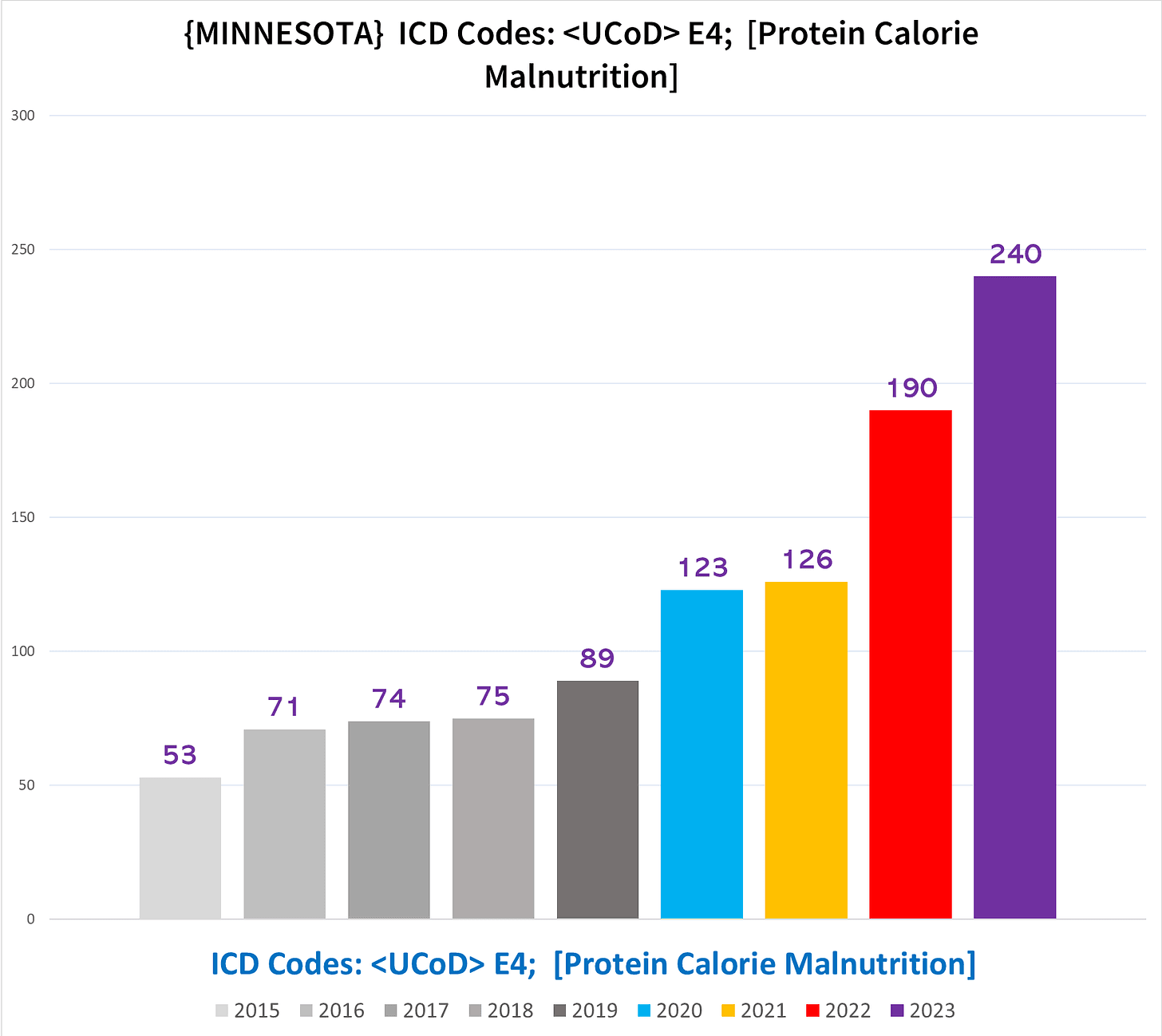
Deaths with PCM as the UCoD at least show a more level trend before the pandemic:
When we break apart the NH vs non-NH UCoD PCM deaths, in Minnesota, the NH has a FAR MORE DRAMATIC INCREASE (?!?!?):
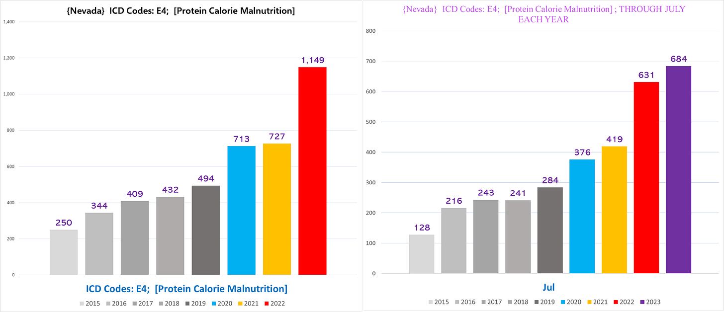
Nevada
Nevada has the same dynamic:
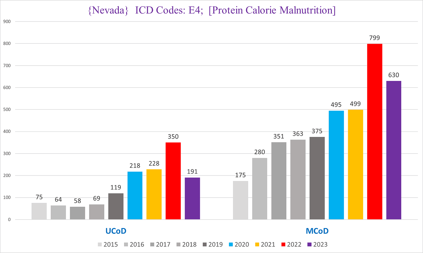
Here’s UCoD vs MCoD deaths in Nevada – UCoD PCM deaths actually go down (??) from 2015-2018 before shooting up in 2019 and exploding forth in 2020:
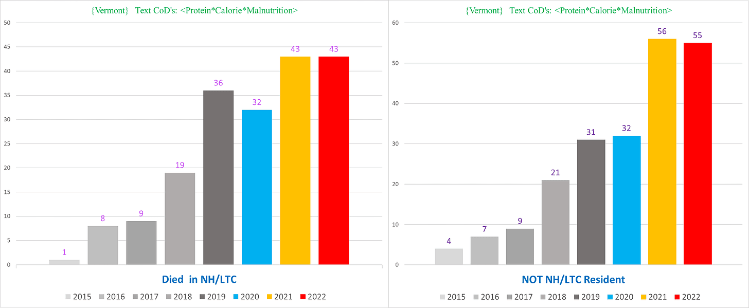
Vermont
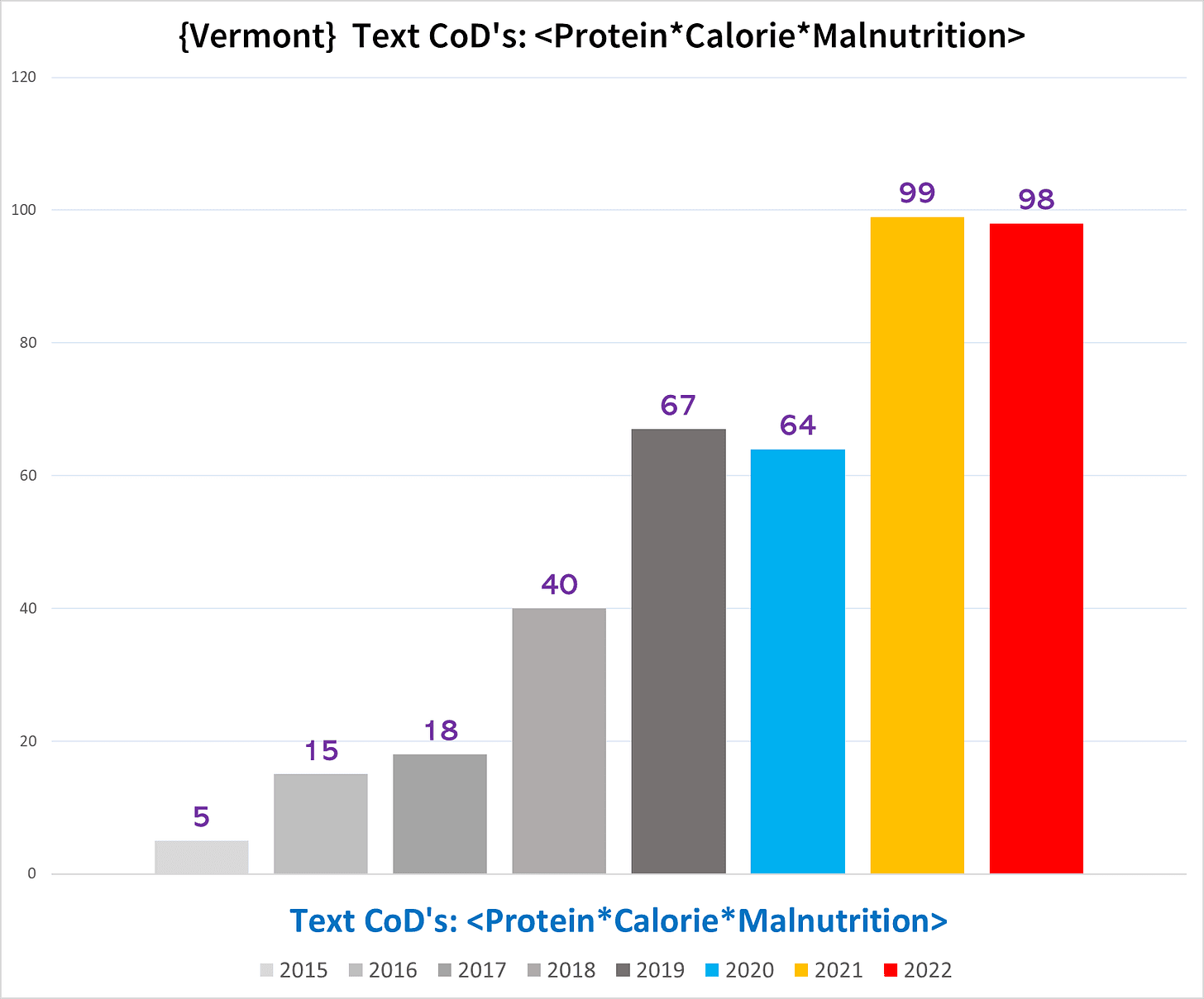
Even Vermont. But Vermont takes the cake with a >1,300% increase in PCM deaths from 2015 – FIVE total deaths – to 2019 – 67 total deaths.
Followed by the obligatory boom in 2021/22.
I wonder what 2023 will look like….
Vermont however has a somewhat more moderated excess swing in the NH deaths (left) not seen in the non-NH deaths (right):
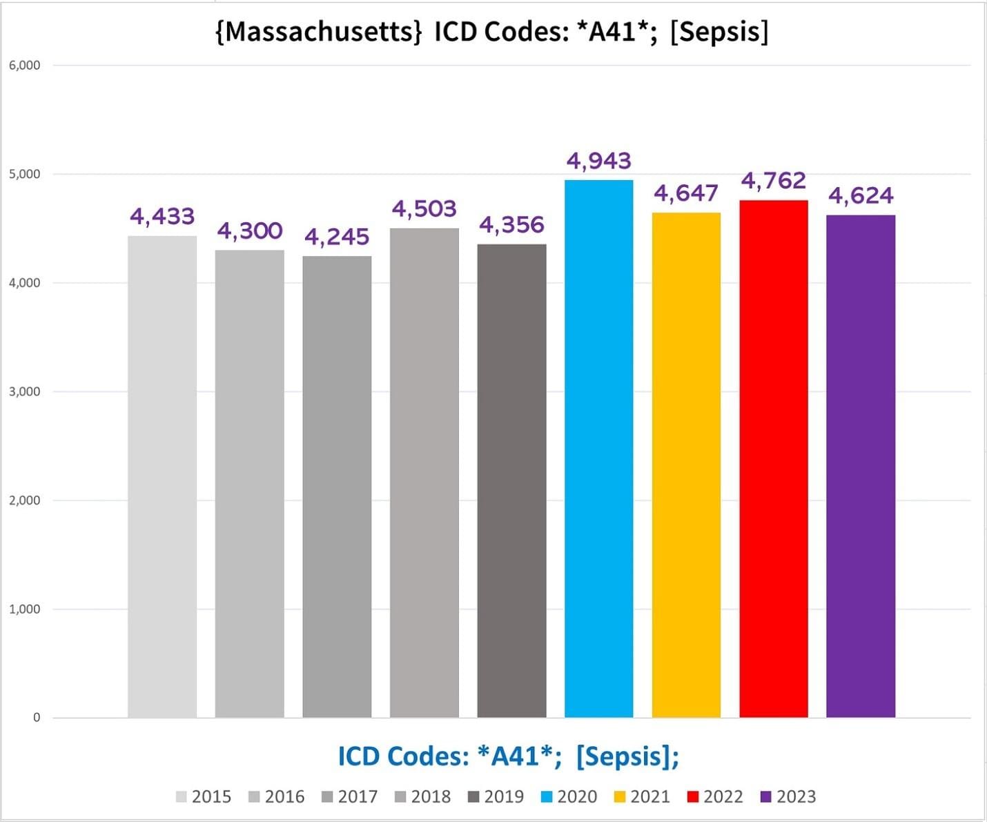
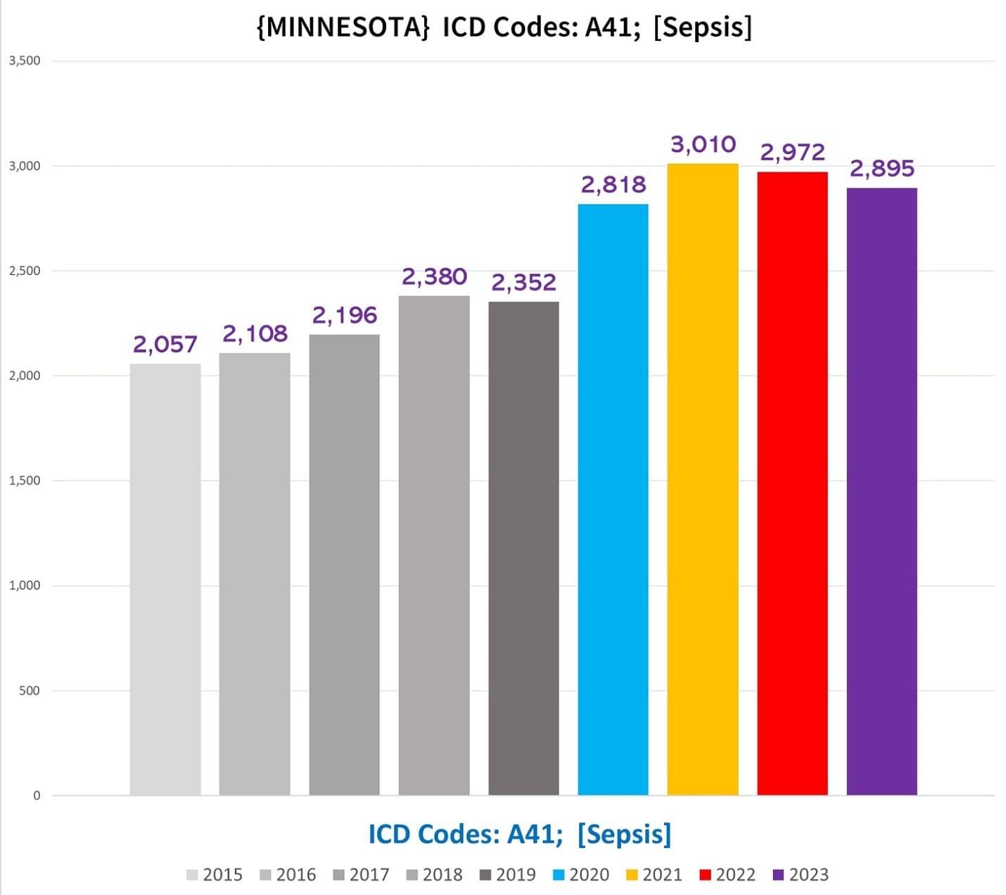
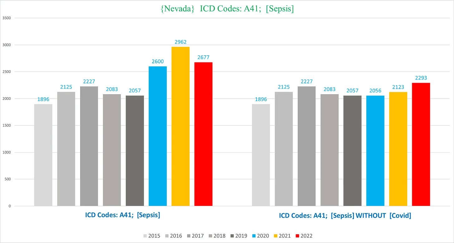
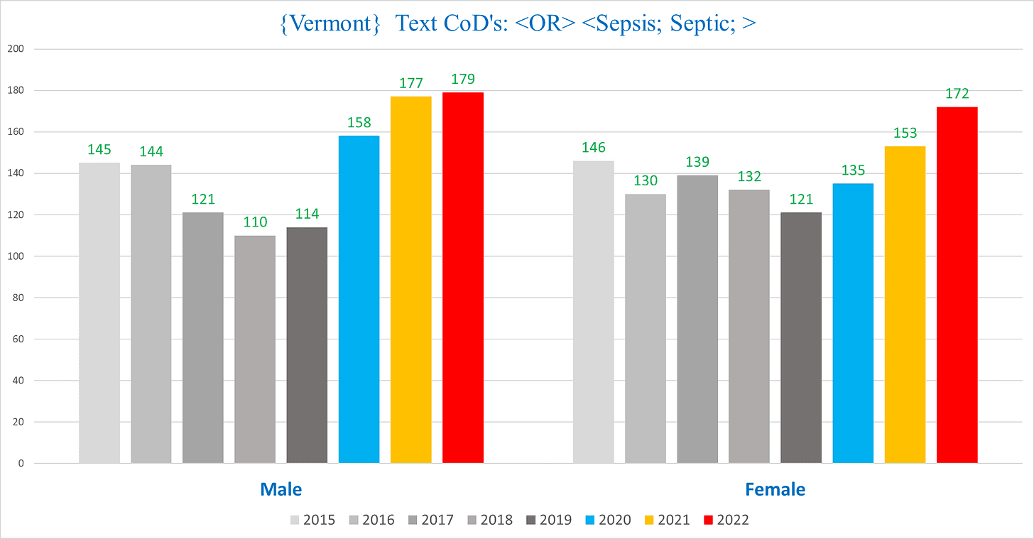
VII. SEPSIS
The Sepsis charts are all charts used for the other conditions and don’t really require further commentary.
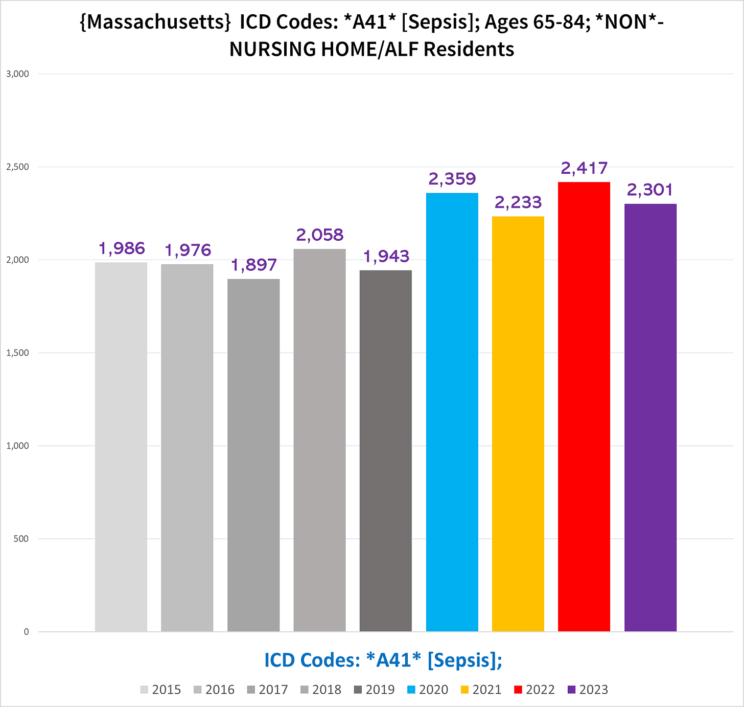
Massachusetts
This chart shows the non-NH death in ages 65-84, where the excess is a bit clearer:
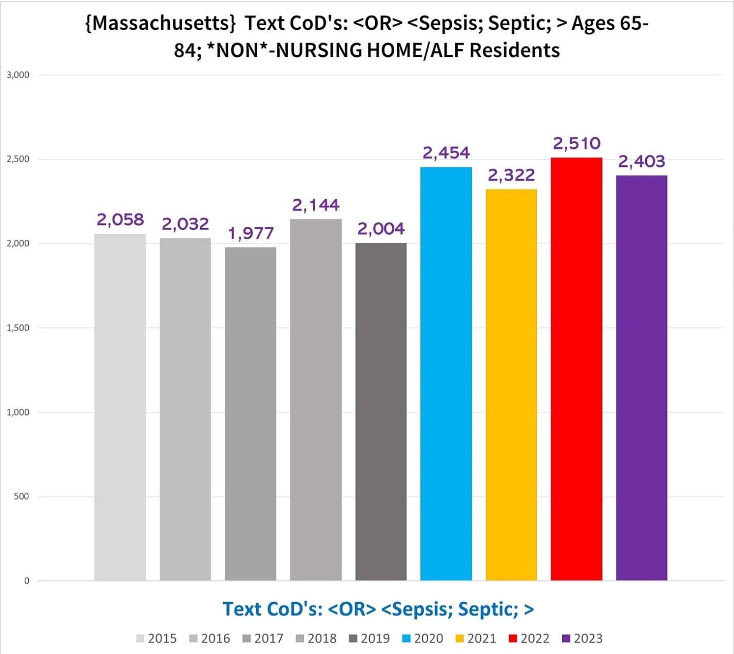
This chart shows the non-NH death in ages 65-84, except we used a text filter instead of ICD Code A41 to search for the sepsis-related deaths:
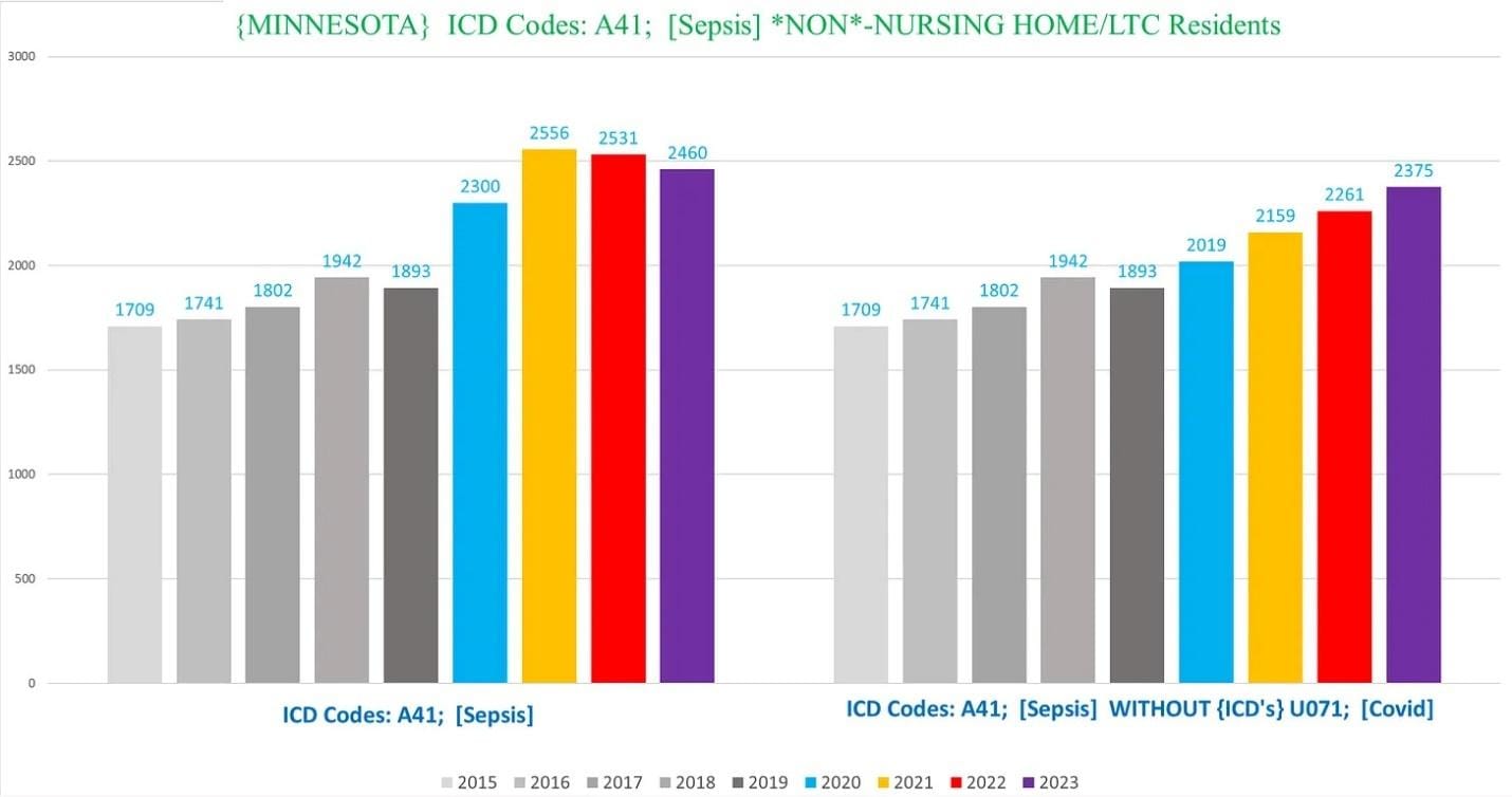
Minnesota
This excess is very substantial:
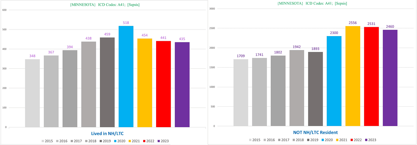
If we exclude Covid deaths from the Sepsis deaths, we still see mounting excess (right):
Nevada
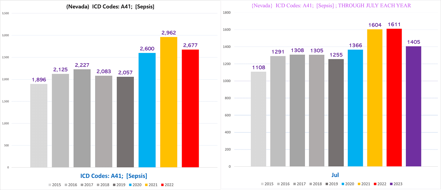
I would bet that if we could separate out the NH vs non-NH deaths, excluding covid deaths wouldn’t mostly vanish the excess trend, and anyway, Covid deaths are massively inflated:
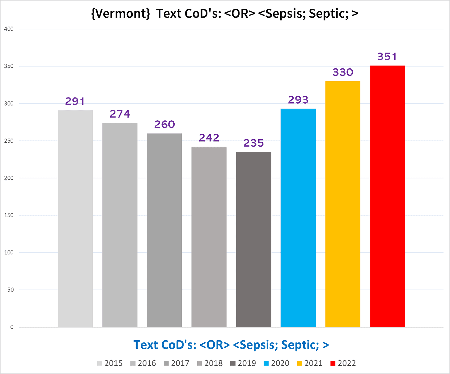
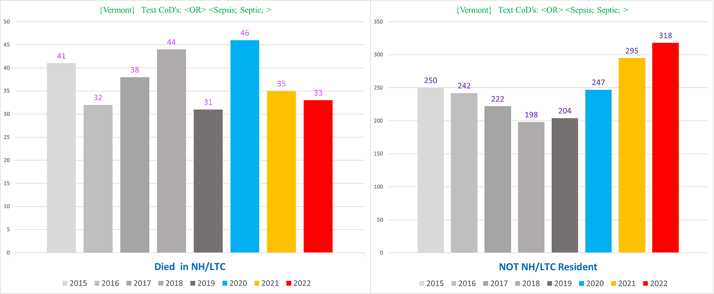
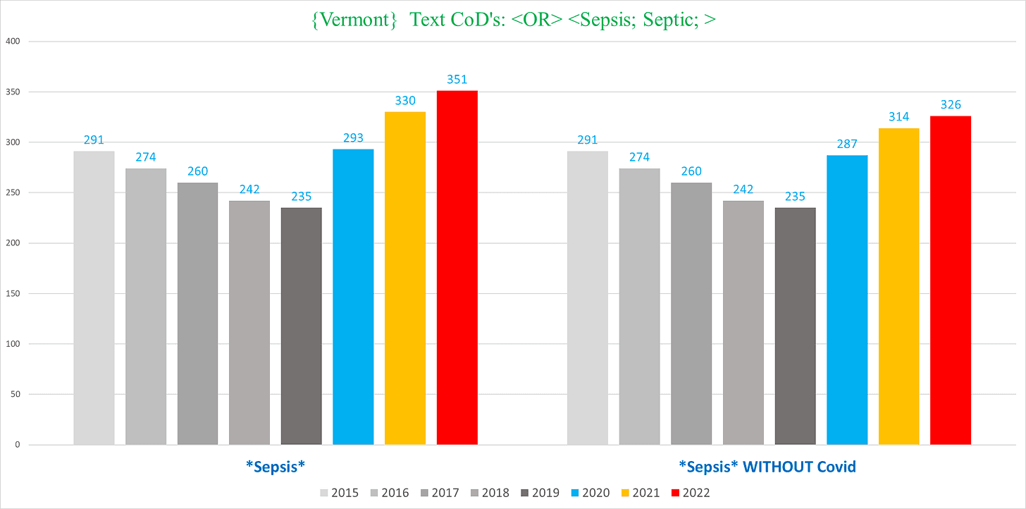
Vermont
We conclude with Vermont, which shows a wild reversal of five consecutive years of decreasing Sepsis deaths:
In Vermont, excluding Covid deaths barely dents the excess Sepsis deaths:
Caveats:
Now for the really boring disclaimers…..
- This is NOT intended to represent a final or conclusive analysis of excess mortality. The point is to show that there are glaring signals which appear to be extremely disturbing trends of substantial excess death, that are being completely ignored by the public health establishment. (However, it is my contention that even upon robust analysis, the vast majority if not all of the signals documented herein will ultimately pan out.)
For more specific or granular information and analysis about death certificate data, check out John Beaudoin’s book The Real CDC which has a lot of charts and exhibits (and a bunch of VAERS reports he matched up with actual death certificates, another elementary failure by the CDC/FDA to do the most rudimentary pharmacovigilance).
You can also see what we’ve written previously on Trial Site News, and I will be writing additional articles there to further elucidate the data and information contained in this article, which are mostly bird’s-eye view summaries of trends.
Ed Dowd’s group also should be releasing a preliminary report on excess deaths with Acute Renal Failure in a few weeks.
- We don’t have 2023 death certificates for Vermont, and only through July for Nevada.
- Vermont only gave us the Text CoD’s, without the ICD codes, so we are forced to use pure text parameters for all Vermont data.
- Nevada only gave us age and sex, so we were limited in how we could parse the Nevada deaths compared to the other states.
- Each state has its own idiosyncrasies about how they describe and document various conditions contributing to death. This makes direct comparisons difficult. The conditions we chose are unique in that there is a consistent trend across all the states we have in our possession. (There is one exception to this, where we went on a deep dive to sort out how kinetic injuries (e.g. falls, blunt force traumas) are written and categorized in each state and show the trends we were able to isolate.)
- An increase in deaths from any given condition is not in itself proof of that condition being the cause of those deaths because it is possible that more people are being killed by something else but “dying with” this condition. Furthermore, some conditions are themselves really proxies for other pathologies and are not on their own primary instigators of disease or death. However, an increase in deaths involving a condition or disease, especially one that outpaces overall excess mortality, is definitely a signal that there might be something to the correlation – something that public health must investigate and resolve.
- The trends seen in the nominal number of deaths are reflected in the population-adjusted rate per 100K (using US Census numbers)
- Cancers are up significantly; however, it is a very complex endeavor to show and is not something that is amenable to framing as a simple trend. Also, since there is already widespread recognition even in the mainstream that cancers are up (“mysteriously”), I figured that it was better to focus elsewhere on conditions with clear excess (And that are also less contentious).
Join the conversation:
[Sassy_Follow_Icons social_networks="x=https://x.com/brownstoneinst,facebook=https://www.facebook.com/brownstoneinst,telegram=https://t.me/brownstoneinst, truth_social=https://truthsocial.com/@brownstoneinst, linkedin=https://www.linkedin.com/company/brownstone-institute/, gettr=https://gettr.com/user/brownstoneinst, gab=https://gab.com/brownstoneinst" shape="round" style="background-color:#ac3900;]
Published under a Creative Commons Attribution 4.0 International License
For reprints, please set the canonical link back to the original Brownstone Institute Article and Author.


